
AllAppsUser
-
Posts
364 -
Joined
-
Last visited
Everything posted by AllAppsUser
-
If you select any standard size such as A6, you get a highlight line around it, yeah? Next, manually change a dim on the right.. does the highlight around the doc size you chose disappear? If the highlight doesn't disappear, create the document, then quit the app. When you reboot the app, do you see the new document dialogue simply picks up the last thing you set it all to? So the dims don't match what the document selected on the left suggests they are? Senario, a user tweaks ever-so-slightly the A4 dims for whatever purpose. Works then quits the app. Next time they go into the app, they create another document without checking the dims match (because you'd expect the two sides of the dialogue to coordinate would you not?). The new document appears on screen and because it's a small tweak, it's not obvious it's the wrong size.... my-oh-my, hours of design work ahead on the wrong size of document......
-
I've been trying to use Edit > Save > Defaults Sometimes in combination with Edit > Save > Sync From Selection as advised on another thread I posted (Text style workflow in Publisher ) It seems to work randomly, if at all. I thought I had saved the No Style to Helvetica and other settings. It appeared to have done so. Then it reverted and is back to the factory "No Style". All I did in between was save a document as a template. I've not so far been able to save a default set of styles into the defauls at all though I've spent at least an hour on it. Is anyone else trying to set up defaults, or do people just not bother? Is anyone else having problems with it? Does anyone have a workaround?
-
file > new dialogue Inconsistency: While A4 is highlighted on the left, there's custom document size settings on the right. What happened: file > new --> trusted highlight around A4 --> create --> Bam! Square document appeared (WTF moment) file > close --> file > new --> clicked on highlighted A4 > create --> got A4. Conclusion: it's an inconsistency in the interface - - - - - - - - - - - - - - - There's a lot more inconsistencies I've tripped up on. Was going to make a list and then post it all at once. Should I just add all consistencies I've observed here, or post them as a list? - - - - - - - - - - - - - - - Why these nit-picky details are so important I'm not sure whether Serif have sight of the priority their interface inconsistencies should have. So I'm hoping this will help create absolute clarity. Depends how(if) Serif want to grow their market of course.... Each inconsistency is a WTF moment?? I hate WTF moments.... they inevitably lead to wasted time. The apps are more difficult to learn than they need to be. The above are big reasons why studios won't even think about converting from Adobe. Anyone know of a studio that was Adobe, but is now Affinity? If yes, how big are they? None of the studios I work with have (all more than 4 designers). They know I'm committed to learning Affinity, and seem to put store in my opinion. I tell them they'd "be in a whole world of pain because these apps are still not there yet. Too many inconsistencies in interfaces and I'm not sure Serif are on it". Strategically - Get studios converting and the market will follow. Freelancers are not the force that will achieve it. (Very slowly perhaps, via the few affinity freelancers who become studios.... not a market storming strategy in my view). One thing I'd like to see is more hamonisation between ipad and desktop interfaces.. though that is really challenging. I'd counsel harmonising to the ipad, rather than the other way round (I've been using both).. no doubt I'll be shouted down, though I've sound logical reasoning for suggesting it. I've also a weirdly uncanny *record of predicting the future* where tech is concerned. I predicted the downfall of QuarkXpress long before Adobe acquired Macromedia... and the meterioc rise of a weird little search engine no one but me used, called Google. I recall my thoughts when I first saw it back in 1998: "that's a winner". Understatement?
-
Flash will be bad news for some of the online papers I read, ha-ha. I used an open source app called Fontforge to convert to OTF and TTF when I saw which way the wind was blowing. https://fontforge.org/en-US/downloads/mac-dl/ - I've not updated it to the lastest one so don't know if it's still as clunky (usability wise) as my version. - - - - - - I won't miss Flash either, though it was a fun when it came out. EDIT.. just seen your question icon. Ooops, I never did it gov. All mine were free ones anyway...
-
Hello Everyone Apologies for not responding sooner. Had to crack-on.. deadlines and all. @Petar Petrenko, thank you. I get that... the label "No style" is the issue here. The label "Reset Style" would describe what you've said... not "No Style". Better labels would be "Manual Style", "Base Style", "Unset Styles". I'm fully aware it's a challenge to label these things in a meaningful way and that I'm probably coming across as pedantic. However... the one thing (in my experience) that newbies really struggle with - and some never 'get it' fully - is: styles. So if it's stumped me, they've no chance. (Just search on text styles in here... you'll see how utterly lost people are, and how often the responses are also a bit confused - I'm not saying changing the label will cure it, but it might help). @Pšanda - Interesting the documentation shows "[No Style]" (with square brackets), which is a good way to indecate it is different to all other styles.... yet the app (I have) does not have the square brackets so it doesn't communicate its special status Thank you also @Old Bruce, really clear. You put a light on. - - - - - Now been able to give this thing some time after tearing my hair out (what little I have still), and vowing there was no way I was going to recommend this thing to the professional designers I know. Setting a Default "No Style" = WORKS ----- EDIT --->>> Just created a new document and "no style" is back to what it was orignally. No text box needed, no text needed Set the font, size, leading, paragraph-after, alignment etc.. anything in the tool bar or via menus. Use Edit > Defaults > Save This worked. Note: if you need to use a sample text to help you make styling decisions for something that's not a style, then knock youself out. I suspect you'll need the extra step as listed by @Old Bruce above, though I've not tested that. The reason I'm bothering to change No Style is because I have a Base Style I use all the time (ie, leading, and Helvetica is the most used font here). In InDesign it also means there are a number of settings you can then forget about (ie: keeps and hyphenation settings) because they then flow through into all the styles you subsequently make regardless of what style the new ones are 'based on'. I'm into the nuances of creating styles here of course. Basically: it saves time. Creating a Default set of styles = DOES NOT WORK? (for me) Using Edit > Defaults > Save DOES NOT WORK. I've tried: Deleting the existing styles Repurposing the existing styles, including a name change Styling the text in a text box > create paragraph style Creating a style from the styles panel with no text on screen Edit > Defaults > Save Edit > Defaults > Save from selection - followed by - Edit > Defaults > Save Checking 'new' is not loading a template - it's not (I even deleted the template in there) There are no 'presets' either in the 'new' dialogue (have yet to fathom what those are in truth). Nothing works. Can anyone shed light on this??? Thank you. It should be noted, I've managed to do it at some point in my previous struggles because the styles in there are one's I've tailored. Can't remember what I did that explains how they got there. Could it be something to do with them being corrupted? For now I've created a template to try to get around this. ------------ Feel like I'm fighting this app at the moment, not good.
- 34 replies
-
- 2
-

-
- publisher
- text styles
- (and 1 more)
-
Hi Two questions: 1) Setting up a document wide default style, workflow... BTW: I'm really confident with text styles. Yet I'm bumping up against the logic in Affinity Publisher. My usual workflow in InDesign: Create new document Style a piece of text to give me font style, size and leading (line spacing) In paragraph styles panel - "[Basic Paragraph]" is highlighted by default. Right-click > "Redefine Basic Paragraph". Job done - start laying-out the document and creating styles. In those 3 moves, I've set up a file with a default *document* text style. (InDesign's "[Basic paragraph]" is not delete-able by accident, that's what the square brackets indicate so it's a safe place to set these 'document defaults'). Can anyone give me a similar numbered step-by-step list for how I achieve the same in Publisher, please? ----------- 2) No Style, keh?! Let's be really clear - > the so-called "No style" HAS a style. It's Arial 12pt Regular (12.4pt). That's ....a style... What is "No style" that's in Arial Regular 12pt style for, please? What's it's purpose, why is it there - what is it for?
-
iOS 14 - go to Settings > Affinity Photo. You’ll see the Photos app listed (I did). It said “selected" next to Photos (meaning Af Photo only has access to ‘selected photos’). Touching that, took me to other options, including “all photos" = job done ✅ . Each time you update your iOS, I think this might need re-establishing. Or at least a major update (13 to 14). That’s what happened to me. I accidentally ended up with "selected photos only" in the settings after updating my iOS. That, or I did something, which is possible.
-
Agh, just apply a filter!! What has thrown me was that I’d tried to invert the mask using an Adjustment eariler, and it refused to apply it to the mask. It insisted instead on applying to the photo layer no matter what I did. I think adjustments don't apply to masks, but filters do. That's my learning here. I'll need to play, to fix that in my brain, and to be sure my new clarity is correct. I'd got confused between Adjustment and Filter... ---------------------------------------- The bigger picture - comment So much to relearn, having moved from PhotoShop, it's really painful. I can't see the established professional design agency market moving to these apps, away from Adobe, anytime soon, tbh. I hope Serif can sustain themselves as it's going to be a painfully slow burn shift. New young designers is where Serif will grow the market most easily... though there's a big challenge they need to ponder: the agencies that will employ them (or won't) will have Adobe in their DNA.
-
See attached, I have created a mask which is not feathered at all currently. I need to apply a feather to the mask. How do I do this? ** Photo on iPad

-
@Dan C - are there any plans that you know of to introduce Shift Edge into the Refine Mask dialogue? Ideally it would need the Refine Mask/Selection feature to preview 'live' too... which I don't think it does (unlike Photoshop's). I assume the team have looked at the Refine Mask feature in Photoshop given it - at first sight - looks like the same thing. The 'quick n dirty' tasks is when it comes into it's own. I've had a play with expanding the selection in combination with the technique @JimmyJack explained, and got to a much better place. It's not a fast workflow though.
-
Thank you @JimmyJack. I see what you've generously shared with me there. Really good technique for subtler mask edge work. Thank you, much appreciated. Got me closer to my goal than anything. I'll see if the client will accept it. They knew they were asking a bit much. Bottom line: I'm trying to push an awful image to a place it just won't go satisfactorily. I'll offer them fine (tedious) manual mask painting if they'll fund it, but suggest their money would be better spent getting a pro to reshoot it. Thanks for your help.
-
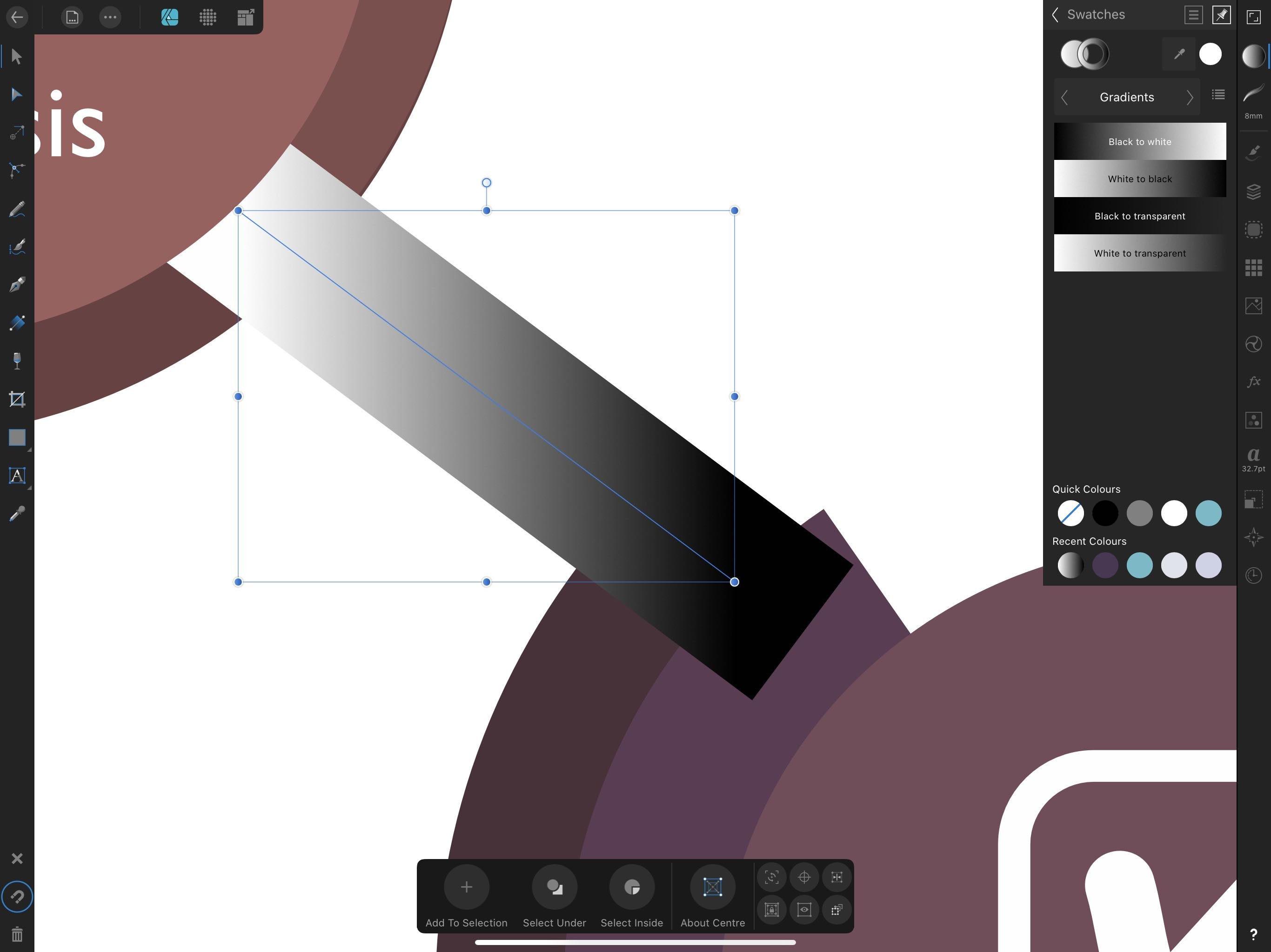
Thanks @GarryP. Don't mind the question at all. This is creative work so there's often no right or wrong to the path to the desired result. In PhotoShop, you can preview Refine Mask without the overlay. I find it especially useful when feathering masks. The more subtle end of mask work. Red overlays do not always communicate the nuances of graduated/feathered masks well. A black and white view of the mask often does this the best. It's the way to work when there's graduation/feathering mask work I find.... mostly. Sometimes, however, you need to see the feather in combination with the original image. - - - - - - - - - - EDIT: Uh-ho ! ! ! ! ! ! In Photoshop the preview is "live". I think I've just registered that it isn't in Affinity Photo (It has to be 'apply'ed to see it). So you "apply" a feather mask refinement... uh-ho.. too much... gahhhhh, can't do a minus feather!!! Un-do.. start guessing... loads of back and forth here that isn't necessary in Photoshop. See attached... in theory I'm testing a feather setting of 0.4px. Because it's not 'live' can you judge how the feather will play out? If you're going to end up simply with a softened halo effect? Can you judge how big a feather to make it without ending up with an unfortunate dark edge instead? Utter blind guessing isn't it.. and you see how the black and white preview won't help here will it? Of course this is where Shift Edge in Photoshop wins hands-down. Is that available in AF Photo at all? I've not been able to find it. - - - - - - - - - - How do you do this Garry? So summary: A red overlay is not great at helping communicate feather on masks Affinity's refine mask appears not to be 'live' ???
-
Thank you @h_d. That does indeed work. I suspect the logic is that when it's not nested it will be treated in isolation... Thanks again for taking the time.
-
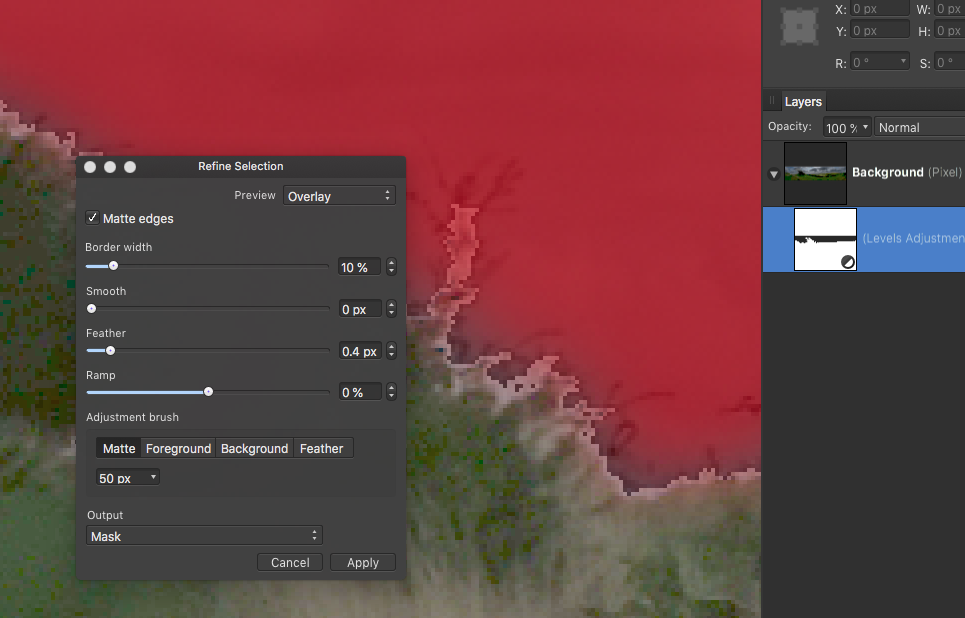
See screencapture I'm working on a landscape with a badly under exposed foreground. Supplied as a jpeg... ( oh-yes, they don't have a raw one ) I've got an adjustment layer (levels) and have created its mask on the adjustment layer itself (as in: I've not manually added a mask). I'm attempting to refine the mask that's on the adjustment layer. (Menu: Layers > Refine Mask) The Refine Selection dialogue box does not appear to show the current state of the levels adjustment, it shows the original as though there is no adjustment applied. Yes, it's an utterly awful photo, but "needs must, please-please help" pleaded the client. I know I could have done something acceptable in Photoshop by now (done, dusted)... but I'm trying to move to and master Affinity Photo.
-
Layers > Refine Mask The dialogue I get is called "Refine Selection" - I assume this is just an Affinity inconsistency and means nothing? I want to preview the original without the red overlay. The options I see in the drop down list next to 'Preview': Overlay (Red devil) White Matte Black Matt Black & White Transparent Is there a setting somewhere I'm not seeing that will let me do this? The red overlay is great for many cases. Where you have a really dark image though, it's not.
-
Is there a 'shift edge' or equivalent for selections/masks? If, yes, where is it ? Shift edge is something found in Photoshop. Photoshop's Shift Edge expands or contracts the mask by +/- pixels. It's available in the Refine Mask dialogue box in PhotoShop. Because it's in the Refine Mask dialogue, it means it can be experimented with at the same time as other subtle adjustments to the mask. I mostly use Shift Edge in combination with Mask feather adjustment. The amount of feather dictates the amount of shift. Shift Edge is really great for avoiding the halo effect when feathering the mask edge on levels adjustment layers. This is when you've got photos with the common problem of under-exposed foreground + over-exposed sky. How do you achieve this in Affinity Photo if there is no Shift Edge? (as I suspect might be the case)
-
O-o-o-oh, for flippin 'eck, @Alfred. It was staring me in the face!! I was totally focussed at the top of the screen on the Colour Studio... duh, doh. Though I did uncheck "Aspect" at the bottom... and those two buttons totally passed me by. Thank you again @Alfred, what would I do without you, mate? I'm cooking wi' gas now! ---- ---- Started before my first cuppa this morning, brain not yet functioning - one of those days where you wake up with a new idea about how to do your project and crack on before you're fully awake. That's my excuse and sticking to it. Can you tell I feel a chump? ---- ---- I was just editing my last post when Alfred sorted me out. I was recording that when choosing the gradient tool, the bounding box disappearing is normal. It had thrown me though, and sent me off down a rabbit hole.
- 6 replies
-
- 1
-

-
- ipad
- designer ipad
- (and 2 more)
-
Interesting... just checked in the Desktop version of Designer. In there, it behaves exactly the same... just going to double check the help on this.
-
New attached... questions the same... If I next select the gradient tool, the stroke gets deselected and we end up at the 1st screenshot Thanks @Alfred
-
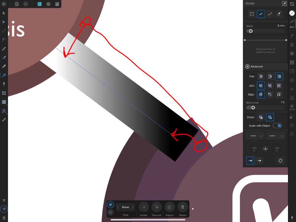
Really struggling with this one. Questions: (Designer - iPad) How should you apply gradients to line / stroke? ( The only way I was able to achieve the illustration below was by selecting a gradient in the swatches panel/colour studio). How do you then amend the gradient? Every time I select the gradient tool, it deselects the line. Thank you illustration below should make it clear what I’m trying to do.
-
affinity designer 2ND drawing using affinity designer
AllAppsUser replied to buko's topic in Share your work
Sorry @Alfred, I quite like the 'flat' illustration contrasting with the more 3D logo. It's got individualism to it - an individual style. Flatter styles of illustration have been in more demand over recent years too. It's all taste of course, there's no I'm right and you're wrong. It's just opinion and all opinions are valid. Only the artist is right 🙂 If you'd like to make it more 3D Phil (@buko), try sticking a temporary pixel layer over it on a "multiply" setting and airbrushing some grey tints onto where you think it'd be in shadow. I sometimes do it the other way round. I cover the whole illustration in a 50% grey and erase where I think the light will catch it. Sometimes that's easier. Or even do both as two separate layers. One for shadows and one for highlights. Photo reference can help a lot with this, though you'd be surprise how 'thereabouts' you can be with it. Then you could either leave the pixel layer in place or translate it into vector shapes (just as @Alfred suggests) with opacity and gradients - again set to multiply. I find I use multiply a lot. Great illustration as is IMHO.. if you choose to experiment, I'd be interested to see where you take it. I happen to love these machines.- 7 replies
-
- 1
-
-
- motorbike
- motorcycle
- (and 1 more)
-
Gah!!! Just drag it over the existing gradient path - snapping on - and job done!! Discovered answer by accident almost straight after posting this! I spent ages messing with it, searching and reading before posting too. Sometimes the way.
-
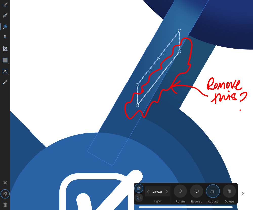
Is this something that can’t be done (yet) in the iPad version of Designer, or have I just not twigged it? I scaled a set of objects, some of which have gradients applied. The online help (which I believe is Desktop only) explains what it is - a "gradient correction path". It says the gradient correction path can be deleted - leaving the original in place I assume - see attached. Totally fine if I have to delete and reapply the gradient. Totally understand the app is at version 1, so there’s a big mopping up job yet to do.
-
I've just learned something.. er, two things. Tapping the right hand (studio menu) anywhere where there's no icons toggles the last studio panel you chose to view. It looks like intended behaviour to me and strikes me as quite handy. I'm always dropping into the Layers Studio and back out again, and back in again. Being able to touch the menu in this way (with less precision needed) is great. Also, I think there's "hot corners". If you use a Mac desktop you'll know what those are (no idea if there's the same on Windows). Bottom left and bottom right. If you gesture by dragging left/right off/on the edge of the screen, you hide or reveal the UI. I like it... you may not. It looks intended behaviour to me. If you're in the habit of resting your hand there and dragging it left and right, you'll be triggering the unhide behaviour. Not sure what to suggest other than being aware you're doing this and perhaps trying not to. I beleive it's left and right.. so up and down and diagonal may not trigger it. Do you scribble a lot with a pixel brush?
-
Artboard Changes!!!!!
AllAppsUser replied to Cheesymac24's topic in Feedback for Affinity Designer V1 on iPad
I pre-date apps that introduced coloured canvases/artboards. In print you always start with a white/cream sheet of paper and lay ink on to it to colour it. So it's always seemed natural to me to create a big rectangle covering the whole canvas, and lock it. Edit: I've just looked into this. Document menu > artboards Tap on the canvas/artboard so the bounding box handles appear. Then select your colour - go for something in recent colours to see it operate.