ESPR
-
Posts
94 -
Joined
-
Last visited
Everything posted by ESPR
-
Installer
ESPR replied to Thors's topic in Pre-V2 Archive of Affinity on Desktop Questions (macOS and Windows)
Im still on win7. Windows didnt even know what to do with an MSIX file. So i googled it can be opened with 7zip. That worked but when i double click the Designer.exe file in the App folder, nothing happens. I know win7 is terribly outdated but Designer V1 ran without too many problems. So i guess i need a new computer for V2 ? -
Thanks for testing ! Im mostly interested in the technique, not the effect. Seems like its based on a bug and not consistent across platforms. I dont even know how to make a bug report for this...
-
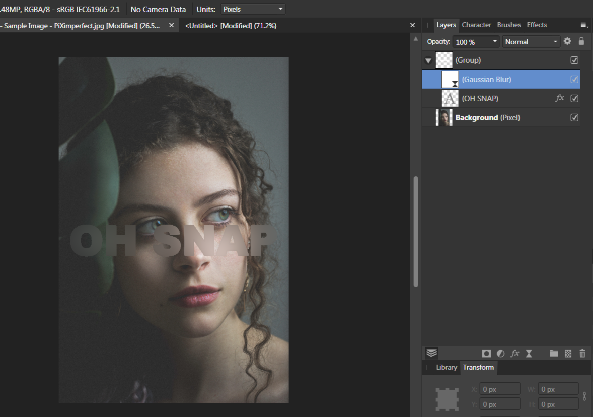
Im following the latest GraphicalFinity tutorial, which shows a nice Knockout Group trick. Sadly i can not replicate this effect and im wondering if its a Mac versus Windows problem (Mr. Graphical is on a Mac, im on Windows). The steps are: 1. on top of an image, create a 'Blur Live Filter' and group it (Blendmode of the group is Passthrough). 2. inside the group and on top of the the Filter, type your text in white. 3. set the white textlayer to 'Multiply' so it becomes invisible. 4. Add an 'Outline' FX to the text. Here is the problem: when i follow the steps, nothing gets blurred and the Outline is visible. This is not what happens in the tutorial. What should happen is the blur is confined to the text and there is an Outline on top. When i put the text underneath the 'Blur Live Filter', the image inside the text area gets blurred, but there is no visible Outline. Instead the Outline is added to the text area. So either im doing something wrong, or the effect works differently on Windows and Mac. Can somebody confirm , please ?!

-
Put Undo on Toolbar?
ESPR replied to Marko700's topic in Pre-V2 Archive of Affinity on Desktop Questions (macOS and Windows)
Undo buttons would be my top wish for Affinity. Coming from Inkscape, which has this feature, its super convenient. You dont have to constantly move the mouse all over the place, or use the keyboard for CTRL + Z. Imo, Affinity has way too many panels, and the History Panel is one, i would happily undock and close for 95% of my projects. -
Frankentoon has a few in his store (Organika, Propaganda, probably more). Mostly paintsplatters and little handdrawn doodle patterns, but also grungy masks, etc. The Shizzle pack from the Affinitystore has textures.
-
LOGO
ESPR replied to Ray 2's topic in Pre-V2 Archive of Affinity on Desktop Questions (macOS and Windows)
Curves means tracing witht the Pen Tool. -
LOGO
ESPR replied to Ray 2's topic in Pre-V2 Archive of Affinity on Desktop Questions (macOS and Windows)
In my opinion having a vector is always the best solution. I would not recommend the Flood Fill Tool as it produces aliased edges ("stairs"). The Recolour adjustment is a good technique but doesnt produce specific colors easily, other than white or black, while the Color Overlay fx preserves antialiasing, but requires transparency. -
Transparent background.
ESPR replied to Ray 2's topic in Pre-V2 Archive of Affinity on Desktop Questions (macOS and Windows)
The difference betwen jpg and png is, that jpg is a lossy format that cannot contain transparency, while png is a lossless format that can store transparency. Jpg produces smaller filesizes but everytime you edit a jpg and export as jpg, quality is lost. Removing the background of an image is a classic graphics design problem, with tons of different techniques. For text or a logo, you might want to try the selection brush with the refine edges feature. Techniques like the Magic Wand Tool usually produce ugly aliased edges ("stairs"). If your logo or text is simple, you can also trace it with the Pen Tool, but that takes practice. -
LOGO
ESPR replied to Ray 2's topic in Pre-V2 Archive of Affinity on Desktop Questions (macOS and Windows)
If these logos are on a transparent background, you can use fx 'Color Overlay'. -
In one of his recent tutorials, Graphical showed how to use text as a mask, by using the Erase Blendmode and inverting it with a Curves Adjustment set to Alpha. Photoshop has a similar feature called knockout, and i was wondering if the Affinity workaround could be implemented more directly. For example by adding an Inverted Erase Mode.
-
have been using G'MIC for ages - great filter ! but sadly it distorts the whole image, not just the edges, like the PS filter does
-
Youtuber 'Graphical' made a videotutorial for this effect. He uses this equation: x = x+(1500*c)*sin((1500*b)*y/h)*(0.01*a) y = y+(1500*c)*sin((1500*b)*x/w)*(0.01*a) Sadly i dont understand any of these mathematical formulas - how comes there are so many variations in this thread, to get to the same result ?
-
Yes ! I seem to have a fundamental misunderstanding about clipping and groups. EDIT: seems the workflow goes like this: 1. Clip Gradient Fill to the Text Layer. 2. Group 3. Clip Gradient Map to the Group. 4. Clip additional Textures to the Text Layer.
-
Yes, i set up a new one. I think the problem is the Gradient Fill Layer.
-
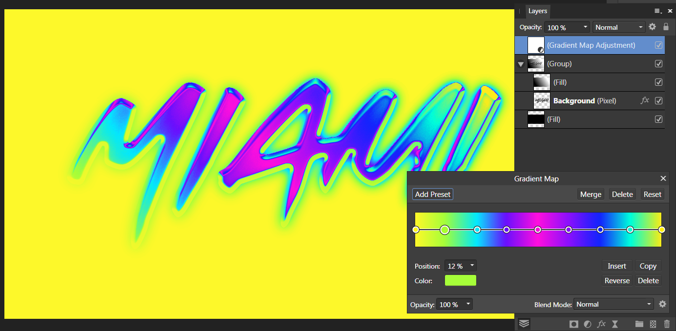
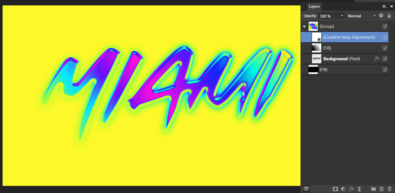
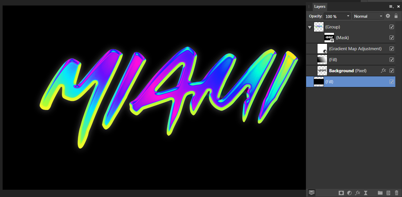
Im trying to recreate the latest Spoongraphics tutorial with Affinity Photo. Text is treated with various layerstyles, then turned into a chrome or colourchrome effect with a gradient map. However im struggling with recreating the procedure, because no matter what i do, the 'Gradient Map Adjustment' is always applied to the background (a Fill Layer), which i want to stay black. I tried putting the text with the FX and the 'Gradient Fill Layer' into a group, but there seems to be no way to clip the 'Gradient Map Adjustment' to the group, so that it only affects the texteffect. Is this not possible with AP or am i doing something wrong ? The only solution i could think of was adding a mask to the group (see image 3)
-
I did a little experiment with the Displace Filter, comparing results in Gimp, Photoshop and Affinity Photo. Basic setup of target and displacementmap (pure black and white on 50% grey): Results in Gimp and Photoshop with a displacement of 80px are almost the same: Finally Affinity Photo, which is just weird. Why the edge detect effect ?? Displacement in Gimp and PS is just straightforward based on luminosity, with white: up or left and black: down or right. With AP i dont even know whats going on.
-
There wasnt any Fillet or Chamfer LPE involved in the making of my effect, but i can see in the code that its mentioned. Actually thats the whole reason i wanted to open this file in AD, because i tried to round corners with the LPE, but its awful, so i wanted to try to use AD's Corner Tool instead. No idea why its still in the code, i removed the LPE and it didnt round any of the corners. So theres no way to open this file in Affinity and maintain the transforms, even if i change the miter limit to something bigger than zero ?
-
I added another example.
-
Im currently working with a calligraphy effect in Inkscape. It works on the basis of a transform, applied to a group. The procedure goes like this: 1.You create a circle and group it. 2. You squash the circle to an ellipse and rotate it to, say, 30°. 3. Then you enter the group and create your design with the Pen Tool - the path will inherit the transform and give it a calligraphy effect with thin and thick lines according to the angle (see image 1). Here is the problem: when i open this svg file in Affinity Designer, the transforms get lost (see image 2). I guess its because in AD transforms are always preserved ? Is there a way to open the file in AD and maintain the transform effect ? Calligraphy Effect.svg
-
I hope your art is better than your comebacks
-
OP calls his post "question for dummies" and you guys debate about the finer details of resampling.
-
Not necessarily. Not if you export as png, because its a lossless format which wont add another layer of compression to the jpg. I think what we really need here to give good advice, are real examples. Btw, fonts are almost always vector. Even in a rasterprogram.
-
Sure, resizing a very detailed image, that is, say 1000x1000px, to a 10x10px size, will loose a lot of information. I tried to make it simple
-
@Gregory100 A rasterimage stays raster. It does not magically convert into a vector because you edited it in a vectorprogram. A vector can be scaled indefinitely without loosing quality because nodes and paths are mathematical formulas. A raster image can be downscaled with no problems and upscaled to a certain, limited degree, without loosing too much quality, but this is not recommended. Mixing raster and vector is possible, but the rasterimage is the "weak link" in this combination and determines at what quality you can export (the original size of the rasterimage).
-
You can also distribute a desired number of circles evenly, between start and endpoint, with the alignment panel (Space horizontally). This can be tricky though, when your object has an uneven length of sides. Sometimes you can cheat and just stretch or shorten the row of dots to make it fit. When its only a small amount it wont be visible.