

Stella HB
-
Posts
17 -
Joined
-
Last visited
Everything posted by Stella HB
-
Dunno. Whatever Joachim said, above. I'll be looking it up presently...
-
Hi all. Hooray for an ugly fix! Today I will be mostly reducing capital letters to 85%...

-
Dear God in heaven. My printer sent me a test page. How can anyone work in that font?! I've done the ugly hack as recommended by Joachim and sent it back to her. It looks better on screen so hopefully will look better printed too. I did look at some alternate fonts and downloaded the Coromorant one (doesn't seem to have a q in Affinity...) but I don't have six weeks to mess around with font!. Thanks all. I very much appreciate all your support!
-
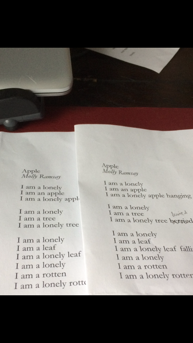
Mum has emailed to say that the poet meant 'buried' but also wouldn't mind rowan-berried. I've decided to go with buried. Thanks for all the advice on this one!
-
Fabulous! Thanks ABC. Have sent a pdf version to my printer today. Would you like to be kept up to date? Also have emailed my poet's mum about the edit - which of course I will HAVE to update you all on - sure you're all DYING to know how that turns out
-
Thanks ABC - Garamond Pro looks pretty good - really appreciate all the advice guys, thank you.
-
And *this* is why I am not editing in a team! Although at least you are entertaining me...
-
'rowan berried in the lonely earth.' You guys...
-
Yes, that's a great point Joachim - I will get in touch with my printer when she gets back from holiday (rude! How dare she go on holiday when I need her?!) and see what it looks like when printed. Will keep the horizontal ugly hack plan in my back pocket just in case . Thanks so much everyone.
-
A fair point and well made Alfred! I just think the way it comes across is like the capital letters are in bold font, and like Joachim says, it's because of the variation in thickness. Not sure what to do tbh!
-
Thanks Alfred, from a quick view it looks like it has the same issue as the Garamond I'm using...
-
JM Wellborn - yes, I'm going to have to change that I think! I wanted to leave it - the poem is by a 10/11 year old and also 'berried' fits the tree theme. But if everyone is just going to think I can't spell...
-
Bugger they are, aren't they? So the fix is, use a different font? Any suggestions for something comparable?
-
Um...it looks pretty heavy on the capital I glyphs to me? It's a poetry pamphlet, so I'm being VERY penickity about it... Here's a screen shot of the same poem after I changed all the capital I glyphs to small caps of a different size. Actually, I'm not convinced it's any better!
-
Right, yes it doesn't make a difference (bah!) Here is the pub file. Garmond Caps issue.afpub
-
Ooh fabulous, thank you. I will try to import and if that doesn't work I'll upload the pub file.
-
Can anyone help me? Capitals in Affinity Publisher using Garamond (copy pasted from Microsoft word) are weirdly bold. See attached example. I don't want to buy a font if I don't need to or I'm doing something daft that can be fixed. I do want to use Garamond, although if the only fix is 'choose another font' I guess I will have to.


.png.ea0e73b10e7afd5921f8b0f406e74566.png)
.png.c87d1570f50f5081f0155ed9ca7f728e.png)