chriscaldwell
-
Posts
219 -
Joined
-
Last visited
Everything posted by chriscaldwell
-
I just wanted to thank you all for commenting and especially to firstdefence for explaining how to remove the background. I always learn so much from you all.
-
Thank you, they are removed! Thanks again for the help. In the future, I'll remember to remove the images that I upload that are purchased.
-
I tried again, and this time it seems to have downloaded the images, thank you. I will save it with the instructions and try to recreate it here. Thank you again!
-
No problem. I understand. completely. I tried to download it, and as you can see in the screenshot, there is no hop image? What does "converted" mean?
-
thank you so much Joe and firstdefence. Absolutely brilliant. This is just great. Firstdefence, can you please send attach the file, so I can have it for reference? This is so helpful.
-
Hello, Can someone tell me to create the effect of looking at an item with the magnifying glass, so that a portion of it looks enlarged? Hope that makes sense. The two pics are attached, I want to make a portion of the hop so the illustration has the effect of magnifying. (There are two hop illustrations. Not sure which one will work best, so thought I'd attach both. ) Thank you so much for your help and guidance, Chris [MOD EDIT, ATTACHMENTS REMOVED]
-
Hello! I have an image that I purchased and want to be able to use this on top of some text in a brochure. Can someone please tell me how to remove the background from the attached .eps image and still maintain the highlights in the magnifying glass so that I can lay this over text? When I bought the image, I assumed it was already transparent. Thank you so much! Chris [MOD EDIT, ATTACHMENTS REMOVED]
-
Hey Old Bruce! Thanks so much! Glad this was simple! Chris
-
Hello, I've been tasked with creating a little 3.5 inch x 5.5 inch (90mm x 127mm) softcover booklet/brochure. They want it to resemble a detective notebook or reporter style notebook where the pages would open vertically. Ultimately it will have about 20 pages and be perhaps staple bound or sewn like a Field Notes type of little notebook. Does anyone know how to set this up in Publisher since typical book project pages/templates open right to left, I can't figure it out. Attached is an example of the binding and the style of booklet. Thank you so much for any help! . Chris

-
Hello again! I'm experimenting with some settings in Layer FX to try and recreated what firstdefence did, and while things are coming along much better, I'm not trusting my own eyes yet. Does it appear that the bottle cap is still floating and not embossed and part of the badge? Perhaps it's a color or shadow setting that needs something? I have attached the actual .afdesign file and also this screenshot. I'm just trying to make the bottle cap area look like it's punched out of the badge as much as possible. Thank you badge project 2.afdesign
-
Brilliant as always firstdefence, and I'm so appreciative that you responded especially because it's late where you are. Thanks to you, I now can continue on with this project! Amazing forum with such talented people. Thank you.
-
. Thank you so much, firstdefence, this is precisely what I wanted to do. Also, thanks for the tip about adding pics to posts. I never knew you could do this, and will certainly be mindful in the future. A couple of questions… 1. When you open up the recolor adjustment Layer>New Adjustment Layer>Recolor, how did you get the exact color of the bottle cap? What I see in the Recolor window is Hue, Saturation, and Lightness, but I don’t see a color picker. Since I’m a bit color blind with some shades, I’m wondering how did you get the color to match so precisely? Normally, I would think there was a picker that you could sample from, no? 2. When you created the embossed look for the cap, I see you used the layer FX in the screenshot, but am unable to see the settings you used to create the effect. Are you able to send me the Affinity file? I sincerely appreciate your taking the time to help me with this, and once again, grateful I am learning something new I’ll be able to do with this amazing Affinity software. Thank you, Chris
-
Hello, I've been given a project an not 100% sure how to do this. My first two efforts didn't seem to get the desired effect, so though I might defer to the experts here! Thank you in advance for any help. So I have an image of a silver police badge (an illustration) and a image of a bottle cap. What I am wanting to do is 1. change the color of the badge so it matches the gradient and goldfish color of the bottle cap, and then, 2. replace the star in the badge with the bottle cap, so it appears it's embossed like the star is. Hope that makes sense? The star in the center seems part of the badge and stands out in relief or 3D. Whilst the cap appears to be 3D by itself, I am not sure how to combine them and get the colors to match. Thank you for any help! I really appreciate it.
-
Thank you, lepr. I'm fixing it now, and appreciate your taking a look at this project!
-
You guys are amazing, picking up the fine detail. (I take Affinity course on a somewhat regular basis, but have not been able to get this level of prociency. It's truly remarkable. Thank you.) Garryp, do you mean by the slight angling of the brush, that creates an issue of a "kink?" I was trying to slightly offset the brush so that it would appear more natural. Yes, it's cartoonish, but I hope I'm explaining this right. I'll remove the stroke around the brush-lines and try again! firsdefence, thank you for pointing this issue out with the halo. I totally missed that. Thanks again.
-
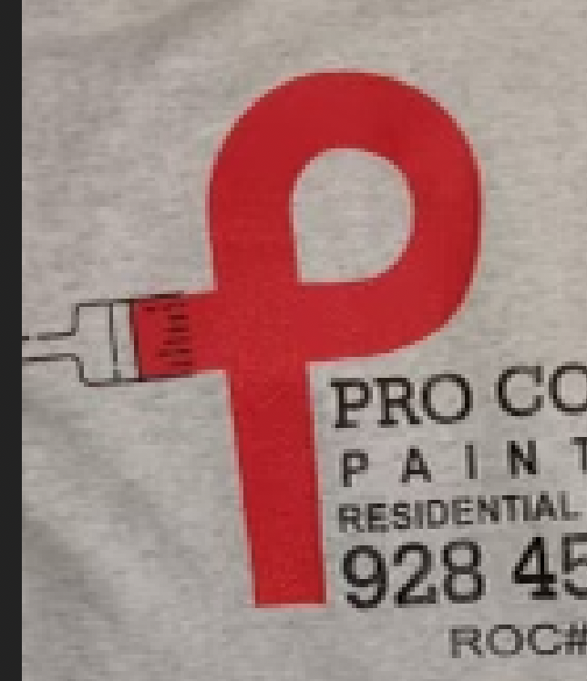
Hi GarryP, Thank you for your reply to my post. I will need to make the brush look more cartoonish, as if someone just drew a simple brush, rather than too precise. I just don't really know how to do this with a trackpad. It should be vector so that I can use it in a variety of ways. Perhaps put it on a t-shirt in a picture, or on a van, etc. Markw's drawing was extremely helpful and I can probably roll with that! Thank you. I only made the outline a bit thicker and the brush strokes a bit darker. It is so nice of you both to try and help me, I appreciate it so very much. I've attached my very light adjustment to markw's version. ProCoatings_logo-2.afdesign
-
Hi markw, thank you for taking the time to do this. how do you get the line of the brush to have that sort of hand-drawn quality? I really appreciate it.
-
Hi Lee, In this case, it's a bookbinding term. A signature is a single sheet of paper that contains multiple pages of a book printed on both sides. It is then folded, cut, and bound/sewn together with other signatures to create a book. Thank you! Chris
-
Hello, I have a poor copy of a logo that I am trying to re-create in Designer 2. I think I got the shapes proper, but really am not terribly confident with my artistic abilities enough to re-draw/create the paint brush part of this logo so that it looks hand drawn. (The person sent his only copy of the logo which was on a T-shirt.) Can someone help me maybe to create the paint brush part of the logo? I've attached my Designer file and the pic of the logo on a t-shirt. Thank you so much for any help or suggestions, Chris ProCoatings_logo-master.afdesign
-
Thank you. If any members have a recommendation for an online printer, please let me know! Thank you.
-
Hello! Hoping someone can help with a project I've been working on that is ready for print. I've created a pocket calendar in Publisher 2 and am trying to determine the best way to print this and have it bound. My first thought is to perhaps take the pocket calendar that this project was based on and remove the pages in it and then replace it with the document I created in Publisher 2. However it appears that the pages in the existing calendar are signatures that have been stitched, and my pages would print consecutively numbered I think? 1. Is there a way to print signatures in Publisher 2? If not, what would be the best way to print and bind this? 2. Is there perhaps an online service that would print and bind my project in small quantities? Thank you for any help. I've attached the project that I created and also a photo of the type of cover I'm wanting. Chris Fortune Telling Diary Master Layout BLANK.afpub PastedGraphic-1.tiff
-
Compositing question
chriscaldwell replied to chriscaldwell's topic in Affinity on Desktop Questions (macOS and Windows)
Thank you very much, Carl. I see there are a lot of little things you did in the file, and I hope to be able to learn from it how to approach this in the future. -
Compositing question
chriscaldwell replied to chriscaldwell's topic in Affinity on Desktop Questions (macOS and Windows)
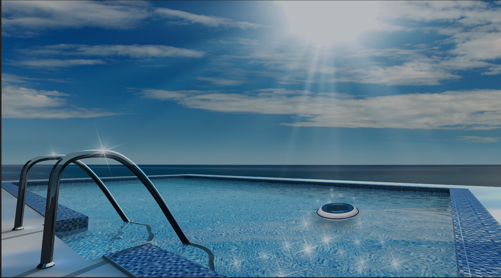
Thank you Carl123 and henryanthony! I really appreciate your input and help. Sometimes, it's hard to be objective with your own projects, so this is so very helpful. I was wondering Carl, can you please send the affinity file you created? Did you just create an oval, fill with black, and then gaussian blur it? Also, is there a formula/technique to knowing how far away to move the shadow to get the proper shadow effect? I guess I need to train my eyes better. I'm thinking the shadow on the ladder is the guide, but I feel like I'm always a bit off. Whereas, you nailed immediately. I attached another example to see if I'm more accurate in this shadow placement, just wondering if it should be more to the right of the floating device. Any suggestions are greatly appreciated. Thank you, Chris
-
Hello there, I'm trying to put an item on top of a swimming pool so it appears to be floating and realistic looking. I tried a few things, like applying a blur, and experimenting with outer shadow in the FX panel, but don't trust my eyes to see if it looks realistic. Is there a technique/trick that would help me get the perspective and realism a bit better, or does this look okay to you guys, or perhaps can it be improved upon? Thank you as always for any help. I've attached my mockup/screenshot, the .png product, and the swimming pool pic. Chris another floatron.afphoto pool.afphoto
-
This is great! I look forward to trying these techniques out. And again, always grateful to learn new things you can do from people who are masters with this software. Much respect to you both, GarryP and Thomaso. Thank you for taking the time to show me how to do this.