heyix01
-
Posts
7 -
Joined
-
Last visited
-
 Rivka reacted to a post in a topic:
AF-Designer: Aligning Text on cruve
Rivka reacted to a post in a topic:
AF-Designer: Aligning Text on cruve
-
Aligning Text on cruve
heyix01 replied to heyix01's topic in Feedback for Affinity Designer V1 on Desktop
Thanks MEB -
heyix01 reacted to a post in a topic:
Aligning Text on cruve
-
Wow, that suggestion works! Thanks, R C-R.

-
 heyix01 reacted to a post in a topic:
AF-Designer: Aligning Text on cruve
heyix01 reacted to a post in a topic:
AF-Designer: Aligning Text on cruve
-
heyix01 reacted to a post in a topic:
AF-Designer: Aligning Text on cruve
-
markw reacted to a post in a topic:
AF-Designer: Aligning Text on cruve
-
firstdefence reacted to a post in a topic:
AF-Designer: Aligning Text on cruve
-
Thanks firstdefence, I summed this tread up and placed it there.
-
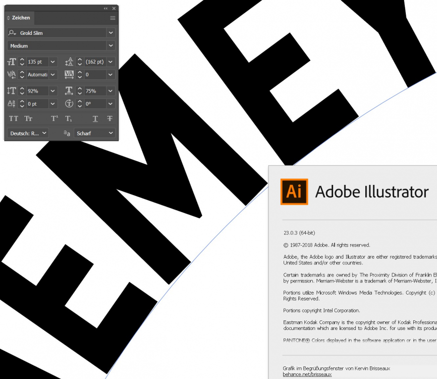
Hi guys, during my recent work with AF-Designer one small question/bug/ request for optimisation occured looking at some detail: I asked for help how to finetune or adjust the behaviour how pathtext aligns to the path. As you can see in the attached image (no.1) the letters (on the circle) align on their right to the curve and always the left is hovering above the line. So the whole word is looking some kind of chopped up. I tried it out in the latest Illustrator CC (23.0.3) - there it works as exspected. Maybe the issue is caused by shinking down the letterwidth to 75% (markw could reproduce it) and AF-Designer isn't able to handle it correctly. So it might be a bug and I hope you could fix it soon. Thanks, Ralf
-
Thanks for your kind help, Mark. There is no other font style that can be used or that fits in that space. I have to use this font one for my customer and I always have to shrink it down a bit into the usable space. I tried the same in the latest Illustrator CC (23.0.3) and as you can see AI handels the letters correctly and aligns every letter perpendicular to the circle. So it could be a bug in AF-Designer. How can we escalate it to serif? Do they read these forums and will pick it out or do we / I habe to adress them directly - and how? Thanks, Ralf
-
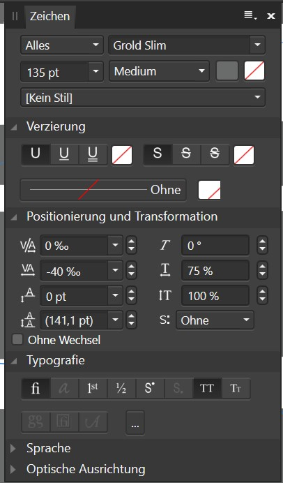
Thanks for your reply, Mark. Yes a have made some adjustments - you can see below. My text needs to be shrinked / condensed down in oder to fit in it's space.
-
Hi guys, during my actual work with AF-Designer one small question occured looking at some detail: How can I finetune or adjust the behaviour how pathtext aligns to the path. As you can see in the attached image the letters (on the cricle) align on their right to the cruve and always the left is hovering above the line. So the whole word is looking some kind of chopped up. How can I align the letters exactly perpendicular to the circle that their vertical centerlines all point to the center of the circle? Thanks, Ralf