Palatino
-
Posts
406 -
Joined
Everything posted by Palatino
-
 Very elegant solution. I understood "No Break" right away, I would not have suspected it under "Ohne Wechsel".
-
Yes, typographically that is usually the right approach. But with some fonts, the distances between the dots are simply too small.
-
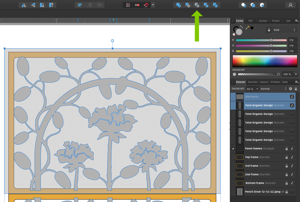
Separating the "Total Organic Design" (and recombining) more often leads to unforeseen effects. I would do it like this:
-
There is colour for the screen (RGB) and there is colour for printing (cmyk). There are greyscales for the screen (RGB: 100% is white) and there are greyscales for printing (K: 100% is black). Affinity doesn't differentiate greyscale into screen and print, my old Photoshop does. So much in the early morning. 😉 The topic is discussed here at least once every week. There is a lot to read and learn.
- 7 replies
-
- 1
-

-
- ingramspark
- grayscale
- (and 1 more)
-
Image removed. I was surprised that this was still possible. Good forum. 😉
-
Adding a measurement to a drawing
Palatino replied to iMac1943's topic in Affinity on Desktop Questions (macOS and Windows)
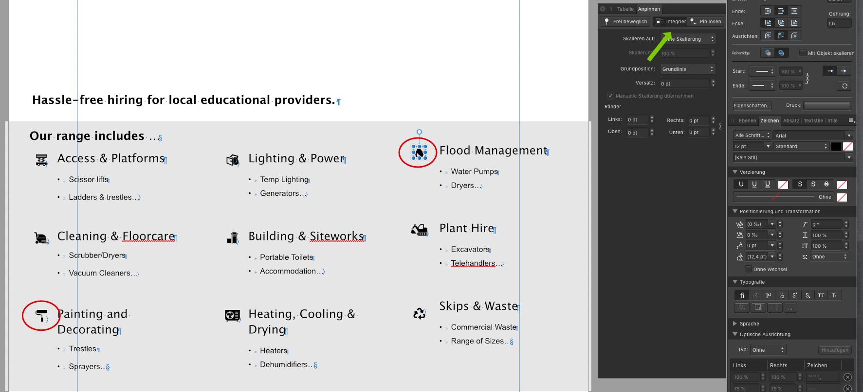
You can also try it with a little imagination. I create a hall plan for an exhibition/trade fair twice a year. I use this construct for dimensioning, which works both manually and numerically. Typing a number into the text field is no problem for me. Of course, the group as a whole must be scaled.
-
Great. That's exactly how I thought it would be.
-
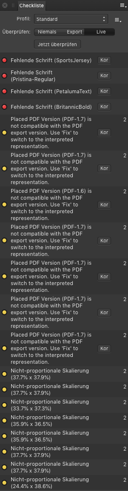
In Publisher I was able to import the file as another page, but I could not save it. After several attempts, a PDF export and import into Designer succeeded. File size 168 MB. There is also an error list.
-
Placing images onto a layer
Palatino replied to hubbsy's topic in Affinity on Desktop Questions (macOS and Windows)
-
Ein kleiner Umweg wäre über die Ressourcenverwaltung möglich: Schaltfläche Im Finder zeigen – Dann mit Doppelklick mit dem gewünschten Programm öffnen.
-
Yes. Weren't you going to bed? 😉
-
Possible source of error - this selection would be wrong.
-
What's wrong with that?
-
Could you show me a graphic in a comparable size that you think is "good"? The graphic doesn't have to be yours, just to understand your claim to quality.
-
There is nothing wrong with the file.
-
PICTORIALISM
Palatino replied to Paresh's topic in Affinity on Desktop Questions (macOS and Windows)
That was easy. 😉
-
Your answer was self-evident. That's why I spared it. Everyone would have noticed that after the first press of the space bar at the latest. 😉
-
Please look at my quote.
-
The button is under your hands and is called the space bar.
-
Inserting Images, Publisher
Palatino replied to dannyB's topic in Affinity on Desktop Questions (macOS and Windows)
The last correction:
-
Inserting Images, Publisher
Palatino replied to dannyB's topic in Affinity on Desktop Questions (macOS and Windows)
-
Inserting Images, Publisher
Palatino replied to dannyB's topic in Affinity on Desktop Questions (macOS and Windows)
-
Text & Logo pixelated
Palatino replied to carlcengiz's topic in Affinity on Desktop Questions (macOS and Windows)
Das Zusammenspiel von Text, Fläche, Lesbarkeit und Ästhetik nennt man Typografie. 😉 ––––– The interplay of text, surface, legibility and aesthetics is called typography. -
Text & Logo pixelated
Palatino replied to carlcengiz's topic in Affinity on Desktop Questions (macOS and Windows)
Edit: In Rechtschreibung bin ich ziemlich sicher. Wenn ich Korrektur lese. 😉