Pyanepsion
-
Posts
951 -
Joined
Everything posted by Pyanepsion
-
 Hello, @Michou, Is it possible for you to show the problem on a video, or possibly on a screen copy? Is it specific to a file or an effect?
 -
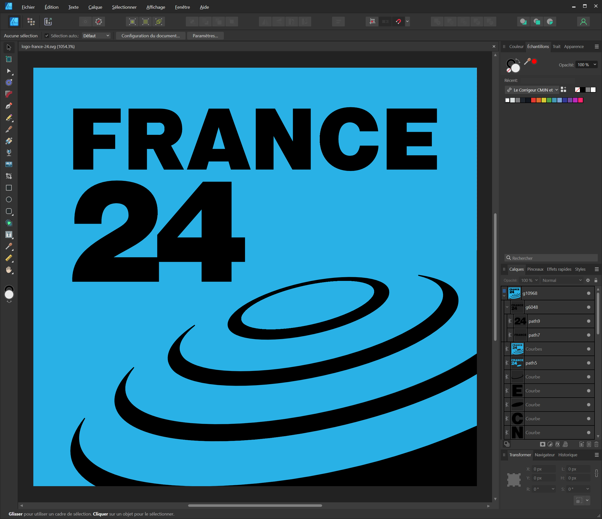
v. 2.2.0.1903 and older. Hello everyone, https://fr.wikipedia.org/wiki/Fichier:FRANCE24.svg This problem concerns the import of SVG files (here from Wikipedia) by Affinity Designer. The software adds black and blue colours that are not present in the original file and make the file structure more complex. To reproduce this problem: Download the attached SVG file from Wikipedia. Open this file with Affinity Designer. You will see the unexpected black and blue colours and a more complex file structure. A workaround is to load the file into InkScape, ungroup everything several times and then paste it into Affinity Designer.

-
Hello @Divax, 😉It's the job that's coming in. Serif may be able to recover the initial file, but nothing is less certain. Using a beta version of any software does indeed entail risks, including the possibility of encountering bugs that are not present in the stable version. This is precisely the purpose of beta testing: to discover these problems before the final version is released. Saving the document created with a stable version is therefore an important step in beta testing. However, beta testing cannot do without working in real-life conditions, as this alone can often uncover malfunctions that cannot be detected with a summary document. Our role as beta testers requires us to test in real-life situations. These preliminary versions, although unstable and likely to contain anomalies, are an indispensable playground for detecting problems that only manifest themselves in real-life situations, and which would sometimes go unnoticed on documents that are too sketchy. Bests,
-
The malfunction seems to have been resolved. Thank you. 🙂
-
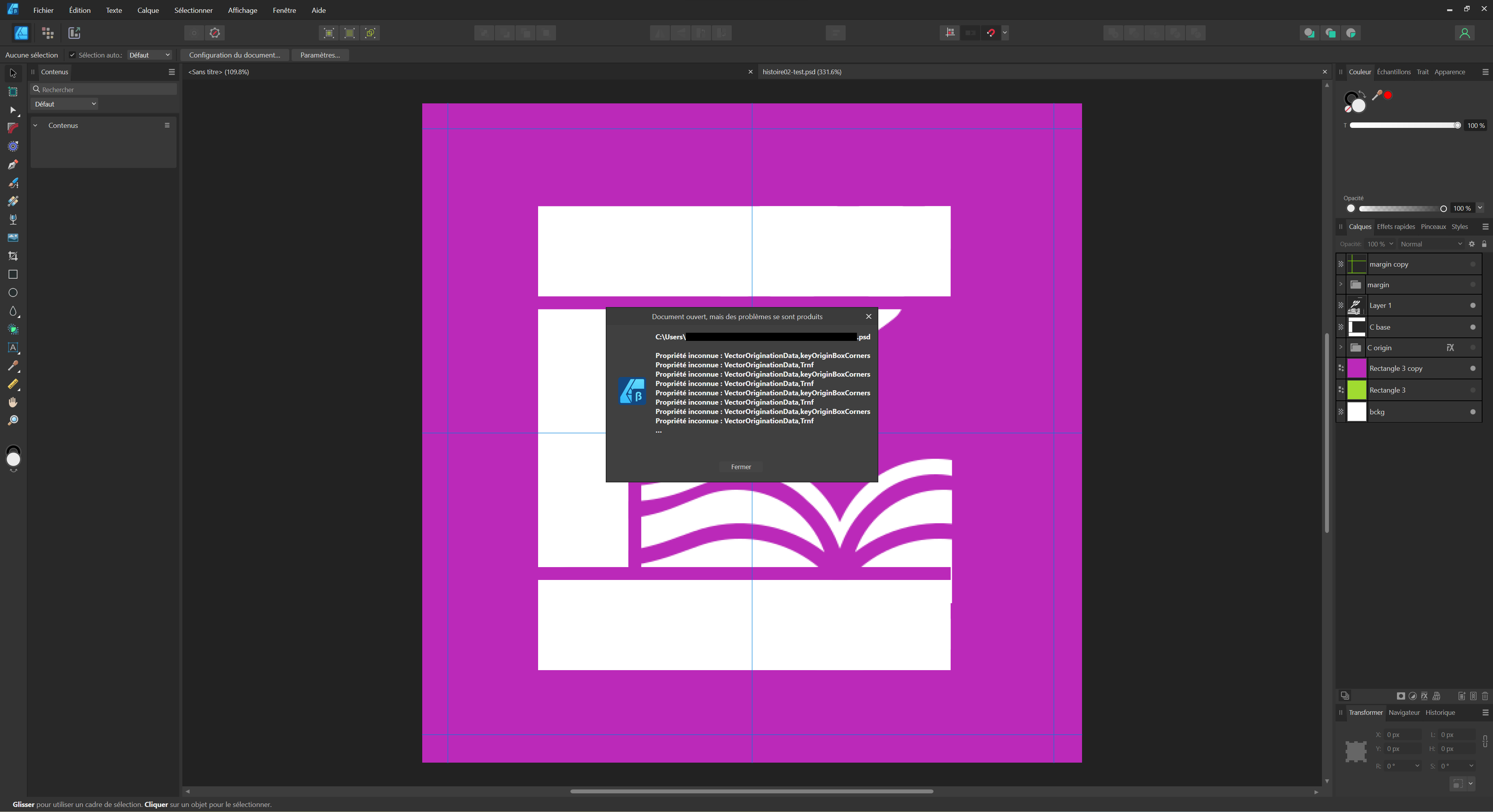
v. 2.2.0.1881 Hello everyone, I’d like to tell you about some difficulties I’ve had importing Photoshop files into Affinity Designer. Our designer has been working on creating icons in Photoshop. When we imported these files into Affinity Designer, we noticed a few anomalies. It appears that certain properties specific to Photoshop are not perfectly recognized by Affinity Designer. We also noted an unexpected conversion of groups into raster elements. Some layers in some PSD files also showed dimensional inconsistencies. To illustrate these problems, you’ll find attached a PSD file that served as a rough draught. I’d be happy to provide you with more detailed files privately if that would help you understand the issues. These malfunctions have led us to redesign all the icons in Affinity Designer, which has resulted in a lot of unnecessary double work. We’re sure your expertise will be invaluable in finding a solution to these problems. Thank you in advance for your attention and help on this matter. I look forward to hearing from you. Pyanepsion histoire02-test.psd
-
Thank you, @BofG, for your reply and your reminder of the importance of the colour profile. As you rightly pointed out, the representation of a colour can vary depending on the profile used. However, I opened the same PSD file as the designer. So, logically, we should be using the same colour profile and colour format. What’s more, the designer uses the default settings. Despite this, we get very different hexadecimal values between Photoshop (for him) and Affinity Designer (for me). Do you have any idea why this might be happening and how we could harmonize our results? My main question, however, was how to get a Pantone match from a hexadecimal color in Affinity Designer, without having to use external tools. Does the Affinity suite offer this important color conversion function like Photoshop? Do you have any further information on this subject? Thank you once again for your help and expertise.
-
Hello everyone, I'm working on a project with a designer who uses Adobe Photoshop, while I use Affinity Designer. The designer provided me with a specific color in hexadecimal code (#e80e65), but I needed the corresponding Pantone code. When I asked for this conversion, he used Photoshop and gave me the following codes: P 65-8 C (Pantone+ CMYK coated) and P 65-8 U (Pantone+ CMYK uncoated). However, when I tried to find the corresponding Pantone code in Affinity Designer, I didn't get the same results, but #D94764. I've read that these differences may be due to the way each software handles color profiles and converts between different color spaces. In addition, Adobe and Affinity may use different versions of the Pantone library, which could explain the differences. This leads me to two questions: 1. How can I find the Pantone code corresponding to a hexadecimal color in Affinity Designer? Is there a specific tool or method for this? I understand that Affinity Designer may not offer the same color conversion features as Photoshop. Is this correct? 2. Is it possible that the hexadecimal code for the same color looks different in Affinity Designer than in Photoshop, due to the differences in color management between the two programs? Is there a way to harmonize this to get consistent color results? I'm open to any suggestions and advice you can give me. Thank you in advance for your help. Best regards, Pyanepsion
-
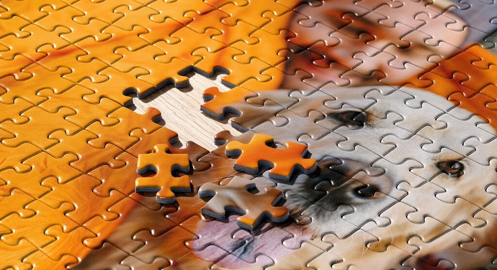
Puzzle-making is a fascinating adventure! My ambition was to design a puzzle in which each piece, although having the same shape, could only fit in one and only one place. This idea has its origins in the concept of aperiodic monotiles, shapes that cover a two-dimensional plane in a non-repetitive way, which has fascinated mathematicians since 1961. To cut the pieces, we can only consider the pressing method, similar to that used in industrial jigsaw production lines, rather than the use of lasers or saws. If you're interested in this process, check out this video: [1000 Piece Jigsaw Puzzles High End Jigsaw Puzzle Cutting Machine Professional Production Line - YouTube] (https://www.youtube.com/watch?v=dQw4w9WgXcQ). Once the puzzle was complete, I added a 3D effect to each piece. To create a kind of "total image view" for each piece, I followed these steps: Select a puzzle piece, then: Menu Layer/Insert/Inside. Load image: Insert tool button (an image). Reposition image: Transform 0, 0 tab. I found a quicker way of doing this by copying the image once and for all: Select a piece of the puzzle, then: Layer/Insert/Inside menu. Paste the image. Perhaps it's possible to go even faster? For the missing piece, I used simple embossing: I did encounter a few challenges in the process, however: The occasional menu selection error: Menu Layer/Insert/Top instead of Inside. Occasional input errors on X or Y values and on the L value. Accidental addition of two images to a room. Program slowdown after adding several thousand parts (solution: close and reopen the software). The program freezes when an image is replaced and no further action is possible (solution: stop the job, and lose the work done since the last save). One thing I didn't manage to do, however, was to create a cardboard thickness effect with Affinity Designer on pieces laid loose on the rest of the puzzle, as in the case of the dog puzzle. If you have any suggestions or tips on how to achieve this, I'd love to hear them. Thank you all for your support and commitment to this community. Your contributions are invaluable to those of us striving to achieve our creative goals. Lacerto, I love your concept. Happy creating!
-
@v_kyr, thank you for your efforts to share resources. However, for me, and, I suspect, for many others approaching the subject, a puzzle refers to something very specific, namely what can be seen on this site: https://www.ravensburger.fr/produits/puzzle/index.html. They are also a multitude of raster or vector methods based on this concept, which I discovered by searching YouTube and Google and adding "Adobe" or "Affinity" to my search terms. 😊 I still think that your approach would have been more relevant by asking, as others have done, questions.
-
@v_kyr I appreciate your efforts to share information and resources with the community. Your second post, however, left me with the impression that you started with a negative a priori. I had done some research beforehand, showing that there were many different methods, a lot of method. I even bought some puzzle models that turned out to be unsuitable. So I was looking for specific advice from the community on the best way to turn photos into puzzles with Affinity Suite, given the variety of methods available. Anyway! Your reply was irrelevant. As for your new message, it seems to imply that my question was imprecise, possibly, despite my efforts to express it as clearly and specifically as possible. This can be perceived as derogatory, and I’m sure that’s not the impression you wanted to give. 🙂 Rather than pointing out perceived weaknesses in other people’s questions, I suggest that we instead continue to work together to help everyone achieve their creative goals in the most constructive way possible. That’s how it’s worked for years, and that’s one of the great strengths about the forum…
-
When I say ‘metamorphose a photograph into a realistic representation of a puzzle based on that same image’, I mean that I’d like to create an image that looks like a physical puzzle based on the original photograph. To give a visual example, imagine a dog photo. Now imagine a second photo that shows a physical puzzle of that dog being assembled, with a few pieces missing. This is what I’d like to create: an image that looks like the second photo, not an interactive digital puzzle. As for the notion of realism, I want the final image to really give the illusion that you’re looking at a really physical puzzle, not a digital simulation.
-
Hello Garry, Thank you for your pertinent comment. I should indeed have been more explicit in my initial request. To clarify, my immediate goal is to metamorphose a photograph into a realistic representation of a puzzle based on that same image, with a few missing pieces to spark visual interest. More than a specific puzzle format or number of pieces, I'm looking for an effective technique to achieve this. I've noticed the existence of numerous tutorials offering a variety of techniques, but I'm more interested in gathering the opinions of the community in order to unearth the most realistic method possible. I've also recently discovered the use of aperiodic monotiles in graphics, an approach that has been solving a problem since 1961. Do you think this technique could be relevant to my project? I'd like to thank you in advance for all your help and advice. Best regards, Pyanepsion
-
Hello everyone, I'd like to turn a series of interesting photos into puzzles, for a more engaging visual experience. I'm of course working with the Affinity Suite and would like to ask for your advice on how to go about this project. Any recommendations for procedures, tips or even Affinity-specific add-ons would be greatly appreciated. Thank you in advance for your help.
-
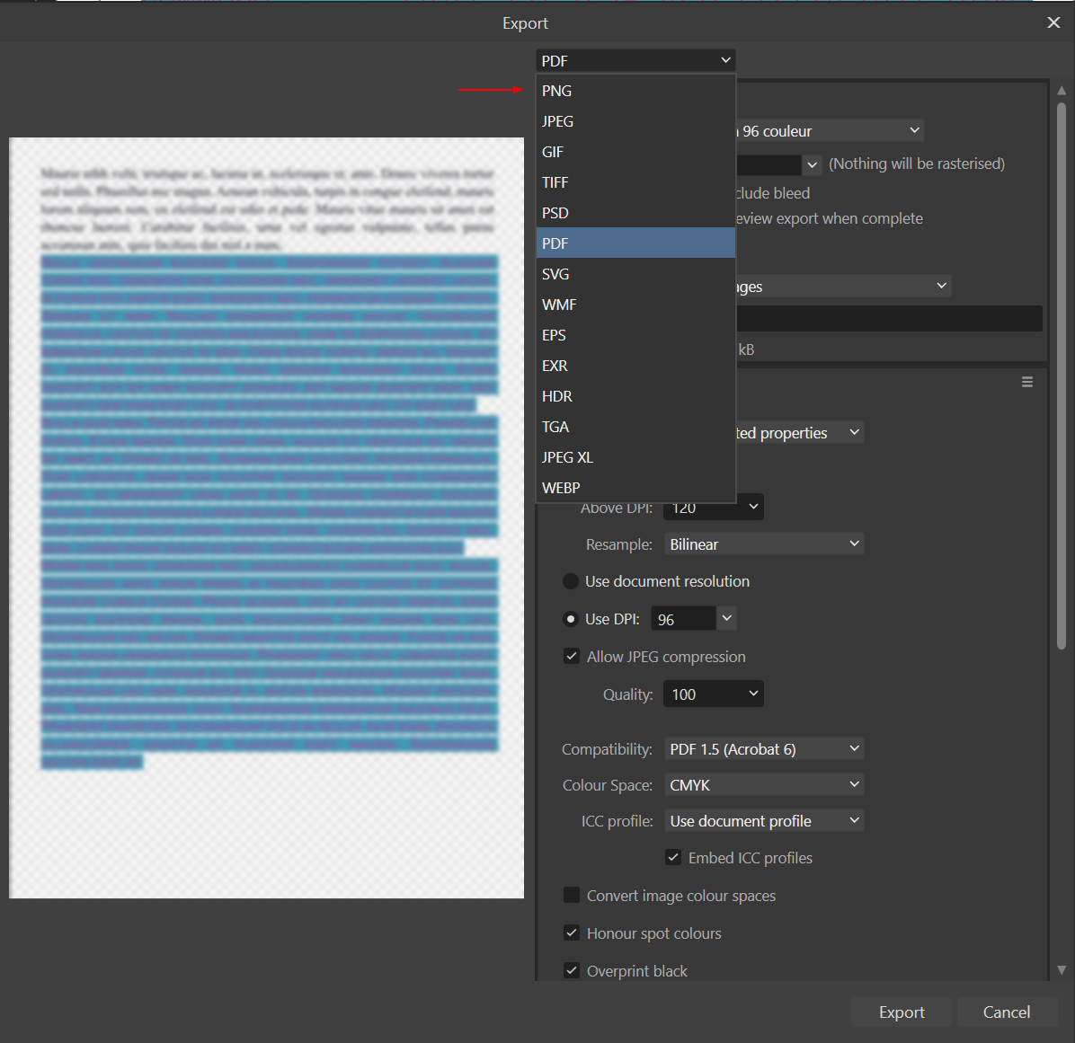
Hello everyone, The current order of export extensions is not very intuitive. It doesn't seem to follow a clear logic, be it based on alphabetical order, date of creation of the format, type of use (web, print, photography, etc.), image quality, or the proprietary or free nature of the format. This confusion can be frustrating, as it forces the user to wade through all the available options. I propose two alternatives: A simple alphabetical order, immediately understandable by all. Here, in brackets, is the sequence number the extensions should have. PNG(8), JPEG(5), GIF(3), TIFF(12), PSD(9), PDF(7), SVG(10), WMF(14), EPS(1), EXR(2), HDR(12), TGA(4), JPEG XL(7), WEBP(13) An order based on the main uses of each format, with each category then sorted alphabetically. It would also be useful to add an icon next to each format to symbolize its main use. Here's how the formats could be grouped: Raster formats (bitmap/raster): These formats are based on pixels. They include : EXR, GIF, HDR, JPEG, JPEG XL, PNG, PSD, TGA, TIFF, WEBP. Print formats: These formats retain the quality and detail important for printing. They include: EPS, PDF, TIFF. Vector formats: These formats are based on geometric shapes and can be resized without loss of quality. They include: EPS, PDF, SVG, WMF. High dynamic range formats: These formats can store a wide range of colors and luminosities. They include: EXR, HDR. It should be noted that some formats can belong to more than one category. For example, PDF can be both a print format and a vector format. Similarly, EPS is both a print format and a vector format. It's also important to point out that not all raster formats are suitable for printing. This is all the more relevant in the context of a user interface that must be easy to understand and use. Intuitiveness: A good interface should be intuitive. Categorizing export options either alphabetically, or according to their primary use, helps the user quickly and easily understand which option to choose, without the need to perform additional research or remember specific details about each format. Efficiency: By grouping formats by type, users can more quickly identify the type of format they need, which can speed up the selection process. Education: This can also be a way of educating users about the different uses of file formats. Users may not be aware of the differences between raster, print, vector and high dynamic range formats. By organizing the options in this way, the interface offers a learning opportunity. Accessibility: Adding icons to symbolize the main uses of formats can help users who prefer visual information, making the interface more accessible to a wider range of people. However, it is important to take into account cases where certain formats belong to more than one category. It may be necessary to make it clear in the interface that certain formats may appear in more than one category, or to find an intuitive way of representing this.
- 1 reply
-
- 2
-

-
The bypass is easy, but its impact in front of the final customer appears however rather negative. He can't help, like Forest Gump and his orchard fruit factory, to refer to the product of a manufacturer specialized, however, in the construction of sun-baked bricks.
-
Version 2.1.0.1799. Hello everyone, I originally reported this major bug in version 2.0.3.1688. We are now in version 2.1.0.1799 and, unfortunately, this problem persists. This is not a minor malfunction. Its persistence has a significant impact on the user experience of the feature. It is important to remember that this bug appeared after an update of Publisher and that it makes the production of indexes unprofessional. Its resolution should be a priority in your efforts to improve the quality of the software. If necessary, I can provide with a file illustrating this bug in strict confidence.
-
Superb demonstration. Well done MikeTo. Thank. However, there is still one major problem: you can only use it for one image. You can't make a collection of images.
-
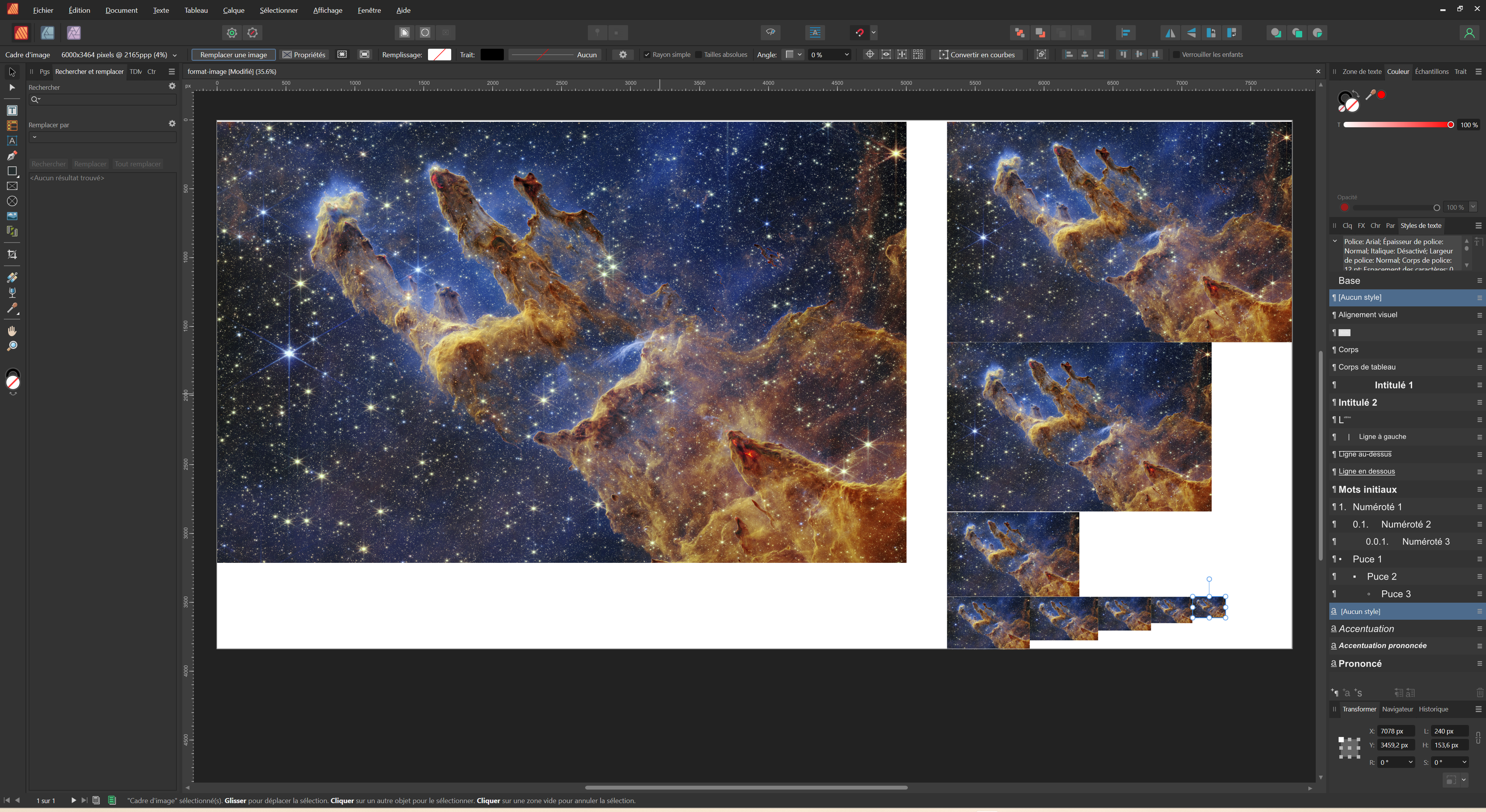
Hello everyone, I'm asking for your help with a problem I'm facing: I'm trying to get images of different sizes from an original photograph. Here are my specific questions: Is there a method to load an image only once and automatically resize it to predefined dimensions? Also, I need to apply this process to a large number of images. Is there a simple and efficient way to do this in series? I thank you in advance for your valuable advice and recommendations. I am open to any suggestions and remain at your disposal for any clarifications. I remain at your disposal for any clarifications,
-
Following on from this discussion, I am looking for an update to the logotypes we had previously obtained. It would be better to have them in SVG format or, ideally, in AFDESIGN format. The logotypes currently available in the Press pack are not true SVG files, but rather PNG images encoded in base 64 and embedded in an SVG container. This has resulted in a considerable increase in file size, from 11 KB for the old logo to 39 KB for the new one, with little change. If anyone has updated logos in either of these formats, I would be grateful if you could share them here. Thank you in advance for your help.
-
@walt.farrell, you're right: I'm no more informed about the developers' intentions than you are. My aim was simply to raise the issue of incompatibility between the different 2.1 betas to avoid this happening again in the public 2.1 releases. I'm glad to see that we are on the same page on this issue. Let's hope the developers take this on board. Let's keep sharing ideas on this forum!
-
@walt.farrell, 😄 You are playing with words. You have understood very well what I wanted to point out and which is implicit in my formulation speaking of beta versions: it would not be necessary for the public versions 2.1 to be incompatible with each other 2.1.
-
The bug that appeared with 2.0.4 may have been fixed on the Mac, but not yet fully fixed on Windows. I can't test it on version 2.0.0, because the 2.1 betas are incompatible with all previous versions (including 2.1!).
-
This does not work either on Windows 11. I haven't tried it on Windows 10. index-orange.mp4
-
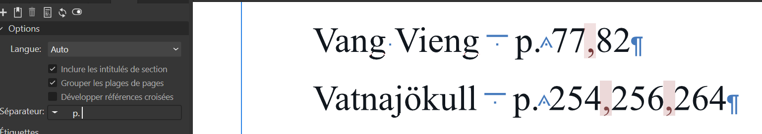
v2.1.0.1736. It isn’t solved. There is always a space missing after the comma. This leads to layout problems, as can be seen here with the break after the hyphen on pages 90 to 91 instead of 105. This lengthens the total index of the book by 1–2 pages unnecessarily. This malfunction has been announced several times as solved. It appeared after version 2.0.0.1640 where the spacing is still correct.
-
Hello, @GRAFKOM, This malfunction seemed to have disappeared in version 2.0.4. Here are a few hints to possibly narrow down the cause. Is it happening again with the beta version? Do you have hardware acceleration? Are all resources present? Are the fonts present and all their characters used?