CJ Randolph
-
Posts
36 -
Joined
-
Last visited
Everything posted by CJ Randolph
-
In Designer you can favorite fonts right now (heart them) which is great, but it would be very handy to be able to create custom font categories/filters. There are automatically-created dropdown categories such as All, Recent, Fixed Width, PDF, etc. I'd really appreciate the ability to name groups based on what I want need, and be able to drop them into those categories — Serif, Sans, Thick, Thin, Playful... whatever way I need to describe my fonts (good for texture, watercolor, humanistic, geometric, military, etc.), then be able to filter them while browsing. Thanks for listening. Big fan of the software. Just something that would keep me inside your software without having to alt-tab. Cheers
-
"Toggle Fill Context" Missing From Keymap?
CJ Randolph replied to CJ Randolph's topic in V1 Bugs found on Windows
Oh! Just discovered the keymap option I wanted. It's labeled "Swap Line and Fill" which would be the correct naming in Designer, but I would suggest the option be renamed "Swap Foreground and Background Colors" or something similar inside Photo. So, there's one of my problems solved, at least. -
Second keymap bug. Currently, some items in the keymap editor have dynamic names relating to the tool in use. By that, I mean that if you haven't done anything in your current document, you'll find "Undo" under Edit. However, if you've just performed a Fill, the keymap editor will now read "Undo Fill". The keymap for "Fade" exhibits the same behavior. It was a little confusing to figure out, and I don't think that's the intended functionality. Cheers
-
"Toggle Fill Context" Missing From Keymap?
CJ Randolph replied to CJ Randolph's topic in V1 Bugs found on Windows
Oh, and the reason I wanted to swap them... The Fill hotkeys under Edit specify "Fill with Primary Color" or "Fill with Secondary Color," but the functionality I'd prefer would be to fill with whichever is currently the Foreground color. I guess it's just a little bit odd that we can swap the colors in those banks OR swap the foreground/background nature of those banks, and tools do not react to that difference consistently. Anyway, thanks for reading, and cheers! -
Hi! I was doing some modification to my keymap in Photo and ran into a problem with the Toggle Fill Context hotkey. I can't find it anywhere. There's from 2017 saying it's listen in Miscellaneous, but I've just been through there and the entire rest of the list (so long) and it just doesn't appear to exist anymore. What I was hoping to change is a little odd, too. Currently, the X hotkey seems to change focus between the foreground and background colors, but I'd instead like a hotkey that swaps them, just as the double-arrow button in the color palette does. Anyway, sorry if I just missed it, but I think I was pretty thorough. If it's been moved somewhere besides Miscellaneous, I'd love to know.
-
No worries. I realize I didn't write it super clearly the first time. Now, the other side of this: if you want to ignore snapping while maintaining a curved node you'd hold Alt, but that's going to create a cusp. The workaround there is just to manually disable snapping. And yeah, feature request makes sense. This obviously isn't a hugely crucial thing. Just a minor UI glitch. Cheers.
-
Hi @GabrielM. Sorry I didn't see this earlier. Haven't been by the forums in a bit. I was referring to clicking on control handles, not on the node itself. If you wish to move a node's handle, holding Alt will cause that handle to be moved separately from its opposite handle (creating a cusp), and it will simultaneous ignore any snapping controls.
-
Hahaha... Oh, goodness. No, the older behavior is neither a bug nor incorrect, and Illustrator has apparently gotten worse at rendering in newer versions. Interestingly, there are about a dozen more boxes in the box test, which CC is still correctly masking. The ones you can see have (I believe) the steepest inclines. Those are the six boxes where it failed. Sorry. Incidentally, I was using the newest version of CC until I switched to your product about two months ago. So no, this isn't just something I've been used to on an old version. CS4 is simply the last licensed version I have left. But, anyway... there doesn't appear to be much either of us can accomplish here. But do me a favor, and please ask one or two of your coworkers to read through this thread. Just for perspective. Have a nice day.
-
Here's another version from CS4, exported at 32x32 px, then blown up so we can see the results. I cannot locate any red tinged pixels. I know I'm getting a bit sarcastic, and I apologize for that. I'm not here to be an annoyance. I'm not a wacko who's gonna make weekly threads complaining about this and crying that you don't care about your customers. I've used Illustrator for 13 years and hated it the whole time, and after using your product for 2 months, I get my work done in 1/4 the time. Without even swearing at my computer. But can we at least agree that these examples I'm showing you here are the desired result? In an ideal situation, this is what I want a renderer to do, and you're going to have a very, verrrrry hard time convincing me otherwise.

-
I've tried it in Illustrator multiple times now, and as I mentioned previously, I get the expected and correct results, which are no color pollution from masked objects. And this is Illustrator CS4, which is 11 years old now. I'm guessing you only looked at it in in the user interface where a thin discolored fringe is visible, but on export, Illustrator properly prevents unseen objects from contributing to rendered pixels. I'm attaching an image, and maybe you can tell me which sample cyan shapes have red duplicates hidden behind them. I've attached the .ai file so you can check for yourself. I'm also including a second set of files with another test, an exported image and the .ai file that produced it. Here, I've created objects that are black squares masked by identical white squares, then arranged them around a white page with zero care for their final pixel alignment and tilted them all off axis, which should provide a pretty rigorous test of anti-aliasing and masking behavior. Again, we see a final exported image from Illustrator that is pure white, the result I would expect. Should I report this as a bug to Adobe, though? I mean, Illustrator is clearly ignoring layers/transparency below the current layer, which you've just told me is a problem. (It's worth noting that Illustrator has a toggle for Anti-Aliasing on export, which would seem to indicate they're performing anti-aliasing later in rendering.) Look... I understand where you're coming from, but you're looking at it from an engineering perspective — we rasterize a shape, that produces transparent pixels along the anti-aliased edge, and overlapping transparent layers will have mixed colors. Totally understandable. But from an end-user perspective (and I'd argue, from a software design perspective), the expected behavior should be that a masked shape is masked, pixel visibility should be calculated earlier, and anti-aliasing only performed on pixels that belong in the final image. Put another way, is this your preferred behavior? Having a miscolored fringe along overlapping objects. Is that what you want to happen? Is that what you prefer it look like when two shapes overlap? Illustrator CS4 Depth Culling Test.ai Illustrator CS4 Depth Culling Test 2.ai
-
Thanks for the suggestions, though my feature request stands.
-
That's exactly what I'm talking about, quite common for gaming, business, and home purposes for at least a decade now. All of these buttons are also already recognized on the operating system level and are exposed through standard interface APIs. And Affinity wouldn't have to detect which buttons were available, only be able to use the signals it's already receiving. I'm not asking Serif to write mouse drivers; that's already been taken care of.
-
Ran a few more tests this morning, and thought I'd share the results. First up, I tested straight-lined objects (squares) and they suffer the same color pollution along their edge just as curves do. That's shown in the screenshot called Square Overlap Test. Test number two is a little different. Here, I created a red square to use as a vector mask and inserted an image that's pure white. The expected result is a pure white square. It displays a red fringe in the user interface, but on export it's clean. The results can be seen in the image labeled Vector Mask Test. Cheers, ~CJ
-
When using the node tool to manipulate handles, snapping can't be ignored because holding Alt creates a cusp. It actually does both, so... conversely, one can't create a cusp while using snapping either. These should be separated somehow, I should think.
-
It would be handy if I could bind "keyboard" shortcuts to some of my extra mouse buttons. The buttons are just sitting around doing nothing, and I could put a tool or two on them.
-
When using the Node Tool, the bottom information line lists "Click+RightMouse to smooth node," but it feels needlessly difficult to accomplish. The user must either click+rightclick perfectly simultaneously, or rightclick and hold then left click. Unfortunately, rightclicking first (which would be easier) brings up the rightclick menu, which blocks then blocks the cursor from targeting the intended node. Meanwhile, attempting to click at the same time is finicky; if the user clicks either mousebutton even slightly before the other, it doesn't work. Either of two changes could improve usability here: setting the rightclick menu to appear on button release rather than on click, or allowing the combination leftclick and hold + rightclick to do it. I hope that made sense. I've been up all night and I'm kind of punchy.
-
I'll add that my own workflow often includes multiple overlapping duplicate shapes, and since the first day using Affinity Designer, I've noticed the odd fringing/aliasing behavior while working (especially while zooming in/out), but I assumed it was an artifact of fast/inaccurate live rendering to keep the interface snappy. Finding the same issues in saved images caught me off guard. So I documented it.
-
Because the shapes perfectly overlap. If one shape is totally covered by the one above it, it logically should have zero visibility in the final render. For reference, Illustrator given the same test produces the correct expected results at all resolutions — an anti-aliased cyan ring with no red color pollution. The test is contrived (as tests often are), but there are certainly real world cases where curved shapes will overlap and mask one another, and shapes that logically are unseen shouldn't be contributing to final pixel colors. This would especially be a problem for designers working at very small resolutions and expecting pixel-perfect results, where the aliasing color pollution can affect an entire shape and not just its fringes. I haven't tested it, but I suspect an object constructed of straight-lines and right angles would exhibit the same issues if tilted off axis, which means that you're getting inconsistent masking & aliasing results dependent on angle. I can't imagine that would be your expected behavior.
-
All tools except "Place Image Tool" become greyed out
CJ Randolph replied to CJ Randolph's topic in V1 Bugs found on Windows
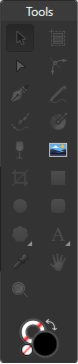
Ah, thanks. As an added bit of data, I'm pretty sure I've had it happen while working on a document. Possibly while hiding and unhiding the interface (which I do a lot). If it occurs again, I'll try to remember the circumstances, if that helps. -
Hi there. I've been having this issue intermittently since I started using designer, but I can't seem to figure out how to reproduce it. Sometimes, the floating Tools panel gets into a state where only the Place Image Tool is available. I can still access other tools through their hotkeys when this happens, and I can fix it by switching Personas. I'm attaching a screenshot. I *think* this happens most often when I start the program and immediately open a document I was previously working on, but I'm not sure.
-
Oh, small update. The issue is also present with large e xport sizes, but is simply less noticeable as it only happens along the anti-aliased pixels. High Resolution Comparison - 20190626.afdesign
-
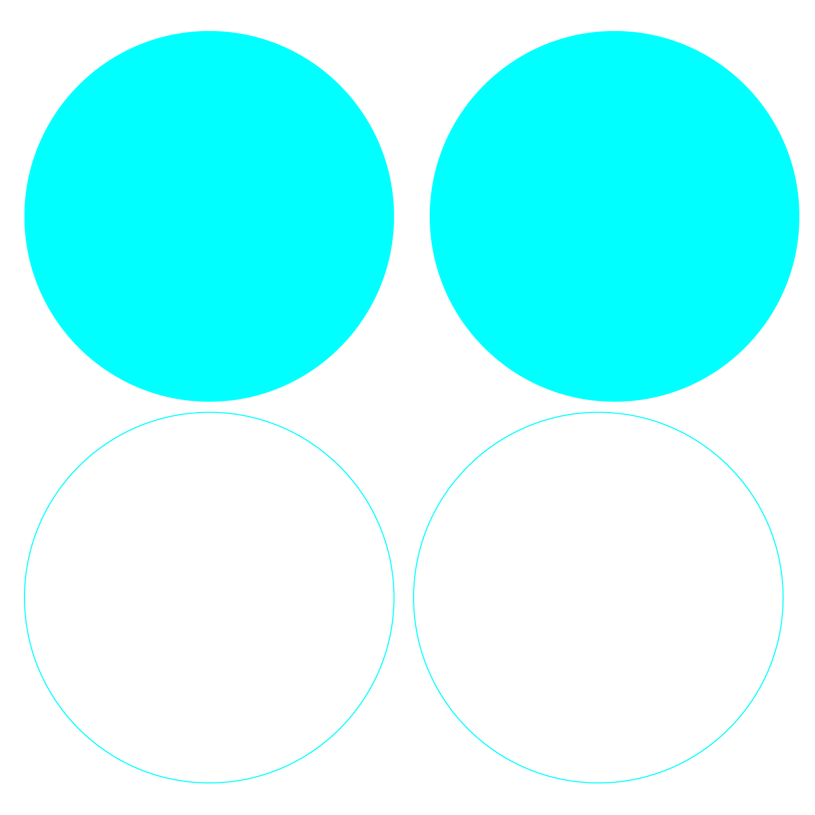
Hi there! I've been participating in a thread about deformities when expanding strokes, and while conducting some tests to research that issue, I stumbled on something else. I had suggested folks work at a larger resolution (like 640x640) and export at their target resolution (64px for instance), but when I tried this myself I got rather incorrect results. So, I put together a file just to test the results I got, and I'm including it as an attachment. In summary, I created two rings of different colors that are perfectly overlapping one another. They're in-place duplicates, just with different colors. The first test should have a 1 pixel stroke and the second should have a 2 pixel stroke, and that stroke should only reveal the top ring's color (cyan) at any resolution, but that's not the case. The cyan top color is polluted by the red beneath. This would appear to be an error in the way the program calculates visibility, especially (I think) in sub-pixel sampling. This probably isn't a critical issue for most designers, but it could present some challenges to anyone working on small icons and the like. Cheers ~CJ Pixel Pollution Test - 20190626.afdesign
-
Thanks for the update, Sean.
-
...and this is slightly embarrassing, but fills aren't disappearing when using the Text Frame Tool now, making think I was mistaken earlier. Anyway...
-
I'm not complaining; I just ran across a behavior that doesn't appear to be as designed, and reported it in the bug forum (as one does). The Text Frame Tool still removes stroke and fill, and there doesn't seem to be any reason that Convert to Text Frame should give different results... especially ones that are uneditable. So... yeah, smells like a bug to me.