Nazario
-
Posts
316 -
Joined
-
Last visited
Everything posted by Nazario
-
No drawing, VECTORIZE!
Nazario replied to Jhonatan S's topic in Tutorials (Staff and Customer Created Tutorials)
Epic stuff. Well done! -
1.8.3 polygon tool does not work
Nazario replied to Nazario's topic in Pre-V2 Archive of Affinity on iPad Questions
Just realised that myself. Needs fixing. -
Polygon tool will not accept any changes to settings. It always defaults to 5 sides and zero curve. If I use the Apple Pencil I get the same result. If I use the pop up to input a number it still doesn’t work. Quite simply cannot use the tool unless I want a pentagon.
-
Or you could do that lol. I always forget about that tool but I don't use Affinity enough to remember it at times.
-
Maybe not the best way but this is how I would do it. Create a line. Make sure the rotation point is set to the bottom. Duplicate it. Rotate the new line 24 degrees, then press command (ctrl Windows) + J to duplicate another 13 times. Group the lines. Align the circles and the now grouped lines to the centre. Done. I did a few more bits in this video like expanding the stroke of the lines and punching out of the circle. Which if you intend to colour each piece like in your image then this way may be a good way to do it. circle.mov
-
Multiple Line Tool Request
Nazario replied to Nazario's topic in Feedback for the V1 Affinity Suite of Products
Fully appreciated Dominik but if this is supposed to be professional software then most professionals don't have the time to 'challenge' themselves and discover ways of working. The app should be intuitive and allow you to create graphics quickly and easily so you can maximise profit or else designers will use other tools to do the job. For such a simple end result the amount of work involved is not ideal in this case. MEBs reply to one of the earlier linked posts seems to be the quickest option but I still think an updated pen tool would be relatively easy to implement and will allow much quicker drawing of complex graphics. -
Im seeing a difference in Bitrate. Vuescan has 48bit and Affinity shows it at 32bit i.e. less information equals less colour range. Could that be it?
-
No worries. Hope it proves useful to people.
-
How to colour greyscale/bitmap logos
Nazario replied to Nazario's topic in Feedback for Affinity Publisher V1 on Desktop
Hi Sorry I missed your responses here. I still haven't found a solution as Im still unable to use Publisher as its missing PDF passthrough which is essential for er... publishing. As such I rarely use Publisher and haven't looked further into the bitmap issue. I doubt it will be in a future release as it is a bit old school using bitmaps however with tons of old files still in use the feature would go a long way to helping people transition from InDesign. 🤷♂️ -
Hi Chris, MacOS 10.15.4 (its also done it on earlier versions). The icons are on the desktop so its standard icon view really but screenshot attached.

-
I was thinking it might be down to the end cap. Try the one on the right of the three options. This will give the overlap but with a sharper edge.
-
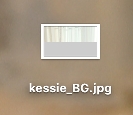
Ive noticed if I export an image, JPEG for example, the icon in finder is corrupt and usually only half of the preview image shows while the rest is grey. The file itself seems to be ok just the icon. Its been doing this for a while but typically now I'm trying to get a screenshot it's not doing it but ive 'fudged' a screenshot so you can see what I mean.
-
I get weird happening with merge selected too. Layers are reordered when flattened and sometimes some are simply deleted and not included in either the flattened version nor do they exist as a separate layer. I can't say I've seen the blurring problem. 1.8.3
-
I too would like both suggestions in the original post. Merge selected is used much more than merge down and should also be part of the context menu when you right click. A slight bug bear for me is Merge visible leaves the original layers in place. I appreciate its a non destructive way of working but we choose merge visible because thats what we want; to merge everything. Not merge everything then have to delete the original layers. If we change our minds thats why we have the history panel isn't it? The colour picker tool I find just a plain waste of time! The completely needless click on the swatch afterwards is a massive frustration. On a large screen colour picking lots of elements with all the extra clicks and mouse movement is stupid. Only this week did I find out that the colour picker tool on the other side of the screen doesn't come with the extra click?! Whats all that about! That needs to happen in the colour swatches panel. It makes people think the colour picker tool in the swatches panel is broken when it doesn't immediately update once you choose a colour. The UI/UX should be efficient and intuitive. Most of Affinity's stuff is but there are some elements that simply baffling! Oh and the selection tool and inpainting tool icons need to be more distinguishable.
-
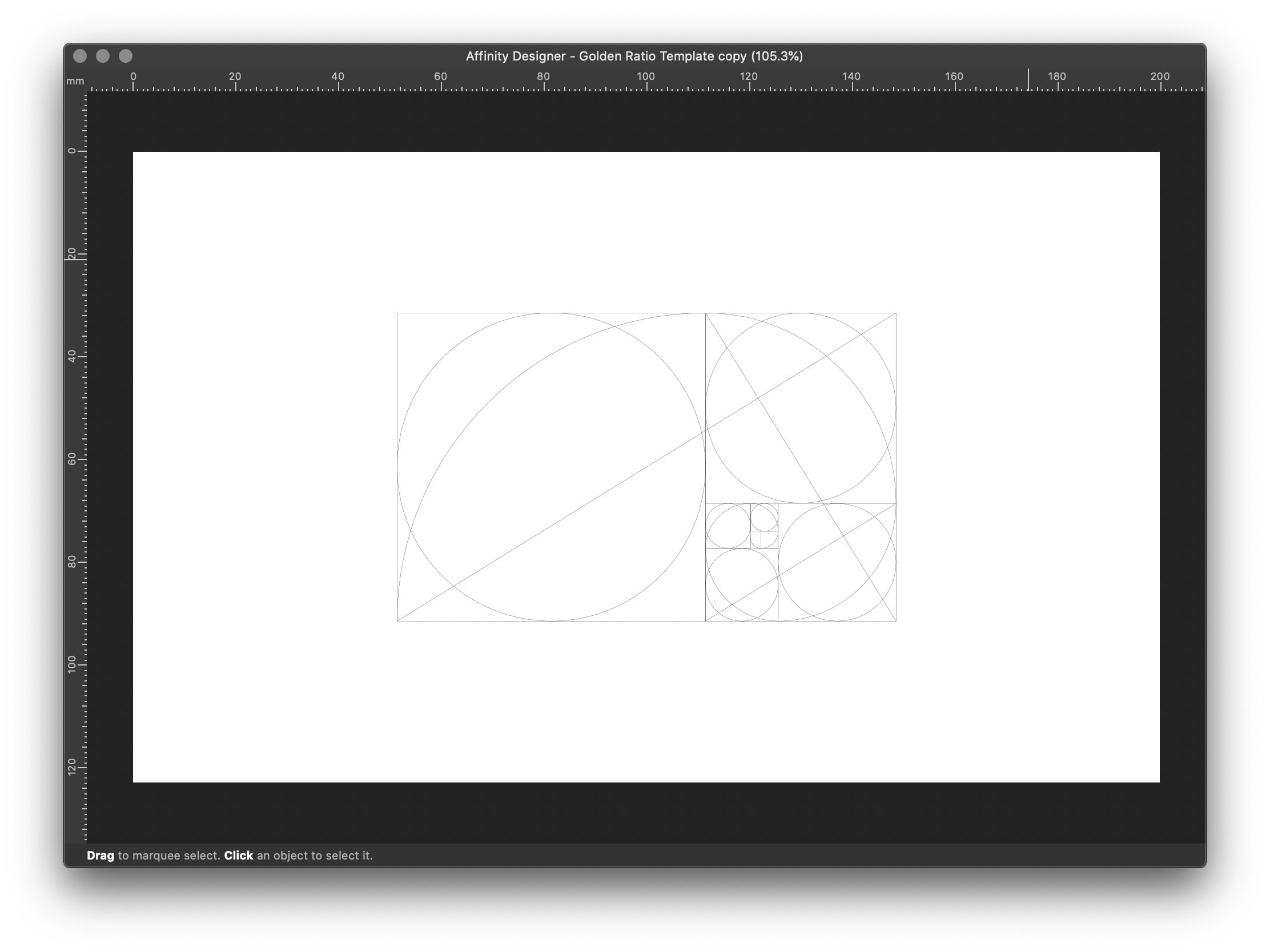
Here is a golden ratio template I use as a starting point for all my projects. Ive converted this to Affinity for you guys. It's a template file so double clicking will create a new document and leave the template untouched. Use it to build graphics with a little extra 'can't put my finger on it magic'. My 'Nz' avatar is angled at a specific angle to attract the eye for example. Golden Ratio Template.afdesign
- 4 replies
-
- 10
-

-

-
affinity designer I just left Adobe for Affinity -- Definitely Happy
Nazario replied to massive.art's topic in Share your work
Really cool stuff. I like the style. What brushes do you tend to use? -
Just a follow up on my issue. Since 1.8.3 I've had no reports of issues so i'm guessing its pretty much fixed in the latest update.
-
I use a Mac and have always used floating windows. I find the majority of Windows users do everything fullscreen but personally for workflow efficiency fullscreen just isn't an option. If you can get used to using separate windows you can use File Explorer like Walt mentioned while you're working in Affinity. Im not sure about Windows but one would imagine you can just drag and drop from Explorer to Affinity?
-
Ah. In publisher it's used to show the page edges when using facing pages. As I said though I still find it irritating and would like it to only appear when using facing pages and only where the pages meet. Theres no need for it on the outer edges. I guess however the argument is its not covering/masking anything unless you are working close to the edge, which if you're working right on the edge then you should be using bleed anyway, so the line doesn't particularly impact anything if that makes sense. Think this is more a personal preference thing more than anything else. I like clean edges and minimal interference. I've found if something sits too close to the edge of the page it can cause 'unease' in the viewer and cause distraction. This is especially true with type. I struggle to look at the second attachment.
-
Multiple Line Tool Request
Nazario replied to Nazario's topic in Feedback for the V1 Affinity Suite of Products
Hi Dominik, Thanks for the tips I'll certainly have a play with that. The tool I envisage however would make such short work of the issue, instead of multiple steps and then leaving non editable shapes as the result with a lot of needless nodes. Also I realised in the example I attached that I could have probably used the appearance panel and two strokes without much fuss to be honest at least for this one. With the other much more complex designs a specific tool would help immensely. It would probably also be able to create some really cool type faces and logotypes quite quickly I think. Heres hoping. -
Multiple Line Tool Request
Nazario replied to Nazario's topic in Feedback for the V1 Affinity Suite of Products
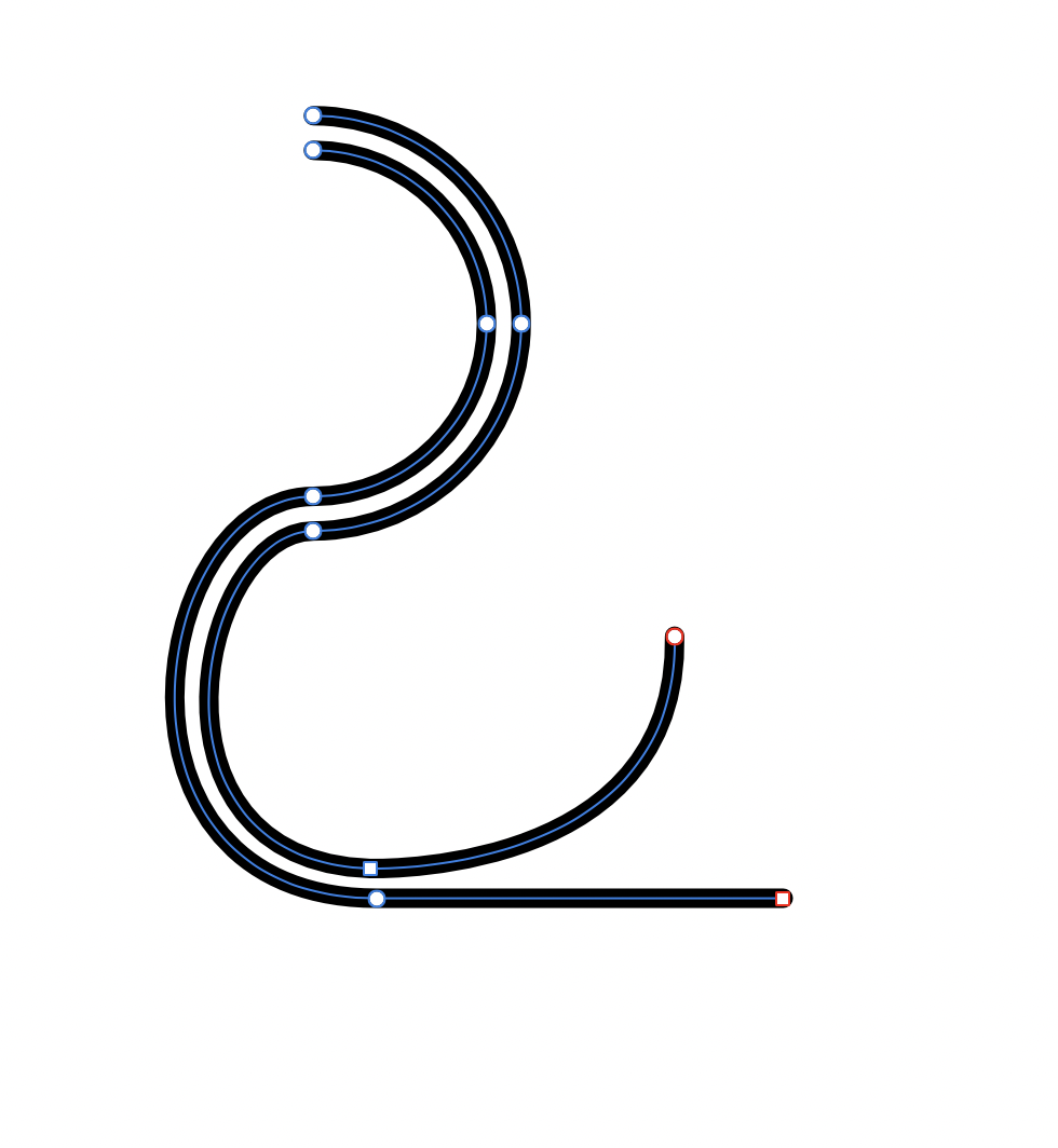
Hi Dominik. Yes of course id have to adjust the line manually to deviate away. That wouldn't be part of the tool obviously. Just the ability to draw a preselected number of paths using one path. The brush idea from GarryP gives the correct 'look' but it doesn't create separate paths so doesn't work in this instance. I do agree its quite specialised but the only other way is to do it manually and its incredibly difficult to get the gap to remain consistent along a line that has quite a few curves etc. So to be able to do this easily when required instead of spending hours trying to get it right would be really good. Attached is an example of what I'm working on. As you can see the lines running top to bottom still are not perfect and its a pain in the ass trying to make it so. I have others far more complex than this one.
-
I too find this annoying and distracting. It appears as if things aren't lined up correctly. I believe it's the bleed outline. If you have bleed set to none It shouldn't be there in my opinion. You can turn it off by clipping to canvas '\' key, or move it out of the way by adding bleed. However I like to see my paste board as its very useful and not have the outline when bleed set to zero but it seems you can't do this, unless I'm missing something.
-
Multiple Line Tool Request
Nazario replied to Nazario's topic in Feedback for the V1 Affinity Suite of Products
Hmm. Still not what I envision but interesting nonetheless. -
Crash to Desktop when reordering colours in palette
Nazario posted a topic in V1 Bugs found on macOS
Affinity Designer 1.8.3 crashes to desktop when trying to reorder colours in a custom made system wide pallete. Happens every time. Crash report attached. report.txt -
Multiple Line Tool Request
Nazario replied to Nazario's topic in Feedback for the V1 Affinity Suite of Products
Thats great but it doesn't create the separate paths. It's still just one path. I need all three lines in your case to be separate paths at the end so I can then edit afterwards. Forgive the crappiness but the attached (now working) is essentially what I'm after once I've drawn one path. I would have a perfect array of paths running next to each other but then I can manipulate each one thereafter. This one ive obviously done manually and you can see that its not perfect towards the bottom, the gap gets thinner. Thus a tool that would keep the gap perfect but allow for manipulation after would be very welcome. It could be a secondary pen tool that you select by holding down the pen tool button to access the multiple line tool, much like you do for artistic text or frame text.