Nazario
-
Posts
316 -
Joined
-
Last visited
Everything posted by Nazario
-
Would that not be a bug that needed fixing then and not a reason to change the UI? App is used in separated mode using a mouse. Which reminds me that another bug related to separated mode is that the top of the toolbar gets cut off every time you use the develop persona. This has been persistent for a long time.
-
As I said in my opening post though clicking an adjustment doesn't do ANYTHING. Clicking Darken or whatever does not darken the image and no panel opens up to amend. I don't use affinity anymore and im checking out what my dad has told me as he is the one using it. The new way described by MEB sounds like another strange decision regarding usability. Does that mean (if it worked) that if you wanted to Posterise something for example that you would have to click Posterise > Harsh even if you didn't want harsh and then reset it and change the settings thereafter or am I misunderstanding it? I cant check it as neither my dads or my copy works. Sometimes even the icons in the adjustment panels don't show up. Sometimes they are all solid white, sometimes its just a word like 'Lighten' in the panel. Im pretty sure its bugged. Yes I appreciate there are other ways to create Adjustment layers but my dad used the adjustment panel for ease, now its just confusing.
-
Adjustments pane doesn't work. Clicking an adjustment doesn't change the image or even open up a dialogue /settings window.
-
Thanks Walt. I understand how they work. After playing a bit more I now have to click the artboard name for the guides to show again. Clicking in or on an element on the artboard doesn't seem to make the artboard active anymore. Pretty sure thats not how it used to be?
-
I have set up a grid manually using guides. If I place some content off the pasteboard to work with later, when I go to click the content the guides disappear. When I check the guides manager they are all gone.
-
A Surprising Proposal: HWB
Nazario replied to dmstraker's topic in Feedback for Affinity Photo V1 on Desktop
Im a brand designer but also work in publishing. There is a fantastic book by Marty Neumeier called The Brand Gap. Its about bridging the creative and corporate sides of a business and is full of brilliant quotes and anecdotes that shows just how important it is that the corporate side understand the creative process and vice versa. It also touches on how important it is to understand the end user and what perceptions they have of said brand. Its a great read and you could probably read it in a couple of hours. https://www.martyneumeier.com/the-brand-gap/ -
Discussion on Affinity Suite for macOS 1.8.6 release
Nazario replied to Oval's topic in News and Information
No you can't. I meant in general apps running user Rosetta 2 on ARM were faster than current apps running on native Intel, at least in single core scores apparently. I know there was a workaround for CS6 whereby instead of installing the software as usual by running the installer as intended you could open the installer package and run the executable from there and it would skip some kind of check and would then install on unsupported hardware. I tried it once AGES ago but I cant remember what MacOS it was other than one that was not officially supposed to run CS6. Had no issues. I imagine by now though MacOS has changed so much that its impossible to run CS6 now. -
Discussion on Affinity Suite for macOS 1.8.6 release
Nazario replied to Oval's topic in News and Information
Just to clarify when I say 'emulated apps' I mean apps running under Rosetta 2. Not things like FusionWare. I imagine those will be slower but maybe not. -
Discussion on Affinity Suite for macOS 1.8.6 release
Nazario replied to Oval's topic in News and Information
I was in the same boat really. Stuck on El Crapitan to keep CS6 alive while waiting for Affinity to add the things required to make it workable in a pro environment. In the end (just last month) I was forced into buying a couple of new machines for my studio which only come with the latest MacOS, so no CS6 available, and as such I've been forced to upgrade my entire studio to Adobe CS (at over £600 a month) and unfortunately Affinity is now just a hobby for me. Which is a shame as I've been waiting since the beta of Affinity Designer to get rid of Adobe and have an Affinity exclusive studio. So I bit the bullet on Intel iMacs knowing the ARM ones were on their way but my hand was forced and thats that really. Seeing the massive improvement that Apple Silicon has over Intel, if I were you I'd go with an ARM Mac. Even when running emulated apps apps via Rosetta 2 the performance is still better than running on Intel in a lot of cases! Just run the Adobe Subscription until you can finally swap. Adobes ARM stuff is still only BETA though at the moment. -
Thanks Walt. I had that turned off.
-
Im sure I read somewhere there was an option to make an adjustment layer an automatic child of the currently selected layer but I never followed it up and now cant seem to find or figure it out. Was that my imagination or is that possible?
-
When will it be available on steam?
Nazario replied to KayNameless's topic in Feedback for the V1 Affinity Suite of Products
If you're on MacOS take a look at this: https://support.apple.com/en-gb/guide/mac-help/mchlf2c0c770/mac -
I totally agree but try and think of it like this. You're an artist. You've got a nice new blank canvas ready to paint on. All your paints are stored in a multitude of draws all around your room. You rummage through some draws and find the colour you want. Only thing is you don't have a palette to put it on. So you go into another room to procure a palette. You put a bit of paint on your palette. Now you want to add another colour so you put your palette down and go rummaging back through the various draws in the other room. Find a new colour take it to the room with the palette in and add it to your palette. Now you want a third colour and so back to the draws again in the other room. Keep repeating that until you have the palette of colours you need. This is what's happening in Affinity at the moment. I propose you have one draw with the paints neatly arranged in boxes and your palette already to hand. You could hover over the draw and pick as many as you like in one go. With colours on your palette and full view of the draw full of paints you can easily choose complimentary colours to add to the palette. That to me is better preparation. I'll leave it there because I've made clear my ideas and don't want to keep flogging it. Just hope some of it gets taken into consideration
-
Click click click click click click click etc.lol. Thanks.. Im talking about improving the suite overall, I know how to achieve these things but Im saying the way they are currently implemented could be greatly improved.
-
No. If you add five colours either from the mixer or from a colour book immediately after opening a document the colours aren't necessarily on the canvas yet. If you create a shape and create a colour for it using the inkwell or colour mixer that is not already in your palette then that colour once applied to the shape could appear in your palette without you having to manually add it yourself. Furthermore if you have a shape in a colour already in your palette and then change the shape to a colour not in your palette the new colour could then be added automatically to the palette. The original colour would still remain in the palette however. So yes there would still be colours in your palette that aren't necessarily on the canvas. These colours will have either been added by yourself or actually used at some point.
-
Yes exactly. At present we have 'swatches' and 'palettes' which are all under one dropdown under the swatches panel. They should all be classed as 'swatchbooks' (as they are collections of swatches) and the one and only palette should be the one that contains the colours in your current document and treated separately.
-
Overall a simple way of working with colour. But the biggest one is simply adding colours from colour book to your document palette. Currently you have to manually create a document palette, then leave your palette, go to a colour book, click a colour, go back to you palette, then click add. It's slow, cumbersome and lots of faffing with a small little dropdown. Two panels side by side. You can see everything at once and drag 5 colours into your palette in 5 seconds, faster if you're wired on RedBull. You could set the default drag option to add as global if you wish or even have modifier key when dragging to switch global or local.
-
Its taken me 5 minutes to figure that out! That just proves my point how convoluted things are currently. All that does however is EDIT one colour already in your palette does it not? I want to choose four or five quickly from a colour book to add to my palette so I can then begin working with them whilst viewing both the swatch book and palette for comparison. Also to get all that information available you already have to select the spot colour book to get the 'edit global/spot colour' button so you've already opened up the book you want, to go past it to then edit only one colour. Thats a heck of a lot of clicks to just see two panels side by side or edit a colour. I appreciate you showing me that though as I had no idea you could.
-
Crash Report: Reorder swatches in panel
Nazario replied to Nazario's topic in V1 Bugs found on macOS
Ah ok. Thats good to know. I'll admit I was confused after my last post where I thought it was me because I had noticed this happen before. I assumed in my last post and in this case I think its true, I was unknowingly working with a spot and not the CMYK I thought I was. At least something was found in the end. Ive created a thread here about colour panels which you may find interesting. -
I misread Jowdays post and responded as I thought how he/she had tagged me they were unloading on me lol. Ive since retracted my original response to that. Thanks.
-
At the moment Swatches and Palettes are hidden behind a single drop down. What if I wanted to look at my current palette while choosing a new spot colour that suits said palette? You cant see both at the same time as I far as I can tell. If they were separate panels you could see them side by side and drag and drop between them. You could also create new swatch books by dragging from the palette to a new swatch book in a separate panel. Much quicker than current way of working as its more visual. After all aren't the type of people using this software visual thinkers? If you think about who the end user is and how they work then the solutions become much clearer. Trying to tuck things away because it looks cool with drop down or merging and classing similar but distinctly different elements then just causes confusion which slows down the brains train of thought. Yes its an extra panel but it is a clear distinction between palette and swatch books and offers a faster route between the two. UPDATE: Just looking at InDesign. Adobes way is similar to mine in that when you choose a new swatch from a colour book it opens up a new window so you can still see your 'palette' (they call it 'swatches') so in effect Adobe also have 3 panels too. The swatches panel, the colour mixer and the pop up for adding colours from a colour book. My idea is much more ingrained within the current UI and maintains a consistency with it. Even Adobe don't offer drag and drop though and I think they're missing a trick for quick adding of multiple colours.
-
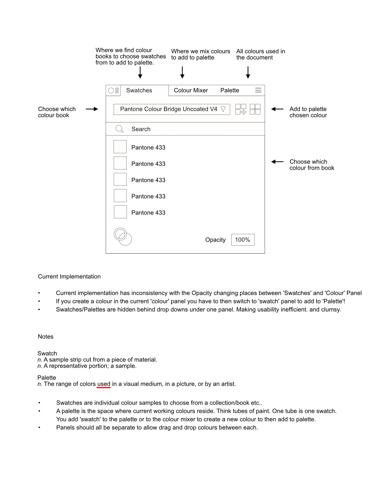
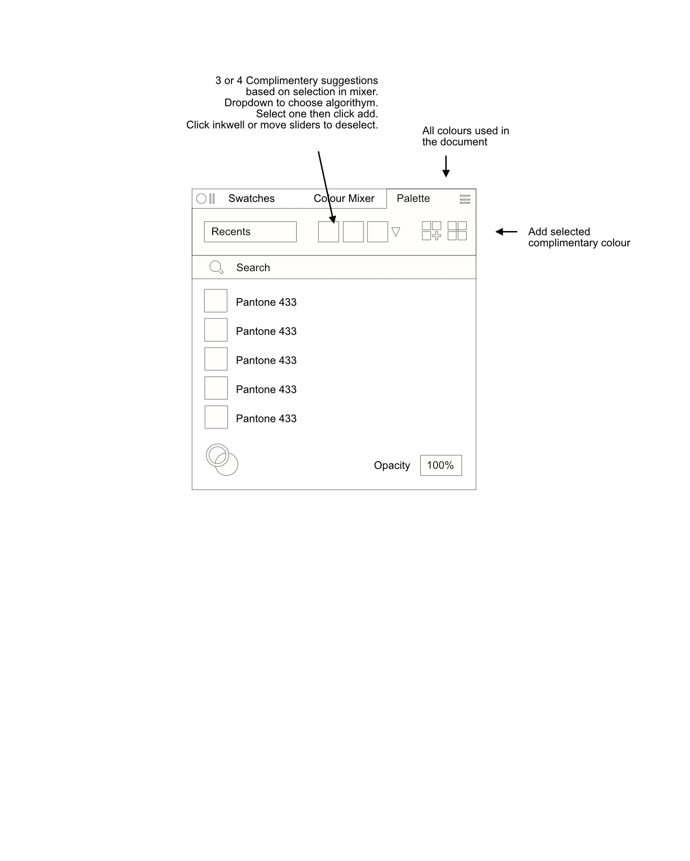
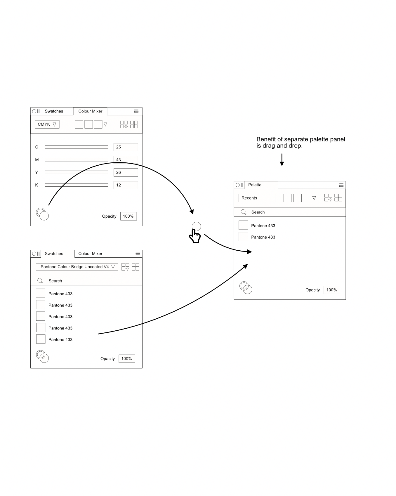
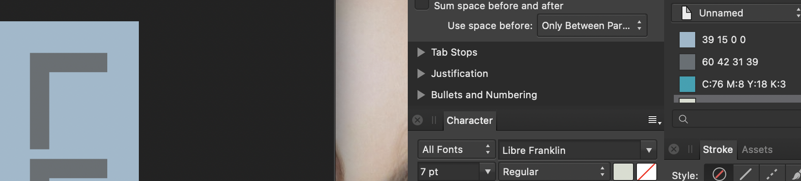
I've always had trouble working with colours in Affinity. I believe in its current state it's a very clumsy and inefficient way of doing things. Not to mention frustrating. Im writing this post after posting a 'bug' which Sean P was quick to respond to, however I now believe it was ultimately my error in using the swatches/palettes panels. I do though, also believe that if the way swatches and palettes are implemented in Affinity were refined it could be much easier to work with colour not to mention much faster. Ive attached some screenshots of a way that, I believe (and feel free to pick this apart), Swatches and Palettes could/should work, for better clarity and efficiency. First of all the current implementation merges both swatches and palettes and they are almost treated as the same thing when I believe this should not be the case. You will see in my attachments that I believe Swatches are individual colours in a collection you can choose to work with and a Palette is the place to keep all the colours you are indeed working with. While this is essentially true in Affinity there is quite a bit of overlap between 'swatch' and 'palette' and both are hidden behind one drop down. At the moment it's all a muddled mess that hides information and slows down the user. I believe there should be 3 colour panels. One for a collection of Swatch books so you can choose 'Pantone Coated V4' for example and then choose a coated Pantone from that list to add to the (separate) Palette. There should be a colour mixer panel to mix colours with the usual sliders etc from there you can add to the separate Palette and then there should be the Palette itself. This will contain any and all colours within the document (raster images excluded unless you choose to add them from an image). As an aside, if you have an item selected on your pasteboard and you choose or mix a colour the item on the pasteboard will change accordingly and the swatch should also auto appear in the palette as it is now in use on the pasteboard. Also with these 3 panels being separate you are able to glance at your working palette useful while mixing another colour or choosing a complimentary spot colour from a colour book but the biggest benefit of all is being able to quickly drag and drop colours between each panel. I hope that makes sense when looking at the attached diagrams but let me know what you think. Also note the more consistent layout of the panels. Notably the search bar and Opacity. How do you find working with colours at the moment?

-
Crash Report: Reorder swatches in panel
Nazario replied to Nazario's topic in V1 Bugs found on macOS
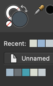
Actually Sean... I think its me! I've just tried adding the actual Pantone 433 spot to the palette and it looks like the one in the screen shot under unnamed. If I create the swatch from CMYK sliders it comes out fine so Im wondering if in my trial and error choosing colours, Ive edited a Pantone and deleted the CMYK swatch I needed?! Guess that will teach me not to rename CMYK colours to pantones haha. I think you can ignore this one, sorry. If the colour palettes were more manageable though it would really help make things easier. A simple icon denoting which swatch is a spot would help, unless its there and I'm missing something? -
Crash Report: Reorder swatches in panel
Nazario replied to Nazario's topic in V1 Bugs found on macOS
Thanks Sean. Does that mean you're unable to fix the System palette bug because its linked to the system? Attached is the file. Look at the darker grey the difference is much easier to see. Ive also attached a screen shot of the difference even in the swatch panel. The inkwell is clearly a different shade to the grey underneath the palette name 'Unamed'. Thats supposed to be the same colour! Also for a clear comparison ive coloured picked those two and attached them too. In the document the two colours are named as Pantone colours. They aren't spot colours however. I mixed them using CMYK sliders based on the CMYK values from a physical Pantone Bridge book. I've done this to get a more consistent match between Pantone and CMYK conversion. The document will be printed CMYK but I named them the Pantone colours to get used to the numbers/names as I work with them for future documents. Helps them stick in my brain for the future lol. test.afpub
-
Crash Report: Reorder swatches in panel
Nazario replied to Nazario's topic in V1 Bugs found on macOS
Here is the same document in RGB with an even greater difference.