F_Kal
-
Posts
214 -
Joined
-
Last visited
Everything posted by F_Kal
-
 Hi @mala! Are there any news regarding your problem? I'm experiencing weird color management issues and I'm trying to pinpoint the cause!
 -
hi @TechniSmart! Thank you so much for the feedback. Regarding my icc files, they were created with a spectrophotometer (a device for the purpose). I did try the System Preferences -> Display -> Calibrate route too, but I was looking for something more accurate and since I could borrow the spectrophotometer, I went "the pro route". Sadly, I bit off more than I could actually chew :rolleyes: and after all the reading, I'm still not 100% sure about the whole process! I read your question on the other thread and replied (there) but please don't take this advice as a professional one, since it's merely what I've understood so far - and may eventually be wrong. Hope this helps! -Fotis

-
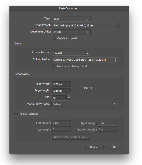
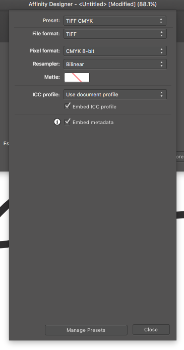
@TechniSmart I'm afraid I'm in no position to offer a definitive answer to you problem, since I'm still in the dark myself! So please take my suggestion with a grain of salt (probably @Fixx knows much better, so I'd be grateful if he comes and sets the record straight) - Still here is my take on the issue: Monitor calibration By OS calibrator, you probably mean the System Preferences->Display->Calibrate button. This one doesn't do any serious calibration/profiling, at least not serious enough for somebody like you who is trying to eventually match colors between monitor and printer. Usually, you need an external hardware device that will allow you to calibrate your monitor properly. There are a few monitors that have embedded the hardware to calibrate themselves, but they are the exception rather than the rule. When you have your monitor properly calibrated/profiled, the process will have created and activated a new .icc profile. Up to this point you will have made sure that whenever your computer tells you monitor that "I want green with a hint of red", the monitor will display exactly the tone that your computer 'had in mind'. Not exactly, but as good as it will ever be able to. Working Colorspace Notice that you may have an XXX.icc color profile enabled for your monitor, but that is completely unrelated to the working colorspace of any particular document you are working on. The working colorspace is the internal color-language of your document, and as long as a) your monitor is calibrated/profiled, and b ) the document has a working colorspace set that is good for the intended use, you are good to go. I think adobe RGB is acceptable for both print and digital form, but if you are sure you only wish to print the document, you could choose a CMYK colorspace. Soft Proofing To be able to "preview" on your display the colors that will be printed, there are two ways to go about: A) Work from the start in the colorspace the printer is asking you to (in this case CMYK/8bit with coated GRACol2006) - Specific Steps for this workflow: 1. create the new AD document, with Colour Format: CMYK/8bit and Colour Profile: Coated GRACol 2006 (ISO 12647-2:2004) (it's already in ADs list but maybe the icc file that the printer sent you is more accurate? not sure, but I'd use the one I was sent) 2. when you export the file in order to have it sent, make sure it's a CMYK/8bit file, embedded with the same profile you chose when making the document. The above workflow has the limitation that if in the future you decide to repurpose your work (eg. print it on a different paper, printer, or use it for a different medium such as web) it will have to be converted at that time and thus will loose some accuracy. B ) Work the document in a more general-use colorspace (such as adobe RGB). When you work it like that, you will need however to occasionally check how the colors would appear when printed with that particular printer. This is done via soft proofing, which is "previewing the printer's colors". In Affinity Designer, it's in the form of an adjustment layer. This video is very informative of the process. In your case you choose coated GRACol2006 for the soft proof layer type. But don't forget to delete/hide this layer before exporting the document though (not sure this last step is necessary, maybe AD automatically disables it, but better safe than sorry)! Whether you work with the method A, or the method B, your monitor needs to be calibrated properly otherwise the result will be off! Hope this helps! Also hope that what I say is correct since it's not something I'm confident with! -Fotis
-
Happy new year everybody! I was playing with the RAW development options in macOS's Photos app, and wanted to compare it against Affinity when I accidentally discovered that I couldn't reproduce the same white balance inside Affinity with Serif's engine, no matter how much I tweeked Temperature+Tint. Not being sure if that was a problem with Affinity or Apple RAW engine, I did a more extended test: I tried the same thing in Lightroom, Olympus viewer 3 (since it's an Olympus camera) and finally Affinity using Apple's RAW engine instead and these were all very close (and I'm sure I could make identical if I fine-tuned the more) - so it seems to me that the Serif's RAW engine is not rendering the colors correctly in the first place...? In the following tests I tried to roughly match the white balance only for the red in the bouquet and the gray/white of the wall. I was paying attention to the hue not the Noise Level/Vibrance/Saturation/Brightness or Contrast in this experiment so please ignore these for now. Here are the samples: Successful Matching Lightroom CC 2015.8 (probably using Camera RAW): Olympus viewer 3: Apple Photos App (probably using Apple RAW engine): Affinity Photo with Apple RAW engine: Unsuccessful Matching Affinity Photo with Serif Engine. When attempting to match the wall color the flowers had too much blue/magenta: Affinity Photo with Serif Engine. When attempting to match the color of the flowers, the wall would become too yellow: In the images you can also see the respective settings in each application. Thank you, -Fotis
-
Non destructive cr2 raw files with XMP?
F_Kal replied to 7immer's topic in [ARCHIVE] Photo beta on macOS threads
I agree with @7immer! For any photographer who wishes to tweak the exposure/white-balance/framing of the dozens of photos shot today, and wishes to be able to revisit these changes in the future can not do this with a 500MB .afphoto file. I understand that this "live development" could be part of a DAM product, but .xmp file support is a nice intermediate step until then (and useful with other programs too). I guess "hot-linking" a raw file inside an .afphoto document, instead of storing all the pixel data of the image (while not ideal for the job) would had been somewhat useful as a temporary workaround - but seems the feature to link a document (instead of embedding it) has not been implemented yet Happy new year everyone! -Fotis -
Hi @James Ritson! Thank you so much for explaining this! I thought the pattern might had been related to the de-mosaicing process - Knowing that the team has it on its radar (and may be planning reworking it in the future) is great news! Also thank you for the idea about replacing noise with artificial grain - it certainly is working, even though it's stripping too much useful detail for my liking (and my already small 16mp sensor) Certainly no big deal, and definitely something I can work around! Thank you again, -Fotis
-
Hi! Here are two random samples (one .cr2 from the 5D mark III by Canon and one .orf by the M-10 mark II by Olympus). Both were opened for development in AP and had all noise reduction disabled, (both in hardware and in Affinity Photo), no lens correction or straightening added either. Raising the exposure and viewing the image at 100% or more zoom, reveals a slightly skewed grid-like pattern in the noise distribution (I've created 3 square boxes to aid the eye since it's barely visible). 5D iii: E-M10 ii: Could somebody verify whether this is something normal to all digital cameras, or something introduced by the AP raw engine? I've never worked with raw before so I'm not sure what to expect. Olympus viewer doesn't exhibit this issue, but may be some under-the-hood noise reduction that the user can't disable. Thank you! -Fotis PS. The skewing/shifting brings to memory the words "wrong offset/block size"
-
How is AP/AD doing with color profiles? Is everything stable? Or are there any quirks? I just got my hands on an i1pro spectrometer. Being a discontinued product, the bundled software won't run on Sierra (software support is limited up to OSX Lion). For this reason I tried creating an .icc profile by pairing it with the free displayCAL/argyllcms but being totally inexperienced, I'm not even sure I got it right. When applying different profiles (system preferences->Display->colors) without quitting AP, AP seems to be flashing a bit before stabilizing to the new colors. Once, it even got stuck flashing colors non-stop. Other times I get the feeling that when reenabling the same display profile I get different colors (but can't be sure about that, might be my eyes attuning to finer hue variations). It also shows very different colors compared to the built in OSX Preview app. I tested the preview app using a gray gradient .tif file (with no embedded color profiles). Unfortunately I no longer have PS to cross-check so I'm not even sure there is a problem whatsoever; and then I remember reading that AP/AD and LibreOffice have some issues in Sierra that get resolved only if you choose the default display profile! Could somebody who has followed the topic a bit more and is using AP/AD with display profiles, give some feedback about whether (and to what extend) do color profiles work okay with AP and AD? (I'm runnning the latest betas - 1.5.2 and 1.5.4 respectively Thanks! -Fotis
-
[AD] flip view (artboard/canvas/document)
F_Kal replied to F_Kal's topic in Older Feedback & Suggestion Posts
hmm, now that I see it practice, it's not so bad when sketching with the vector or pixel brush tool and you don't care about the layer order; I've set an express key on my wacom to perform the < V, cmd+A, /, V > combo and it's rather satisfying! On the flipside the undo stack fills up with extra moves... Still @Herbert123 you've given me something to keep me going for now :) Thank you! -
[AD] flip view (artboard/canvas/document)
F_Kal replied to F_Kal's topic in Older Feedback & Suggestion Posts
hi @herbert123 thanks for the reply! If I got it right, you suggest selecting all layers and then transform->Flip Horizontal-ing them, right? It's a good trick, and I suppose this would work when you occasionally need to flip everything, but (correct me if I'm wrong) it's far from optimal for systematic use - I'm detecting the following three bottlenecks in particular: - cmd+A won't select all layers in any tool other than the Move [V] tool (it won't work while using the vector brush tool, or the pen tool for instance) - Flipping the layers would flip them according to the center of the combined selection, but this doesn't necessarily mean it's the center of the art-board (of course this can be solved if you have a rectangle at the bottom of the stack sized like the artboard) - by the end of the process all layers are selected so you have to reselect back to the original layer/group where you were working on, and finally choose the tool you were using before switching to the move tools in other words <V>, <Cmd+A>, /, <click select proper layer/group>, <B> -Fotis PS. Having a dedicated Flip View option, would have the additional benefit of allowing you to flip the canvas mid-process eg. while adding points with the pen tool, you'd be able to flip, and continue adding them there. -
Another idea: I discovered that if you work in separate mode, you can have two or more documents (or views) open side by side, but when not in separate mode, this is not possible. While not a major deal, it would be nice if you could somehow, while still in full-screen split the screen between two views/documents like in photoshop IMO a more intuitive way of splitting the screen horizontally/vertically, would like CPS (Clip Paint Studio) does it: docking the document window where you want it as if it were a Studio Panel! as seen here. -Fotis
-
regarding Affinity Designer: May I suggest that for illustration work the ability to flip the artboard (with all its contents) would be rather useful? (for checking the synthesis balance that is) just like one can do in Affinity Photo! Actually it would be more appropriate if the option was under the view menu, (where rotation/zoom/new view exists) and be applied to a specific View, not the actual document data - but that's taking it a bit too far and I don't want to scare anybody ;-p
-
[AP trial] Brush hardness counter-intuitive
F_Kal replied to F_Kal's topic in [ARCHIVE] Photo beta on macOS threads
hi Andy, it's totally understandable - it's not the most pressing issue (one could always work larger and downsample later) so as long as you are aware of the issue I'm happy :) You've done a great job so far, thank you!!! -Fotis -
copying clipboard content [also] in svg format
F_Kal replied to F_Kal's topic in Older Feedback & Suggestion Posts
@MattP & @MEB Wow! Regardless of whether it currently functions properly in Hype, this is just awesome! I tested it out with a sublime text and it rocks!!!!! Does enabling the SVG clipboard export have any negative side-effects when copy-pasting (regardless of Hype)? I'm asking this, since by-default it's unchecked, so maybe there is a catch/scenarios when this wouldn't be desirable? -
[AP trial] Brush hardness counter-intuitive
F_Kal replied to F_Kal's topic in [ARCHIVE] Photo beta on macOS threads
hi @paolo.limoncelli, indeed - it's as you say it: AP/AD's hardness behavior is exactly as in other software, it was misguided of me looking in that direction in the first place. In the bug report thread I make no mention of hardness and simply focus on AA being weak. Of course you are right that it may not classify as a bug per se; it might be simply be an insufficiently low AA value (and not something wrong with the math). Still I thought of bringing it to the attention of the developers in any case - it's something from which AD suffered at some point too, and was tweeked (or fixed) subsequently to a more satisfying value! cheers! -Fotis -
[AP trial] Brush hardness counter-intuitive
F_Kal replied to F_Kal's topic in [ARCHIVE] Photo beta on macOS threads
Hi @paolo.limoncelli thanks for the comment! The airbrush tip, is very useful, thank you! While writing my reply to you though, I realized that I was subconsciously trying to compensate for a bug. I do penciling and the reason I wanted to smoothen the AP brush all over by a constant measure was because the stroke was somehow too harsh in AP. In manga studio/clip paint, artrage, Affinity Designer or photoshop it was always smoother so I never had to change the hardness for that purpose. But in AP It appears as what I would describe aliased. I won't go into details here since since I opened a thread in the bug section (found here) but for the sake of friendly exchange of knowledge, if you still feel inclined to explore the topic, I would very appreciate if you elaborated a bit on your last reply: I was indeed trying to recreate a brush with a constant initial hardness: A brush feathering of n pixels that won't scale with brush size as appears on the second stroke on the image below. How would you go about doing it? Omitting to set the a hardness-pressure controller would result in the first stroke of the image; sharp at the edges, smooth in the center am I missing something here? Please don't feel pressured to reply - My initial problem is no longer standing. Thanks again, -Fotis
-
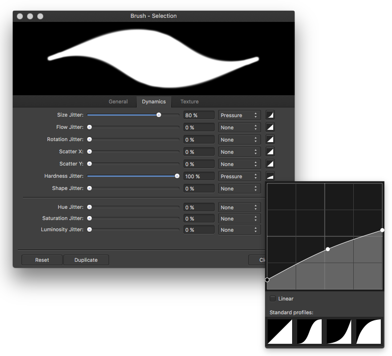
Hi! I've been trying AP, and I'm very puzzled by the behavior of the brush hardness parameter: It's expressed in percentage(%) and thus scales with size. I work with a stylus and while this proprtional scaling feels acceptable for an airbrush, it feels strange for a brush/digital brush: The feathering of the brush IMO should remain constant regardless of the brush size. So far the only way of maintaining a constant hardness regardless of size that I have found is via trail and error adjusting the hardness jitter with a curve to compensate for the loss of detail as seen in the image below . Am I missing something? Would be nice if you could specify hardness in pt/px instead of percentage (and probably default in px) -Fotis
-
what a coincidence! I've been perplexed by this exact issue all day long - I too have been trying to create symmetrical shapes; I recorded dozens of videos while trying to find the reasons as to why sometimes it will merge the two zero-distance (overlapping) points into ones perfectly fine, other times will distort the handles warping the shape, while other times will retain both point and connect them by creating a zero length straight line between the two points, even though they are perfectly overlapping!
-
Ah, that explains a few things! I too had this misunderstanding even though I have no illustrator background. I think the reason that this causes confusion is that the join curves option appears with the node (selection) tool, not the move tool (that I consider as the equivalent to a curve/path/shape selection tool) - and this is giving (to me) the impression that joining curves is an action that can be performed on specific nodes! The behavior gets more puzzling since the tool will choose "randomly" a candidate-pair when there are more than one equal distance pairs. eg. zero-distance pairs like in the following video (I couldn't upload the video in mp4 or webm format so I had to upload it on youtube) It took me a couple of hours of trial and error, plus reading this whole thread on the forum to get this straight in my head, and while now I don't think I'll even do the same mistake - It's probably something that at least some new users might have issues dealing with; probably something that needs to be clarified/reworked a bit? -Fotis
-
I've been setting my eyes on Hype 3.5 for animating my AD creations and read someplace that between Sketch and Hype you can transfer SVG code simply with cmd+c and cmd+v since they can exchange clipboard data in SVG. (hmm, was it sketch, or AI with some plugin? I'm no longer sure) regardless, wouldn't it be great if AD would generate SVG code when copying to the clipboard so that other vector programs (hype, inkscape etc) could get this information instead of the rasterized bitmap?
-
(Ps. Just found the answer regarding the stroke - there is a setting in the strokes panel that says "scale with object")
-
Hi! I've been trying out version 1.5 on Sierra and I'm so impressed! I've come across something that confuses me though: I've created a shape and gave it some round corners with the corner tool (radius 5mm - without baking them) Now if I try to resize to object, say down to 10% of the original size, neither the corner radius doesn't change proportionately but stays the same (5mm) thus distorting the original shape How could one make it so that the radius scales along with the image? I'd rather not bake it if it is possible thank you! -Fotis PS. Same happens with the stroke - how would one treat that?
-
Adjust how trial period is calculated
F_Kal replied to alexgoldstone's topic in Older Feedback & Suggestion Posts
Thank you @MEB for clarifying! -
Adjust how trial period is calculated
F_Kal replied to alexgoldstone's topic in Older Feedback & Suggestion Posts
I must agree with @Alexgoldstone, it's a better way of doing the trial. If the trial counts only the days that you've launched the program (as @alexgoldstone suggest), it doesn't have to be 30 days trial - IMO 15 days would suffice! Btw @Alexgoldstone, if I'm not mistaken, whenever a new version comes on the app store you trial gets an extension -even if it had expired already. @DavidMalcolm: Affinity products are awfully cheap for what they are, but that doesn't mean that they are what somebody needs; and if it's not something you need/want, then even 1€ is money wasted... -
wow @Herbert123 I learned something today! I've been using Manga Studio for inking precisely because of the brush smoothing and how fast it is compared to PS, but never knew you could do most of the crazy stuff that you demonstrated in the gifs!!! Thank you!