Horseflesh
-
Posts
101 -
Joined
-
Last visited
Everything posted by Horseflesh
-
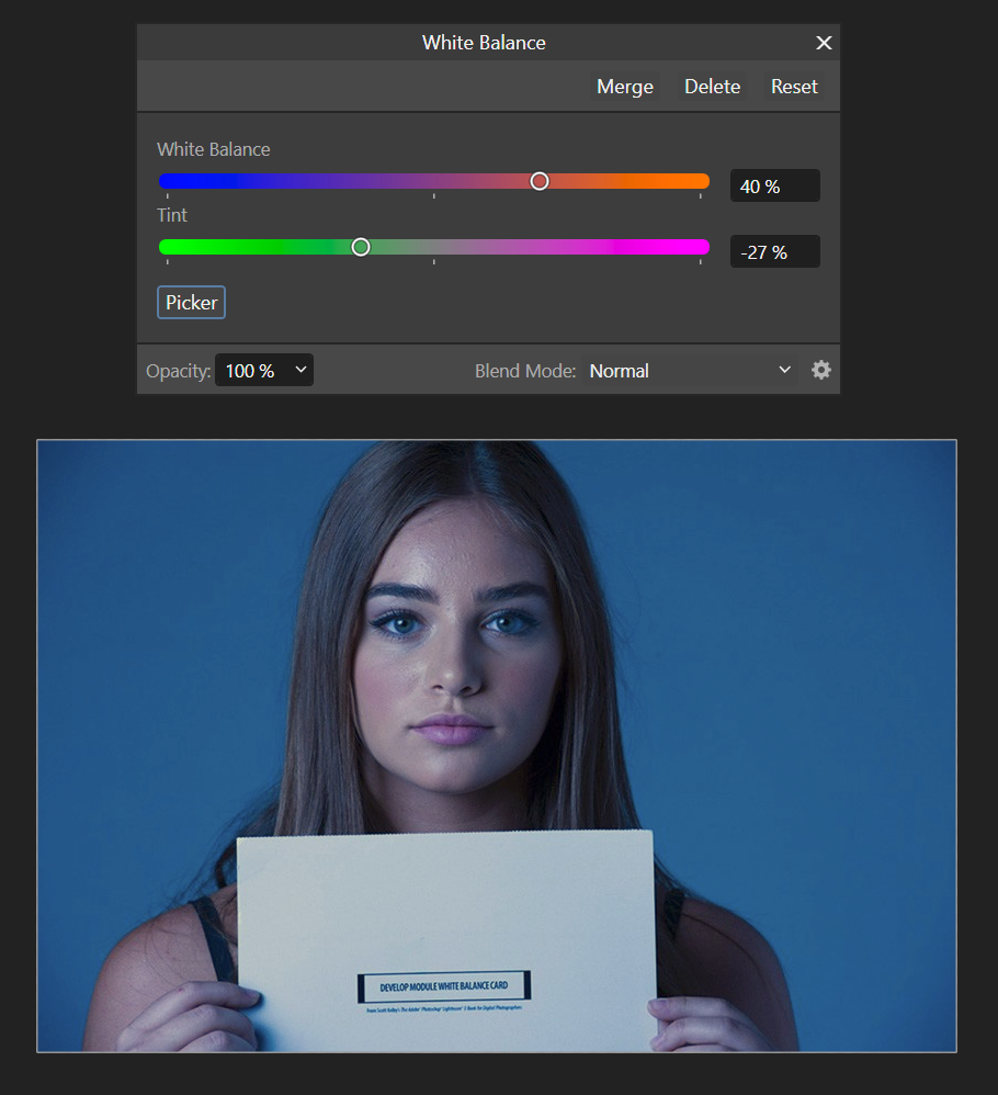
Here's a pic of a model holding up a white balance card. It's from this article which shows how to use Lightroom. https://lightroomkillertips.com/using-gray-card-setting-white-balance-lightroom/ I don't care for APh's corrected version below. But, this is a jpeg from a web site, not a raw file that I shot myself.

-
The original photo showed a desktop including objects I knew to be white, all lit with yellow light like a sunrise. So, I think the paper is white, but since it wasn't my photo I can't prove it. But the behavior of the white point picker seems to be poor, regardless. Even if it was colored paper, the white point picker it should yank the image colors to the point where the paper was neutral, right? That's what that tool is supposed to do, it's our job to use it wisely. The issue I am trying to report is not that this image cannot be corrected, but that I've never seen the tool work as I would expect with any image.
-
Yeah, Photoshop nails it if you're careful to have a proper grey reference available. I've not seen APh perform nearly as well. I'll try dragging around in APh, thanks!
-
It has -- I think this image is uncorrectable because the cast is too strong. But Affinity Photo seems more wrong than Photoshop. And if you have a slight color cast, AP can't correct that either. To me it seems like the white balance picker doesn't work at all, not just in this strongly colored image.
-
Upgrade? I still can not decide...
Horseflesh replied to Fritz_H's topic in Feedback for the Affinity V2 Suite of Products
I am sure there are more capable apps than those in the Affinity suite but value also needs to be considered. If I didn't care about value I'd just subscribe to Adobe CC. If there are apps out there which are dramatically better than Serif's, for a similar pricetag, please name them, I'd love to know. -
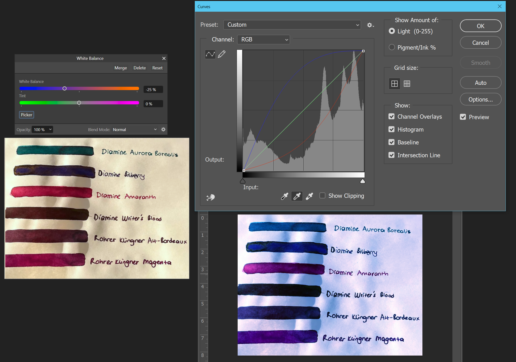
I'm having a hard time using the white balance tool in Photo to correct lighting color cast. Here's an example. The image is not mine, it's just a good example I stumbled on... A photo of a piece of paper with colored ink, but with a strong yellow cast from the lighting. In Affinity Photo I used a White Balance adjustment layer, clicked the Picker button, and sampled a spot on the paper. The yellow cast was somewhat reduced, but not eliminated. In Photoshop, I did the same thing with the grey point dropper. The yellow cast was eliminated as I expected. The image has other problems now, but isn't it more correct? I cannot get similar results in Affinity Photo unless I twiddle the sliders myself. This just doesn't seem right. This test image is dramatic and probably not really salvageable, but it illustrates the problem. I am unable to correct even small white balance problems in Affinity Photo via the picker. Basically, a huge white balance problem receives a small correction, and a small white balance problem which should be fixable receives little or no correction. If I am misunderstanding this tool in Affinity Photo, how can I click to pick a grey point as is possible in Photoshop? (While this sample was done in v2.0.3 for Windows, it has worked like this since my v1 days.)
-
Surely there is a way for a MSIX app to have normal performance? I have gotten games from the MS store via Game Pass and they certainly didn't perform worse than .exe games. No one pixel peeps and checks benchmarks like gamers, if there was a guaranteed performance hit the game world would be out for blood. Anyway for fun here's my benchmark run. My machine is crummy, it's an old 6th gen i7 laptop with a mobile Nviadia 1070. 256 / 989 / 145 / 6210 / NA / 182 / 4021 / NA Whatever the benchmark says, perf has been fine for the kind of tasks I do, so I have no complaints yet.
-
Hairline Stroke Width
Horseflesh replied to Nicole4481's topic in Feedback for Affinity Designer V1 on Desktop
I'm still unclear if "hairline" is metadata other than the stroke size. If a laser cutter needs a "hairline" to denote a cut line, can that be simulated with a manual stroke width, or do we need some other "hairline=true" bit for proper support? -
The ability to process a photo shoot is my top desire for AP. It's arguably not part of the Photo philosophy. Even Adobe released separate products for it. But if we just had Photoshop Elements-level features for handling a group of photos within AP, that would be a great start. As it is I maintain an old copy of Lightroom, but it sounds like I should check out Raw Therapee.
-
Vector Warp - awesome, but...
Horseflesh replied to Dampsquid's topic in Feedback for the Affinity V2 Suite of Products
Unfortunately everyday chores like installing fonts and working with files in iOS/iPadOS is so deeply unpleasant! -
Everything about working on the iPad is kind of a pain in the rear. I bought a couple of the v1 apps for iOS and once I began using them, I just resolved to make time to do that work on the desktop. The apps are fine, it's routine stuff like file handling and installing fonts that makes the iPad as much fun as doing taxes.
-
No .exe, no interest
Horseflesh replied to UweJelting's topic in Feedback for the Affinity V2 Suite of Products
One of the benefits of MSIX was listed as easier upgrades. If I stick with MSIX will my apps update automagically? Or do I have to download new installers still? Since I don't need to change the default install location and I never need to poke around the install directory, the switch to MSIX had not bothered me. If it updates itself, I'll stick with it, too. -
My job is making software and part of that is figuring out what users want. Time after time I have figured that out, only to find that the userbase didn't actually want it. They just thought they did. So you try to figure out what they really need, not what they say they want. And if you give them that, they are still unhappy because they think you didn't listen. I have a lot of sympathy for anyone that tries to prioritize enhancements. It always seems like there is no right answer. I am not trying to defend Serif from any specific oversight, just making a general observation.
-
No .exe, no interest
Horseflesh replied to UweJelting's topic in Feedback for the Affinity V2 Suite of Products
I don't see the problem making a shortcut. I right-click on a v2 product in the start menu and pick Create Shortcut. It says "I can't do it here, want it on the desktop?" And then I have a shortcut. BUT I am on Windows 10 AND I have replaced the Start Menu with Open Shell, so maybe that's why it works for me. I don't like not being able to change install location, but then again... I didn't. My boot drive is always my fastest drive and apps like this would go there anyway. I am a classic WIndows guy and I do not like the direction Microsoft is taking things either. But if using MSIX buys Serif time to add features, it is a compromise I will happily make. -
I don't know if I'm a crown-wearing thorn... But the squeaky wheel gets the grease @JDW!
-
While I did just buy the v2 suite, I'll also enthusiastically call out things I think they need to improve. This seems to be one of them. If I am mistaken and doin' it wrong, well, like I said in the other thread, I'd love to be wrong on the internet today. Anyone who wants to hold off buying the update, I won't blame 'em. We all need different things and some strange omissions remain in the suite. I thought you might want to see where the thread goes @JDW.
-
I have a scanned document which shows white paper with a strong pink tint. (I don't know how it got this way, and it cannot be rescanned, I didn't create the file.) In Affinity Photo v1 or v2, if I enter the Develop persona and click the White Balance tool, clicking in the pink area produces a color temperature change of zero to 1%, which is insufficient to correct the color cast. Sampling a larger region with the Alt key is no better. If I open the same file in Photoshop and use the white point tool in the Curves dialog, one click in the pink area sets it to white, correcting the color of all the other things in the document as well. To get the correct-looking Photoshop result in Affinity Photo, I have to drive the White Balance Temperature and Tint sliders manually, which seems backwards. Is there a better way to set white point in Affinity Photo? cc: @JDW
-
Look, with the v2 launch coming in hot and people all upset that 40% off isn't enough, I hate to pile on during what is Serif's worst day in years... but it's time for real talk about a problem that makes the Affinity suite literally unusable. We have to tackle problems head on to move forward and I think we're all mature enough here to have an uncomfortable discussion. Well, some of us are. What is this dangler called, and why is it there? It haunts me.
-
I'm sure, under the hood, it is some kind of overly-protective fraud detection. We don't have time for me to list the things that suck about credit cards!
-
No extra discount for existing users (split)
Horseflesh replied to monzo's topic in Customer Service, Accounts and Purchasing
I'm OK with no upgrade pricing because the 40% off launch deal is about what I would have expected anyway. I know it'll never happen but a nice benefit to upgraders might be to let us transfer a v1 license to another account. If I could give away my v1 products to some other people, that would be nice for me, and it might encourage a v2 sale later. -
Same here. I have used this CC for a previous Serif purchase, a few weeks ago in fact. The same card is linked to my PayPal account and I used that successfully. Serif, I tried to pay you directly with no middle man!
-
We bought a copy of v1 Publisher a few weeks ago for my wife's Mac. Given the opportunity I'd happily unwind that purchase to get a copy of v2. Is there any purchase protection?
-
Anywhere you draw the line on new features, someone is going to be left out and angry. I am OK with how Serif has handled this update... If.. If they continue to fix bugs in the v1 products. At least for a while! Not everyone is going to be able to upgrade soon. I DON'T expect the new Mesh Warp to appear in Designer v1. Should it have been there years ago? Arguably yes, but that ship has sailed, hit an iceberg, caught on fire, sunk, been raised by James Cameron, placed into a museum, burned down when the museum caught on fire, and memorialized on a stamp. I DO expect the awful bug that causes a hard crash to the desktop when you type in the font name picker to be fixed, though. Congrats on the release to everyone at Serif. V2 looks great. I'll be buying the bundle ... and I'll continue to complain about missing features like the good old days of v1!
-
How do I use the white balance picker?
Horseflesh replied to KipV's topic in [ARCHIVE] Photo beta on macOS threads
@JDW I am late to the party and found this thread when just now, I wished to fix the white balance on a scanned image. The white balance tool in the Develop persona doesn't seem to work at all... I opened a scanned page with an obvious pink cast, and sampling pink paper pixels dialed in a color temperature change of -1% which did not fix the problem... Not even close. If I drove the sliders by eye it seemed to need about -33%. On the other hand, using the white point picker in Photoshop's Curves panel worked as expected, making the white paper in the image white instead of pink. I don't care where that magical click is in the Affinity workflow, but it seems like it should be in there somewhere. If I'm doing it wrong and someone wants to correct me, I would love to be wrong on the internet today. -
Font Search makes Publisher, Designer and Photo Crash
Horseflesh replied to Algernon47's topic in V1 Bugs found on Windows
I came to report the same thing. Glad it's a known issue. I'll just live with it for now rather than messing with my Windows updates.