Jörn Reppenhagen
-
Posts
98 -
Joined
-
Last visited
Everything posted by Jörn Reppenhagen
-
 1. Fire up the beta. 2. Open any stored picture file. 3. Click on QuickMask in the upper toolbar. 4. Choose the Donut tool in the toolbar on the left. 5. Try to draw a donut in the picture. Exitus. Video:
 -
Issue with Paint Brush Opacity
Jörn Reppenhagen replied to Rick G's topic in [ARCHIVE] Photo beta on Windows threads
Experienced the same phenomenon the other day. All 100 %, wet edges, Normal blend mode - but still the brush refused to fill correctly, needed about 30 strokes to do it's job, with the background color still coming through. Unfortunately, this happened with the latest beta. -
@Guzzi Just open the Layer Effects panel. Now click on "3D". You'll notice the controls now use the whole panel's vertical space which appeared empty before. With a dynamic window/panel size, there would be sudden size changes according to the contents of the active tab. Believe me: You would deeply hate it if the panel would happily cover more or less of your picture according to the setting selected. Similar reason. Some settings need more horizontal space to be displayed correctly or to provide ample space for fine tuninng of e. g. sliders. Again, a dynamically changing width would cause real disturbing effects. Could be. But the question is: Should be? Some more line spacing allows precise and easy hitting each line with the mouse pointer, you don't need to concentrate too much on the click action, you can still focus on the effects on the picture displayed without shifting your view for precisely hitting the right line. Luckily that's the case. That way, you can pick the floating panel and move it to another screen of a multi monitor setup. You can even choose "Float All" in the Window menu, move all your tools to a secondary monitor while having just the image (without any controls or other UI elements) fullscreen on the main display. So that "issue" indeed provides a lot of flexibility. Partly agree. Can be disturbing, can also be quite neat. Example: I often need a blue/red color channel swap for processing IR photos. Thus I saved that as a preset which displays as a preview thumbnail in the list. A simply click does the swap. Unfortunately, this only works with the Adjustment tab, it's not possible to select previously saved presets in the single panels, like Channel Mixer. WHY ? Would be fine if there was a way of deactivating those thumbnails - and/or restrict that thumbnail display to my own presets. It's also a real nuisance that a simple click on an adjustment's name immediately applies the first displayed option to the picture - but a second click does not revert that action. Just try the "Invert" adjustment. Tipp: If you wish to avoid those thumbnails, just switch to the Layers tab, select the adjustments via the Adjustments icon at the bottom: That way, there's no thumbnails at all.
-
Done, Sir!
-
Hello, @GabrielM! I can't, it's too large (~ 50 MB) for the forum. Where shall I send it?
-
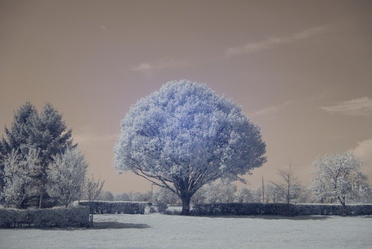
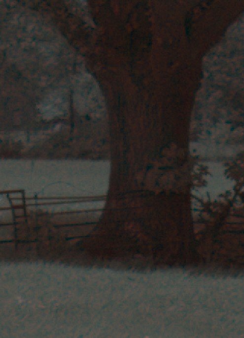
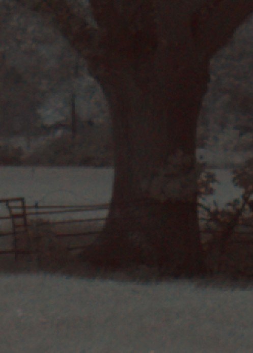
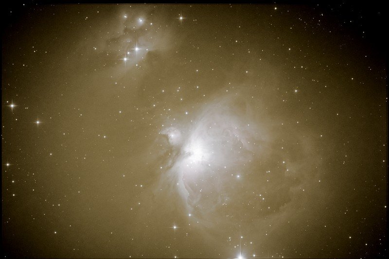
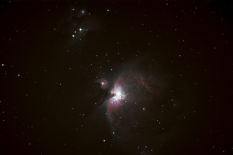
Hi there! Here's a problem which should primarily concern all that brave IR photo warriors including me. Something's wrong with RAW development, at least if using with IR photos. Concerns regular and beta version. Camera: Fujifilm X-T20, thus RAF RAW format. Lens is the kit lens, XF 18 - 55, famous for it's lovely bluish IR hotspot in the middle. Here's it: This is a RAW IR photo developed with Lightroom, correct white balance already applied. Nothing else done. This is the same photo, developed with Affinity Photo 1.6.5.135, white balance via picker applied. That's the same photo, developed with Affinity Photo beta 258, white balance via picker applied. Okay, does not look too critical, hmm? Just ignore the fact the LR developed picture is far brighter and crispier. Now for the real ugly things ... Zoomed section of the LR developed photo. That's the way it should be. Uniform "colors" in the grass, foliage and tree. Same section of the photo developed with Affinity Photo. Browns and wrong greens everywhere. Similar with Affinity Photo beta. Better, but still a lot of wrong greens and browns. Those issues render the picture unusable for proper IR processing; the results with the beta are always far inferior to the results I get with using Affinity with IR photos developed with Lightroom. Photos processed with the regular Affinity Photo version are completely unusable. Affinity indeed manages to achieve a correct white balance if using the picker. But there's still that "impurities". And it's not a problem of this particular picture, it's the same with all IR photos I took. Really sorry to say - I hate creeping back to LR for RAW development. So my obvious question for the developers: Anything you could do ? Shall I send you the original photo ?

-
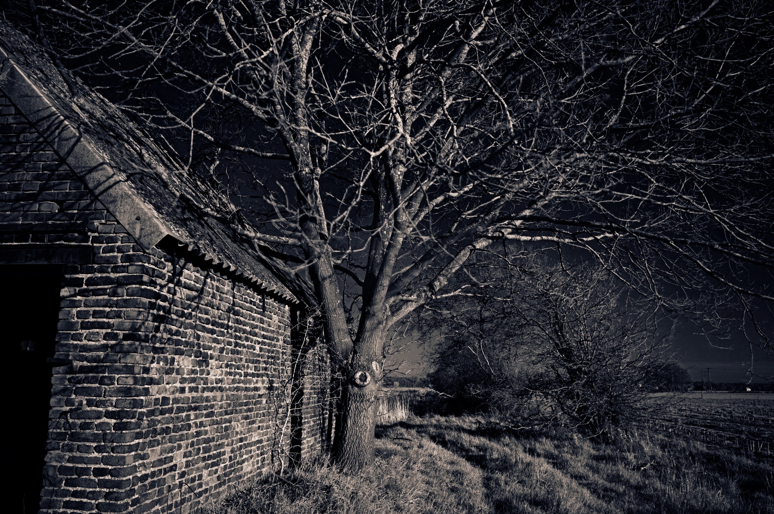
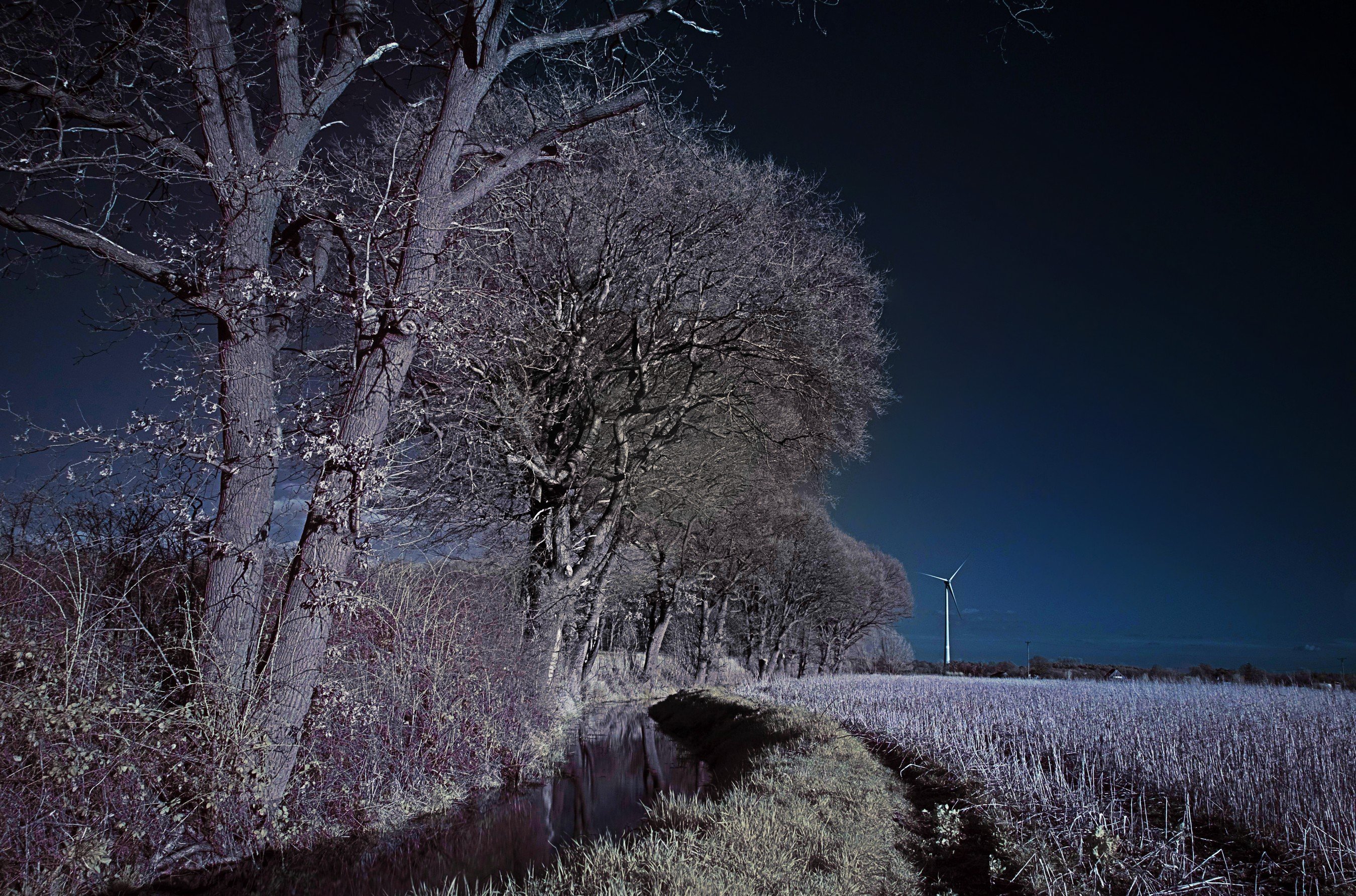
affinity photo A few infrareds
Jörn Reppenhagen replied to Jörn Reppenhagen's topic in Share your work
Three more. Same rig.
-
@MPAffinity17 - Just checked. XF 27 mm prime lens: No lens correction with 1.6.5.135, the beta does the correction. XF 18 - 55 zoom lens: No lens correction with 1.6.5.135 and beta. XC 50 - 230 zoom lens: No lens correction with 1.6.5.135 and beta. So it seems the regular version does no lense correction with Fuji lenses at all, the beta does it with prime lenses, only. Erm ... Just loaded another picture taken with the prime lens into the beta: Now the beta also does no lens correction. Ah, guess I found the culprit: You can only switch lens correction on/off if the option "Apply lens corrections" is enabled in the "Assistant Manager". If it's disabled, the checkbox in the Lens tab intensely does nothing.
-
@Mark Ingram: Please also have a look at the general implementation of the lens correction with Fuji cameras/lenses. I found there's no lens correction at all with the regular version 1.6.5.135, lens correction seems to work with the beta, only.
-
Fixx: Of course, that's the technique behind it, changing the container size. But adapting the visual size would still be a sound idea - the human brain is a quite strange thing. Even if we knew there's some tolerance around the visual "knob", we'd still try to hit it straight in the middle; thus not much gained as it would take a quite similar degree of concentration. I guess developers chose that tiny sizes for two reasons: Looks highly professional - and gives enough room for clicking left and right of the "knob" (someone please tell me the correct technical term ) for being able to select an absolute value with a single click - without creating a large deadzone around the "knob". Regarding the professional look, there's always a chance of overdoing it - just take that tiny LR triangles as an example. At least for me, it's a kind of hindrance, as I wish to concentrate on the picture, not on sharpshooting the UI elements. As for that left and right clicks: I always find myself choosing relative values by moving the sliders, just rarely clicking left or right. But that's just my personal habit. That's why it might be a nice idea being able to select the "knob" size - all according to working habits. - But of course I am aware of the programming effort behind such "simple" requests. Reminds me of my days as a programmer ... Customer: "Hey Jörn, there's just this itsy-bitsy tiny little mini change we like you to do on the UI - matter of seconds!" Me: "There goes my weekend ..."
-
Fixx: If I wish to include pictures into a catalogue, I am happy to import them. But I wish to be able to use the organization features with all files and folders, without being forced to first import them into a catalog. Just quickly open a folder, pick a file for editing - while being able to e. g. display RAW files only, use tags, ratings, color codes, and the like.
-
Lightroom alternative
Jörn Reppenhagen replied to majkelos's topic in Feedback for Affinity Photo V1 on Desktop
There's another point to consider ... Recently, Skylum added "DAM" functionality to their "Luminar" product, obviously concentrated on nothing else than creating that addition. The outcome became a disaster. Why? They announced working on a DAM - thus people demanded seeing progress, increasing the pressure on the developers. User's voices got louder, demanding the launch of that DAM version. "ON THE DOUBLE!" Thus the results of an over-hastingly work got launched to calm down that voices. Rendering the software close to useless for a great deal of owners (including me, which of course is the worst part ). Providing a "DAM" reminding of cheap smartphone gallery apps, a rag rug with almost no practical use, a toy with severe lack of a solid base for building. Not even showing file names or file types, not even being able to exclude pictures from child folders. You can imagine the chaos. And killing all your work if you added a drive which was not present at the time of initial installation. All catalog data gone, all edits gone, pictures uneditable. And more, more, more. No support anymore because all support guys were busy with calming down angry users. Then the same voices previously demanding a quick DAM launch went ballistic because of that problems. As usual. And that's still the present situation. So let developers do their thing, don't demand a clear yes or no or a roadmap. Either statement would put pressure on them. I see developers taking great care of a sound evolution of Affinity Photo. So I guess if there will ever be a DAM, it will be a well-thought-out one. Sometimes patience is a better driver of progress. -
Unfortunately, my preferences regarding a DAM were not among the choices. It's quite simple: Like in LR, but without being forced to import pictures (or to pay a monthly fee ).
-
A few ideas...
Jörn Reppenhagen replied to Klababa's topic in Feedback for Affinity Photo V1 on Desktop
3) Or (suggestion for Windows): Alt + Mousewheel changes the size, Alt + Shift + Mousewheel changes the hardness. Far more natural. -
No big deals. Missing blanks, like in "23.97MP", "XF18-55mmF2.8-4 R LM OIS". Using blanks at the correct places just makes reading and recognizing the data at first glance easier: "23.97 MP", "XF 18 – 55 mm, F 2.8 – 4, R LM OIS". – Looks far better, hmm? It's a common problem, seen almost everywhere. Stil nice if done right. No focus change if moving the mouse pointer to a different area after using a slider. Example: Changing the opacity of a layer or size of a brush. When done, I need to click somewhere outside the slider panel for closing it. Causes two problems: After changing opacity, I always find myself clicking the next UI control for using it, but it doesn't react. Because the first click after setting opacity is needed for closing the slider. After changing the brush size, I need to see the new size. But Affinity doesn't show the new size until I close the slider by clicking somewhere. Of course I click into the picture. Causing the slider to close - but at the same time activating the brush function: Voilá - selection changed, or a big fat blob of color in the picture, which I don't want. Would be nice if the sliders close as soon as I move the mouse pointer away. That way, I'd be able to click the next UI element without doing that slider-close-click, and without applying the newly sized brush at places where I don't wish to apply it. Size of the (how it's called?) "slider knobs" . I am aware of the fact that tiny "knobs" look nice and highly precise. And I am quite at home with using a mouse. But an option for changing the "knobs" size would still be great. We usually concentrate on that "knob's" effects on the picture. Thus we click that "knob", but at the same time our eyes swing back to the picture for watching the effect. And in quite some cases, there's no effect because we missed the tiny "knob". Maybe it's just me? As said: No big deals, just cosmetic improvements.
-
Interesting find. I am in love with the X-T20 and three lenses (XF 27 mm, XF 18 – 55 mm, XC 50 – 230 mm). I also found this tiny issue with the beta (258), it does not occur with the regular 1.6.5.135 version. Interestingly, pictures taken with the XF 27 mm are perfectly okay, just that two zoom lenses are affected. Plus, the Lens Correction feature shows no effect with the zoom lenses (no effect if you switch it on and off), while it works as expected with the 27 mm prime lens. Thus it looks like lens correction in the beta does not work at all for a set of lenses; maybe it's just inactive for Fuji zoom lenses. Well, it's a beta. Till now, I did not find this issue change my life or stop the earth rotating. Might be different in Berlin.
-
Haha, IanSG ! To start with astrophotography, you need to stash away about 3000 to 4000 Euros clandestinely from the control of your spouse or bank. Advertizing tells you slightly different things. "300 Euros for this brilliant telescope including sturdy mount of the professional grade - and you're all set." Accompanied with various photos taken by the Hubble telescope, of course. You're indeed set. For a heart attack after having a look at your first pictures. Typical novice dialogue in expert forums: Me: I've got [SUPERPRO-EXPERT-ALL-IN-ONE-PACKAGE] for 300 Euros. Can't get into focus. They: [facepalm] Throw away that sh... Buy a real telescope. Everybody knows that. Except you. 300 Euros plus. Me: Got the real scope. Can't see much in the pictures. Theys: [facepalm] Buy a larger scope. Everybody knows that. Except you. 500 Euros plus. Me: Got the larger scope. Mount does not hold it, always tips over. Makes funny crunching and grinding sounds. I guess that's normal? They: [facepalm] Forget that sh... mount. Buy a real one. Everybody knows that. Except you. 1500 Euros plus. Should have tried the Scotch mount. Me: Got that real mount, bank is after me. Can expose up to 30 seconds. After that, stars become lines. They: [facepalm] Two options: Buy a pro mount for just 15.000 Euros. Or buy an autoguider. Everybody knows that. Except you. 800 Euros plus for the autoguider, 150 Euros plus for the smaller scope the autoguider needs. Me: Got the autoguider. Can expose for centuries. But stars outside the picture's center get blurred, look like comets. They: [facepalm] You need a coma corrector, stupid! Everybody knows that. Except you. 200 Euros plus. And so on ... It's an endless story. But at least you've got something to do and to burst out in tears about after having a shy look at your bank statement. But it still is a real fascinating hobby. Nothing compares to freezing four hours in the backyard protecting the blinking and whirring, that way shouting "steal me!" equipment from theft. Shotguns get pretty cold in winter. I'll have a look into the LAB thing. And will try my first milky way pictures as soon as the eternal German rain (you can tell the seasons by the rain's temperature, only) starts to fade. Thank you.
-
Oops! Didn't even notice this thread got replies. At least till now. Thank you for your hints - but unfortunately it does not help. firstdefence: The Dehaze tool does not remove a gradient. Lee D: This is indeed a real helpful video (as most works of James "the voice" Ritson) are, but also does not deal with gradients. I also liked his amazing video about pin sharp stars. John: I did, several times before opening this thread. By the way: You really should try astrophotography; it's one of that hobbies which really conjure a big fat smile on your face. Which sometimes even replaces the memories of the previous hours when you pondered about shattering all your equipment into pieces. I also wrote a little poem about that hours in the dark. Unfortunately, it's very German, so I fear you cannot really enjoy it. But you never know ... Doch manchmal am Abend vergess ich die Welt, erhebe die Augen zum himmlischen Zelt, schau Sterne, den Mond, die Planeten, das Licht, in weiteste Fernen reicht dann meine Sicht. Nah wie der Tisch scheint die funkelnde Pracht, undenklich fern in unendlicher Nacht. Ich schaue so weit, ich schaue das Sein, das All und die Schöpfung und fühle mich klein. Ganz klein im Anblick der Unendlichkeit, ganz klein im endlosen Raum und der Zeit, ganz klein unter dem, was die Schöpfung erfüllt, ganz groß, weil es sich meinem Auge enthüllt. Erm ... Back to topic. I guess I should explain the term "gradient" in the light of astrophotography a bit. Gradients are discolorations and brightness variations (similar to vignetting) often caused by light pollution (usually giving them an ugly yellowish color) and the special characteristics of the telescope/additional lenses/camera combination, often caused or increased by irregular sensor illumination. There are means ("flat frames") for reducing that "picture pollution", but these sometimes are just impractical. Thus a software-based solution often is the key. I'll show you the ugly face of a gradient. First picture (lunatic settings for highlighting the problem) clearly shows the culprit. Second picture appears to be a bit better. (That picture got just about 14 minutes of exposition, thus the quality is still very low.) That gradient seems to be almost gone - but at the same time the fainter stars and masses of details also waved farewell. Just note the nebular object in the upper left, the "running man" nebula. Almost gone; and not really for good.
-
Hi there, Affinitists! I do some astrophotography (deep sky objects, not milky way) somewhere between bloody beginner and intermediate level, would love to use Affinity for most if not all tasks except taking the photos. Now Affinity is no specialized tool for astrophotography purposes, I am quite aware of that fact, so my expectations don't go ballistic. I experimented a bit during the last days, things like stacking, stretching, and all that other tasks all around processing - but found myself reverting to Deep Sky Stacker for stacking; and surprisingly using Luminar for further processing. I just got the better results using that combination. But I am a bloody Affinity noob - thus I might just have overlooked some vital features. Thus I wish to collect some opinions, hints, suggestions for Affinity use with AP challenges; and of course also consolidate feature suggestions. I guess that's better than just flooding the respective threads with streams of thoughtless suggestions. First suggestion: Gradient removal tool/filter. I know there's a plugin for PS, GradientXTerminator, also found a feature in Luminar (Remove Color Cast) doing quite a good job; at least sometimes. But I didn't find anything similar in AP; did I just overlook it?
-
Yesterday, there was a fierce storm. Conclusion: There's fierce storms every single day, all year long. Found the mistake? At the points of time I looked for a PC version, there was no such indications in the "Hamburger menu", PC related links led to a Microsoft store restricting the use of Affinity to Windows 10. It's been all Apple and a tiny piece of PC. And it's points of time because I looked for a usable PC version multiple times, using smartphones and tablets. And I love hamburgers. Maybe I should also note I am no novice, am a former programmer since good old ZX-81 times, am still not allowed to enter the USA due to successful hacking activities way back in the Reagan era, worked as a web developer and IT tutor for years, am now creating contents including masses of web contents for global players, thus spend about 12 hours daily and up on the net. So I impudently dare to claim not finding a suitable PC version hasn't necessarily been a problem of competence but a problem of contents. As I also reflect on the initial lines of this post, I need to happily admit there had been changes, it's far easier to find a PC download, now. That's a great relief as I would love to witness Affinity conquering the PC world. By storm.
-
Also had a look again. It's a bit different now, I also guess there's quite different versions shown according to browser, platform and locale. For instance, I did not get the screen posted by Pšenda. NOW I was able to spot a link allowing to buy directly after scrolling a bit down, looks like a direct purchase without the previous Microsoft nuisance. This had been different not long ago. Feels far better!
-
Mr MEB: Thank you for the quick reply on semiholy Saturday. 1. My bad - should have revealed I was babbling about the Windows version. 2. Ah, forgot about hardness. In that case we need to forget about Shift working as a 10-step modifier, it's better used for setting hardness. Thus speed of wheel rotation could be used for determining the stepping rate: Slow - single step. Fast - increment by 10 or even more, speed-dependent. Still keeps programming rather simple. (Everything is simple if you expect others accomplishing it.)
-
Hoi MEB ! I already tried the first approach - but I still need to change each and every brush size keys separately. It doesn't do a global change. Tried with 1.6 and the latest beta. About the second issue: Please reread my suggestion (even if I tend to be quite lengthy) - we're talking about different things. Already suggested a possible solution to this problem.
-
Personal experience: I heard from Affinity quite some months ago - YouTube videos, YouTube advertizing. But I didn't buy. Instead, I bought Luminar and On1 in addition to LR and PS I already owned. Because I just couldn't find out quickly if Affinity is also for PC. Website was not clear about that. At least not the parts which I saw first. Some months later, I saw more advertizing, also watched some hands-on videos made by James "the voice" Ritson. Again wished to try and buy Affinity. So I returned to the website. But again didn't find a quick way of making sure it's for PC - got scared off when I read of iTunes (or similar), clearly pointing to the Apple ecosystem. Didn't look any further. Some weeks later, I again returned for having a look. And it seemed like there's a PC version at last. Fine. But this time, I was pointed to a Microsoft store, offering Affinity for Windows 10, only. I was using Windows 7 at that point of time, so pointing to that store was pointless to me, which is the point. Finally, I found a link shoving me into the right direction. And finally, I bought Affinity. And I am very happy with it. You created a real fine piece of software. But buying took a lot of persistence and a dose of luck. So Serif guys: It's real hard to find out Affinity is also for PC, it's real hard buying it. - Because you need some time and luck for finding the information you're after. Especially if one's purchase decisions usually are early morning in-bed actions using a smartphone - with no greater intentions of digging deep into the guts of a website using that tiny screen. I guess there's thousands of potential buyers experiencing similar problems like me as they don't find clear information at first glance - or getting scared away by that Microsoft Windows 10 bondage. So make it prominent Affinity is also for PC, show a "BUY HERE, STUPID!" link at first glance, sell more, be happy.
-
Good idea - would really help deserting from Adobe applications and quickly feel comfortable in the enemy's lair. Plus, the help section could need some brush-up. Would be helpful to have more pictures for showing the elements the texts refer to. That way, a noob (like me) could clearly see "Ah, that's how it looks!". Surplus, the help section could also need some more detailled explanations - like where to find items referred to. Example: "Use Blend Ranges." An experienced Affinity user will know it's that little cogwheel. But a novice will start seeking and swearing because he just doesn't know where and what to look for. Better: "Use Blend Ranges (the little cogwheel found in the Layers panel [picture])." As a certified tech writer, I know writing documentation is a pain in the you-know-where. But it would really help new Affinity affinitists doing the change.