CarrotMan
-
Posts
34 -
Joined
-
Last visited
Everything posted by CarrotMan
-
Opening the same image today and carrying out the same steps as in screenshots 1-7 above I am not now finding a problem. How odd! The only difference today was that I initially turned off “apply tone curve” in the Development Assistant, but then turned it on again.
-
Hi Dan, Here are the screenshots (1-7) going from Develop, through a small horizon straightening and crop, to opening the file in Viveza and Color Efex from within Affinity. (I also developed the raw file with DxO PhotoLab (my usual raw developer) and straightened the horizon, which produced a small auto crop (8). When I then open the image in Affinity from within PhotoLab (9) and then apply the Nik filter (10), the image looks normal, without the checkerboard.)

-
Thanks. I’m not very good with computers! Would it provide you with enough information if I could provide static screen shots of the uncropped photo opened in Affinity, the straightening/cropping stage, and then the adjusted photo opened with the Nik filter in Affinity? If not, I’ll try what you suggest above, but it might be a while before I get back to you (tomorrow in any case at earliest).
-
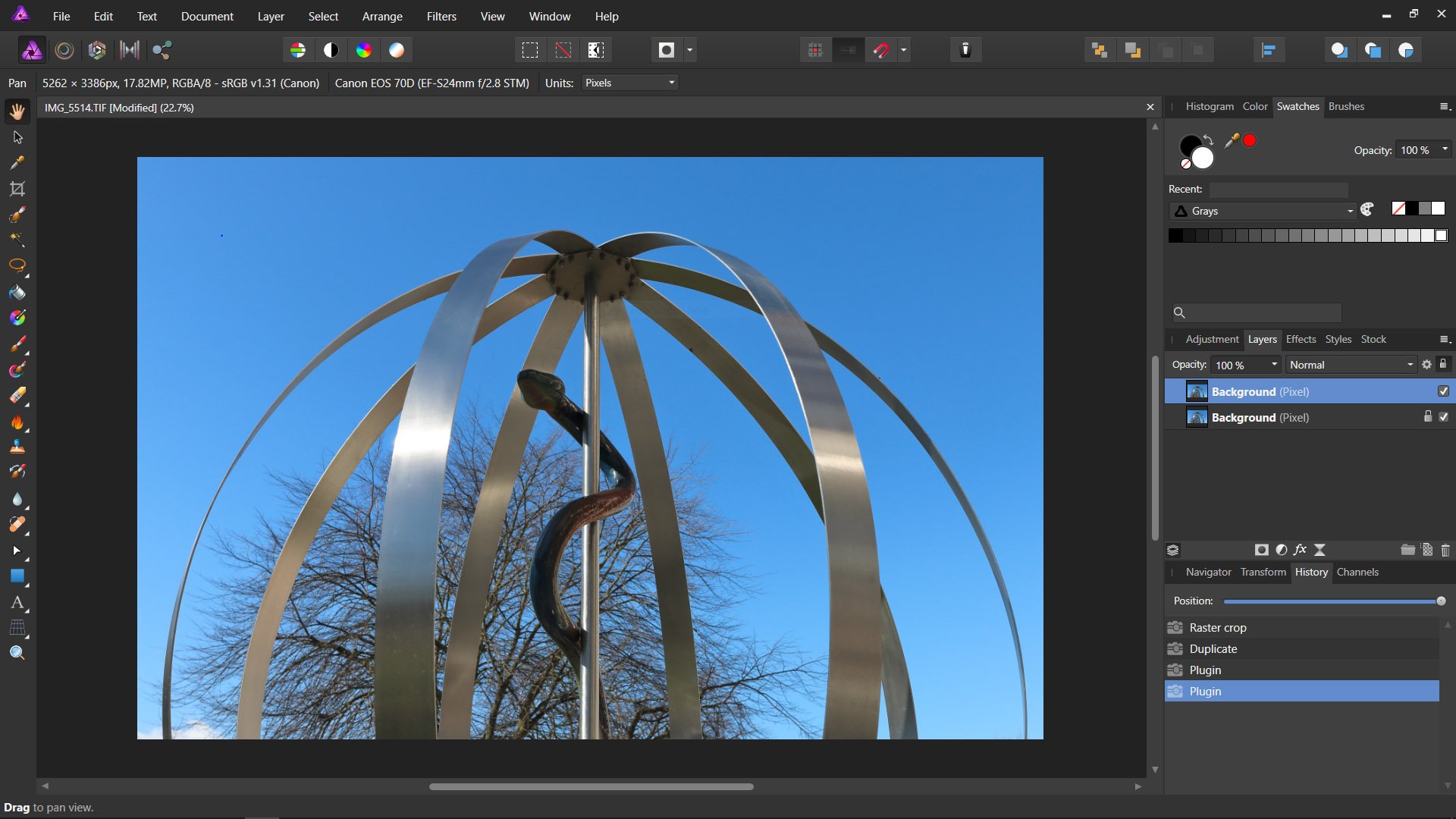
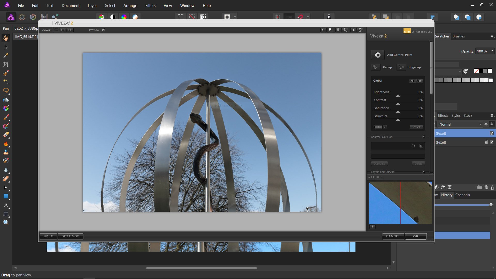
I am using Affinity Photo (latest update) which I haven’t used for quite some time. Opening the Nik Viveza filter I have a broad strip of “checkerboard” at the top of the image. I have previously carried out a slight horizon straightening and very small tidying crop to this image, but I’m sure I’ve not cropped away anything like the amount of “checkerboard” which is visible. Any suggestions as to what is happening? Added- I see now that it occurs with other Nik filters too. It doesn't appear when I crop even a lot from the top of the image, but does happen when I straighten, though only the top of the image is affected.
-
Thank you. I take your point about possible future uses of a file, but I always keep my raw files and so, if (by some miracle), someone decided that they liked one of my images sufficiently to want a print or whatever, I could then, presumably, edit 16 bit in the widest colour space?
-
Thank you for your replies. I have just a couple of queries: 1) The setting I’m referring to is found in Edit: Preferences: Color: RGB Color Profile. In the drop-down menu are numerous options, including sRGB, Adobe RGB, ROMM RGB, and my specific monitor profile. So am I correct in thinking that I should (a) set this to Adobe RGB, and (b) output my TIFFs from DxO PhotoLab with an attached Adobe RGB profile? 2) It is my understanding that it is best to upload JPEGs to the internet with sRGB profile attached to avoid problems with others possibly seeing incorrect colours. If so, why is it not better simply to use sRGB (with its more restricted colour range) throughout the editing process? Would this approach not give me a more accurate idea, as I make editing decisions, of the colours that other people who view these images on the internet would be likely to see in the finished result? (Sorry if I’m being a bit dim here)
-
I find the topic of colour management a bit confusing and would welcome some guidance. To get the most accurate colour when using AP to edit images (on my laptop) which will be displayed on the internet as opposed to being printed, which profile is it best to use? I tend to use DxO PhotoLab for raw conversions and could export as either sRGB or Adobe RGB. Affinity Colour Preferences allows a host of choices. Should I use sRGB IEC61966-2.1, or would it be better to use the specific profile created when I use my Spyder to calibrate my laptop screen. Or should I use something else again. I have read that it is best to edit in the widest colour space available, but that it is best to upload sRGB to the net. (Sorry, please keep any answer rather basic since as you can probably tell, my understanding is pretty limited.)
-
Thank you for your suggestions. I have tried them but not yet really got a result as good as I got using DxO Nik HDR Efex, though I do find that I have to dial back the saturation quite a lot in that program. I generally prefer Affinity HDR for that reason. What I did find in Affinity was that I can “Select tonal range” to select the highlights. If I could use that to target just the highlights in the window, to make a selection, then maybe I could erase the areas within the window tracery to leave my “good” window exposure showing through from the layer below? I can’t really work globally on the selected highlights because some areas e.g. on the whitewashed walls, I don’t want to lose.
-
I have a series of 3 bracketed shots (-1, 0, +1 EV) taken some years ago in a church. I should really have got a darker exposure for exposing a stained glass window in the scene (I am better at the camera stuff nowadays!). I can get a good version of the interior of the church using just the -1EV shot in 32 bit HDR, or I can use all 3 shots in normal Affinity HDR, but either way the window is a bit too bright. I can also get an acceptable rendering of the stained glass window by reducing the exposure of the -1EV shot a bit. I can use the selection tool to try to select the glass without selecting the tracery (which I don’t want to darken too much), and combine the results using layers, but it is rather fiddly. But what I’m really wondering is if there is an easier way to work with this, maybe by using the Blend Ranges function or something else to combine my HDR file with the darker version of the -1EV shot in a more straightforward way than by using selection tools?
-
I am using the latest normal version of Affinity, not the beta version. Yesterday I upgraded to version 2.3 of DxO Nik Collection (free to existing v. 2 users). I haven’t had much chance to try it out yet, but what is clear is that there certainly isn’t any longer the grossly incorrect colour issue with Viveza when used as an Affinity plugin and using a sensible magnification. DxO’s release notes refer to a “partial” fix. I think that I can see a difference between a file with an Adobe RGB profile, with the colour less saturated in Viveza, but I don’t think I’m seeing a change with sRGB files when opened in Viveza. In the former case, the colour looks less saturated, but it is certainly nothing like the terrible colour shift which was found with the older version of Nik. Maybe it’s now fixed for sRGB but still not for Adobe RGB? I wonder if anyone else is seeing the same (my screen is not a wide gamut one). At least some progress if this is so.
-
I don’t think I explained myself very well. I think I’ve now discovered the answer to my query, so I’ll post it here just in case anyone with the same query should happen to come across this. When modifying a selected area of a raw file in the Develop Persona using the gradient overlay, the gradient overlay has first to be drawn onto the image, and then the edit can be made, for example a graduated reduction in the exposure of a sky. I now realise that to achieve a similar result in the Photo Persona, the gradient has to be drawn onto the adjusted layer (for example, a levels adjustment layer). So the gradient overlay in Develop is drawn before the adjustment is made, whereas the gradient has to be applied after the adjustment is made in the Photo Persona.
-
I sometimes use the gradient tool in the Develop Persona, for example starting with the cursor at the top of a sky and using it to achieve the effect of a sky getting darker from the horizon to the top. What I don’t seem to be able to do is use the gradient tool in the Photo Persona in the same way. Whereas in Develop the red gradient overlay changes to show the colour image as soon as I change a setting (e.g. reducing the exposure slider), when using the gradient tool in Photo, all I see is white. I just want to use the tool fairly basically to apply the same sort of graduated change in Photo as I can in Develop. I’m probably missing something pretty simple.
-
Thanks for this, it does look as though this is the source of the problem. I’ll get onto DxO again. It seems very odd that the sRGB profile is presumably attached to the TIFF which PL2 launches into Affinity, but somehow missing from the TIFF which PL2 exports to the Pictures folder. At least I know now that this is not an Affinity issue, and that AP is correctly applying the set profile to a profile-less TIFF when opening the file from Pictures, but presumably finding a profile when the program is opened from inside PL2! Does this mean that PL2 creates two TIFFs, I wonder? I don’t tend to use PL2 and Affinity together much because of the known problems with Viveza, which means I tend to use PSE to apply Nik edits. I initially thought it was just another DxO - Affinity tiff (apologies for the awful pun!), so good to know that Affinity is “not guilty”.
-
(I have already sort of asked this question here, but not got a reply yet, so I’m revising it). I inadvertently had ROMM RGB set instead of sRGB in AP colour setting preferences (sorry, haven’t got AP open at present, but I mean in the setting near the top of the menu). When opening a TIFF in AP, which had been converted from a Canon .Cr2 in Canon DPP, or from a Fuji .RAF in Silkypix (these TIFFs being 8 bit sRGB), the colour looked fine. But if I opened a TIFF (again, 8 bit, sRGB) which I’d processed using DxO PhotoLab 2, the colour was awful and very over-saturated. But if I opened the same TIFF directly into AP by launching the “Export to application” function, the colour looked fine. I wonder why? It looks as though maybe opening the file from within AP makes the software use the ROMM profile, but launching AP from within PL2 somehow ignores it? (Everything is fine now I’ve changed the profile from ROMM to sRGB, I’m just curious about this issue).
-
I don’t know whether I am doing something wrong or what is going on. My problem: convert a raw file in DxO PL2 (doesn’t matter whether it is a Canon or (old, non-X-trans) Fuji. The tiff is exported as 8 bit and sRGB. If I open these tiffs in Photoshop Elements 2019, they are fine. If I open with Affinity, the colours are weird and grossly over-saturated. This is almost the reverse of the known issue with Viveza and Affinity. If I process the raws in Affinity, the colour closely matches what I get from PhotoLab. (The colour rendering in Affinity of Canon raws converted to tiffs in Canon DPP, and of Fuji raws converted to tiff in Fuji/Silkypix, is not problematic). ADDED I have now discovered that this only happens when I open a tiff by browsing to the file within Affinity. If I use the “Export to application” command in PhotoLab, and choose Affinity Photo this way, the program opens and displays the colour correctly! ADDED I have discovered that I’d got the RGB Colour Profile set to ROMM RGB in error. Presumably launching AP from within DxO causes the program to display the tiff as sRGB, but opening AP and then opening the file causes it to display as ROMM.
-
Would it be possible to include the option of displaying more grid lines within the Curves tool than the current three verticals and three horizontals? Maybe dividing up the current 16 squares into 64?
-
Thanks, I will suggest it.
-
Thanks. I’ve looked at this, and I can alter the grid superimposing on my image, but it doesn’t seem to control the Curves display. In the Curves dialogue the grid divides the display into sixteen squares and I’d like a lot more if possible.
-
Apologies if this is covered in an existing post which I’ve overlooked. Is it possible to change the grid displayed in the Curves tool, to give a grid with a finer “mesh”?
-
Thank you Callum. I’ve now downloaded the update and it seems to be working fine. Re what I wrote about the Mac and Windows differences, I got this from a recent (5 June) review on ephotozine, which seems to be suggesting that some speed improvements made to the Mac version have not yet been implemented in the Windows version. I appreciate that the Nik problems require work from DxO. It would be great if they could sort it, but maybe they aren’t too keen to do so.
-
I have a few questions about the new 1.7 AP release: 1) If I update from my version 1.6 (not sure of the rest of the version number, I’m not on my laptop), can I still keep the last 1.7 beta on the same laptop (Windows 10), just in case I hit a snag with the updated version? 2) Will the improvements which have been implemented in the Mac version of 1.7 be available to me as a free upgrade when completed for the Windows version? 3) When (if?) the DXO Nik plugin issues eventually get sorted, will this be in a free update or is it likely to be in a future paid upgrade? Thanks
-
@John Rostron Thank you. I’m a bit confused by this because I thought that this image, an 8 bit TIFF which I converted from a raw in Canon DPP and then opened in Affinity, was by definition a rasterised layer, so don’t really understand why I would need to rasterize it. My knowledge is very limited, but reading up a bit on this my understanding is that one can have vector layers in Affinity which can be rasterized, and have to be for certain purposes, but if a TIFF is a raster format how can it be rasterized (or re-rasterized). Or has Affinity done something to “unrasterize” this TIFF? Please excuse my ignorance.
-
I'm disappointed to find that the weird colour problem with Nik Viveza seems unresolved still in Affinity, but I seem to be having another issue too. I cropped a photo, duplicated the layer and applied the Viveza filter, and find that not only does it have the usual colour problem, but that the filter layer is uncropped too (screen shots attached. Please ignore the first shot, which is just a duplicate of shot 2. And the fact that the shots seem to be breeding!!!).
-
@John Rostron I think that the non-alignment issue was almost certainly because the darkest raw file, which I was trying to put beneath the HDR merge, seems to have had a slightly smaller pixel size for some reason, than the HDR stack layer. It may be because DPP had apllied lens correction but AP hadn’t (only CA and defringe). I think this is what the poster in post 3 is suggesting. Certainly DPP can make quite a noticeable difference to what appears in the image after lens correction is ticked. I think that DPP preserves all the lens correction parameters once applied until re-set. Julian

.png.aa35d7f2be4f53630ea669296a6b05b5.png)
.png.6de83c72c409097cf83fb38c6c5e2222.png)
.png.730d6ca1e973850e31a743c6f8fb808f.png)
.png.d335280c590323892b8a963ea99d79a1.png)
.png.00332b51e7e14a36d6059823ec94d7ab.png)
.png.9649806aa7e2318ddc01603e1ad3559b.png)
.png.d0d1b5e2be8a63b071b401f13429973c.png)
.png.468969bdb9ded963503c548a78ee7a8b.png)
.png.8d29e4bcb0e9710cb4f494062ecc405b.png)
.png.940824b34f47a1784828595a8b51f0d5.png)