ABHULtheELF
-
Posts
23 -
Joined
-
Last visited
Everything posted by ABHULtheELF
-
 I have had problems converting Affinity Publisher files to PDF (even with fonts embedded) in particular with some lower case letters "a" for example.
 -
Does anyone have any insight regarding which fonts work better as substitutes for Helvetica and/or Helvetica Neue on Affinity Designer projects primarily viewed as PDF presentations on PC and Mac system screens, but sometimes also for standard printing? FYI, my system is MacBook Pro running OSX 11.2.3 Big Sur. FontAgentPro is my font handling app.
-
Thanks, MEB. Yes, my display is set to Default. I am wondering—does anyone from Affinity actually read these forums? If so, I would really like to hear from one about the future of fixing my issue.
-
How much trouble would it be for Affinity developers to put a size (increase or decrease) option in their apps? I love Affinity apps, especially compared to the highway robbery payment options Adobe charges. And since I am semi-retired now, I can no longer afford Adobe anyway. But I still have a few clients that require graphics apps for their projects, and with the small icon sizes it takes me a lot longer to complete jobs now. Please Affinity!—add an icon enlargement option!
-
I am on a MAC running Big Sur using a 27" Apple Display. I am not on a PC. So your suggestions do not help me, because I cannot find a Control Panel or Preference Panel to change sizes. Is there anyone out there that has this problem fixed on a MAC?
-
Thanks for the quick reply, MEB, I really appreciate it. No ability to change icon size is a real bummer. When I asked a tech-savvy friend of mine, "Why are computer and phone things getting so small?" he replied, "Because they are all being built by young people who don't have the same issues older people have. And unfortunately, by the time these young techies become Seniors, you and I will be gone already." So true!
-
Where are the controls to enlarge my tools icon sizes? I can't find it anywhere, and because I am a Senior (older) person, the tool icons are so small they are difficult for me to read and understand. I have attached an image of the tools I am talking about.

-
Lagarto — The attached magnified screenshot will show you what I am seeing. It seems to be happening only with the lower case letter "a" and only in the PDF file. The funny thing is, if I magnify this type in my viewer, (like you saw) everything looks normal. It is still a real puzzle to me. Maybe I have one or more incorrect settings either in my Affinity Publisher document or in Acrobat Pro?
-
I agree, Richard. I had several steep learning curve issues. Most of these were simply because of the British English versus American English way of describing tools and setting preferences. Lately, I had a pickle of a time trying to figure out how to get the best PDF quality for a 26-page brochure I was working on for a client of mine. The main issue was that the document export had to work both for pint versions and screen reading purposes. I had no trouble in the past with Adobe PDF conversions, but the Affinity Publisher export options had to be "tweaked" quite a bit (using the "More" call-out at the bottom right of inside the PDF export creator.) I had to experiment with many different settings before I finally figured out the best combination of adjustments and saved it all as a new User Custom Setting. I also continue to have issues with fonts not behaving as I was used to with Adobe CS. But ll-in-all, the cost savings far outweigh the learning curve and I would definitely recommend Affinity as a very viable option all around.
-
Apparently, the document did not upload properly. I am uploading it again here. WintersWilden_Brochure_ONE_PAGE.afpub
-
YES!—I have attached a single page that shows it best. Note in particular that the lower-case letter "a" in the body type probably reveals the problem best when converted to PDF. WintersWilden_Brochure_ONE_PAGE.afpub
-
You're right, Old Bruce. The reason for this is simple—Often, we proof-read what we expect to see instead of what is actually there. That is especially true if the designer is also the body copy writer and gets magnified when the designer has a tight deadline. But, it is always best if we catch our own errors first. One mantra some designers go by is to get their client to sign off on a proof before printing. That way, the client is responsible for errors, not the designer. Personally, I think this is cuts two ways (1) it does let me off the hook, but (2) it makes me look like a shoddy, insecure designer. The whole idea of getting someone else to proof-read the copy is a great one! My wife has caught a few of my own misspellings over the years. Another "Old Timer's" tip I learned decades ago is to proof-read the copy backwards instead of forwards.
-
I unfortunately, had the same habit when I was a young designer. But habits can be broken and fixed, and in the case of spelling, it is absolutely necessary. I once cost the company I was working for, almost $6,000 on a project because of my spelling mistakes.It was fortunate that I didn't lose my job! But through that experience I quickly learned how important it is to force myself into learning, practicing, and exercising an accurate spelling habit. Trust me, poor spelling is no laughing matter and can cost you dearly. Just a word to the wise.
-
Fancy doesn't matter. All of us were all "Newbie's" at one time in our career. Please share!
-
I switched to FontAgent Pro years ago and it has worked great for me. It is from Insider Software. I am on Mac's exclusively, but FAP also comes in a Windows version for PC users.
-
Yes, it is a CMYK document, and here is the thing—The body type in this document is not 100% Black, but rather is supposed to render 70% Gray tone. So, If I understand you correctly, then the problem started when I selected K70, instead of rendering the type in CMYK numbers that would equate to K70. Is that right? And if so, what CMYK setting would render a 70% Gray tone?
-
The problem is the latter (It only happens viewing the PDF on a computer screen. The printed copies are fine.) The problem is, most of the people who receive the 26-page document will most likely view it on their computer, rather than printing it out. To answer the other part of your question, I am viewing the document in Adobe Acrobat Pro (which is the default app that converts all my Affinity docs into PDF.) However, the entire 26-page document is emailed to WintersWilden's potential clients so they can view it on their own screens or print the document out on their own printer.)
-
Which PDF setting renders body type the best? I regularly produce a 26 page brochure using Affinity Publisher. NONE of the AP PDF settings would render really crisp small type. The closest I got to an acceptable result was creating my own custom settings with No Downsampling. It is acceptable, but not really crisp (see the page sample I have attached to this question). I hate to say it, but the PDF renderings I used to get with InDesign were always crisp. I think that is because InDesign PDF's included a setting option to "Include All Fonts". What can I do to make sure all fonts are included with my AP PDF's? Is there something I am not understanding? Can anyone help me please? — FYI, I am using a MacBook Pro with 27" Apple display. WW wText Sample.pdf
-
Lee D — Thanks for getting back to me, However, my post was over a month ago, and in that time I finally came up with my own PDF Preset in Affinity Publisher that finally turned out the way I needed. My biggest issue was that the final PDF had to be small enough to email (standard email) and still be a high enough resolution to render a very good print final. My ultimate solution was so simple it was staring me in the face!—I simply had to choose "PDF (for Print) > More > Then remove all of the downsampling, JPEG compression, and uncheck "include Layers". I have attached the final PDF in the new PDF Preset settings I created through these adjustments. WintersWilden_Brochure_MAY_2020-4AF.pdf
-
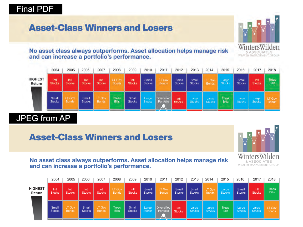
I am a graphic design professional now retired but still doing side work for a few clients. I dropped Adobe products because I could no longer afford them. This was my first job working with affinity publisher (a 27-page document). I imported an idml file into AP and all went well UNTIL I tried to create a final PDF for my client. Regardless of the kind of PDF conversion I selected, all either had massive type issues (strange letters, missing letters, incomplete letters) and color bars with overlaid type that turned the color bars into color with "ghost shadows/images" of the overlaid type (see the attached images of a clean JPEG versus the best PDF). Regardless of the AP PDF setting I chose, some form of corruption resulted. I finally just exported the job as JPEG pages, then created a PDF using Acrobat. The first PDF was over 250mb which is much to large for my client to use. I got a usable file by saving the PDF as a Compressed PDF. This turned out to be only 4mb which is what my client needed. When I was using Adobe IND all images were clean and small in size as they should be. It is only when I used AF that the whole process ended with a slightly dirty final PDF. What did I do wrong, or what could I have done to get a small clean PDF?
-
Affinity Publisher for macOS - 1.8.2
ABHULtheELF replied to Patrick Connor's topic in News and Information
I am so thrilled with the changes in Publisher, especially the ability to open IDML files. WOW! What a great improvement. -
Affinity Publisher Public Beta - 1.7.0.292
ABHULtheELF replied to AdamW's topic in [ARCHIVE] Publisher beta on macOS threads
Hallelujah and pass the biscuits!—(hopefully to be shouted with even greater intensity, as soon as you guys switch from beta.) Finally after all these years of paying through the nose for Adobe apps, there is an alternative! Adobe makes great products, but they are so-o-o-o expensive. Please, please, pretty please I'm begging you . . . please get Affinity publisher fully up and running for us! I just bought Affinity Designer and Affinity Photo and I can't wait to get a chance to buy a full featured, fully functioning Affinity Publisher! You guys are doing a fantastic job and I, for one, have become a HUGE FAN of Affinity software. -
Hi Y'all — I am now retired after a 50-year career as a Senior Creative Professional and Ad Agency Owner, but I still requests for the occasional logo design, brochure, and so forth, so I still work a few hours a week. I am absolutely thrilled to hear about Affinity Design Software! One of the "Young Pups" at my local Apple store told me about Affinity last week and I couldn't wait to check it out. I was getting tired of plunking down the cash for another year of the subscription service products, especially since a lot of the work I am doing these days is pro-bono or small pay. I just downloaded the Affinity trial and beta versions and can't wait to take them out for a test drive. Thanks, Affinity!!!